Primer CSS es un marco CSS gratuito de código abierto que se crea con el sistema de diseño de GitHub para brindar soporte a la amplia gama de sitios web de Github. Crea la base de los elementos de estilo básicos, como el espaciado, la tipografía y el color. Este método sistemático garantiza que nuestros patrones sean estables e interoperables entre sí. Su enfoque de CSS está influenciado por los principios de CSS orientado a objetos, CSS funcional y arquitectura BEM. Es un modelo altamente reutilizable.
El marco Primer CSS proporciona diseños que se pueden cambiar usando utilidades como visualización, visibilidad, posición, alineación, flotación, desbordamiento, ancho y alto. En este artículo, aprenderemos a implementar varias utilidades de ancho y alto para documentos de diseño.
Primer CSS Clases de ancho y alto de diseño:
- ajuste de ancho: esta clase se usa para establecer el ancho máximo al 100%.
- ancho completo: esta clase se usa para establecer el ancho al 100%.
- width-auto: esta clase se utiliza para restablecer el ancho al valor inicial automáticamente. Esto se usa generalmente para la función de respuesta.
- Ajuste de altura: esta clase se utiliza para establecer la altura máxima al 100 %.
- height-full: esta clase se utiliza para establecer la altura al 100%.
Sintaxis:
<div class="Layout width and height class"> ...</div>
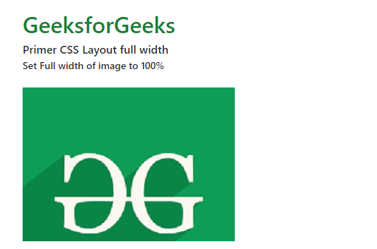
Ejemplo 1: el siguiente ejemplo muestra la clase de ajuste de ancho para establecer el ancho máximo en 100 % para un recurso de imagen .
HTML
<!DOCTYPE html>
<html lang="en">
<head>
    <meta charset="UTF-8" />
    <meta http-equiv="X-UA-Compatible" content="IE=edge" />
    <meta name="viewport" content=
        "width=device-width, initial-scale=1.0" />

    <link rel="stylesheet" href=
"https://unpkg.com/@primer/css@^18.0.0/dist/primer.css" />
    <style>
      body
      {
        margin-left:20px;
        margin-right:20px;
      }
    </style>
</head>

<body>
    <div class="o-container" style="padding:1em;">
        <h1 class="color-fg-success">
            GeeksforGeeks
        </h1>
        <h4 class="font-bold">
            Primer CSS Layout full width
        </h4>
        <strong>Set Full width of image to 100%</strong></br></br>
        <div class="one-fourth column">
              <img class="width-fit color-bg-subtle" src=
 "https://media.geeksforgeeks.org/wp-content/uploads/20220522122914/geeksimage-200x145.png"
               alt="geeksLogo" />
        </div>
    </div>
</body>
</html>
Producción:
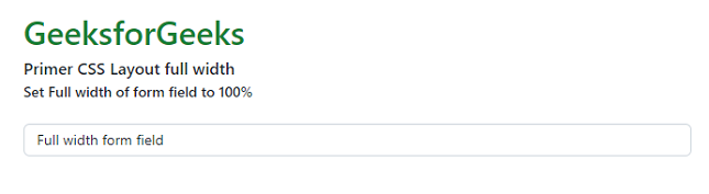
Ejemplo 2: El siguiente ejemplo demuestra la clase de ajuste de ancho para establecer el ancho al 100% para un campo de formulario.
HTML
<!DOCTYPE html>
<html lang="en">
<head>
    <meta charset="UTF-8" />
    <meta http-equiv="X-UA-Compatible" content="IE=edge" />
    <meta name="viewport"
          content="width=device-width, initial-scale=1.0" />

    <link rel="stylesheet"
          href=
"https://unpkg.com/@primer/css@^18.0.0/dist/primer.css" />
    <style>
      body
      {
        margin-left:20px;
        margin-right:20px;
      }
    </style>
</head>

<body>
    <div class="o-container" style="padding:1em;">
        <h1 class="color-fg-success">
            GeeksforGeeks
        </h1>
        <h4 class="font-bold">
            Primer CSS Layout full width
        </h4>
        <strong>Set Full width of form field to 100%</strong>
        </br></br>
        <div class="d-table width-full">
            <div class="d-table-cell">
                <input class="form-control width-full" type="text"
                       value="Full width form field"
                       aria-label="Sample full width form field">
            </div>
        </div>
    </div>
</body>
</html>
Producción:
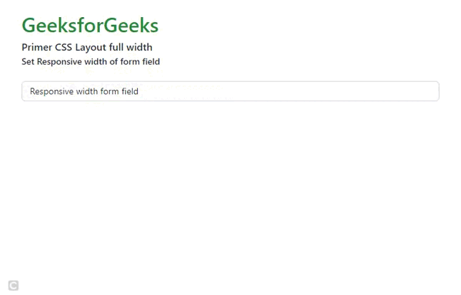
Ejemplo 3: El siguiente ejemplo demuestra la clase width-full y width-md-auto para configurar un campo de formulario receptivo.
HTML
<!DOCTYPE html>
<html lang="en">
<head>
    <meta charset="UTF-8" />
    <meta http-equiv="X-UA-Compatible" content="IE=edge" />
    <meta name="viewport"
          content="width=device-width, initial-scale=1.0" />
    <link rel="stylesheet"
          href=
"https://unpkg.com/@primer/css@^18.0.0/dist/primer.css" />
    <style>
      body
      {
        margin-left:20px;
        margin-right:20px;
      }
    </style>
</head>

<body>
    <div class="o-container" style="padding:1em;">
        <h1 class="color-fg-success">
            GeeksforGeeks
        </h1>
        <h4 class="font-bold">
            Primer CSS Layout full width
        </h4>
        <strong>Set Responsive width of form field</strong>
        </br></br>
        <div class="d-table width-full width-md-auto">
          <div class="d-table-cell">
            <input class="form-control width-full" type="text"
                   value="Responsive width form field"
                   aria-label="Sample responsive width form field">
          </div>
        </div>
    </div>
</body>
</html>
Producción:
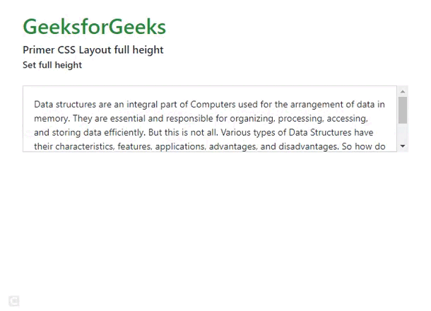
Ejemplo 4: el siguiente ejemplo muestra la clase de ajuste de altura para establecer una altura máxima del 100 % para un div HTML .
HTML
<!DOCTYPE html>
<html lang="en">
<head>
    <meta charset="UTF-8" />
    <meta http-equiv="X-UA-Compatible" content="IE=edge" />
    <meta name="viewport"
          content="width=device-width, initial-scale=1.0" />
    <link rel="stylesheet"
          href=
"https://unpkg.com/@primer/css@^18.0.0/dist/primer.css" />
    <style>
      body
      {
        margin-left:20px;
        margin-right:20px;
      }
    </style>
</head>

<body>
    <div class="o-container" style="padding:1em;">
        <h1 class="color-fg-success">
            GeeksforGeeks
        </h1>
        <h4 class="font-bold">
            Primer CSS Layout full height
        </h4>
        <strong>Set full height to max-height 100%</strong>
        </br></br>
        <div class="one-fourth column"
             style="height:100px;overflow:auto;">
            <div class="p-3 height-fit border">
                Data structures are an integral part of Computers
                used for the arrangement of data in memory.
                They are essential and responsible for organizing,
                processing, accessing, and storing data efficiently.
                But this is not all. Various types of Data Structures
                have their characteristics, features, applications,
                advantages, and disadvantages. So how do you choose
                which data structure to choose for a particular task?
                What is meant by the term Data structure? How many types
                of data structures are there and what are they used for?
            </div>
        </div>
    </div>
</body>
</html>
Producción:
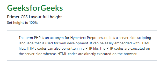
Ejemplo 5: El siguiente ejemplo muestra la clase de altura completa para establecer la altura al 100% para un div HTML .
HTML
<!DOCTYPE html>
<html lang="en">
<head>
    <meta charset="UTF-8" />
    <meta http-equiv="X-UA-Compatible" content="IE=edge" />
    <meta name="viewport"
          content="width=device-width, initial-scale=1.0" />
    <link rel="stylesheet"
          href=
"https://unpkg.com/@primer/css@^18.0.0/dist/primer.css" />
    <style>
      body
      {
        margin-left:20px;
        margin-right:20px;
      }
    </style>
</head>

<body>
    <div class="o-container" style="padding:1em;">
        <h1 class="color-fg-success">
            GeeksforGeeks
        </h1>
        <h4 class="font-bold">
            Primer CSS Layout full height
        </h4>
        <strong>Set height to 100%</strong>
        </br></br>
        <div class="d-table border">
            <div class="d-table-cell height-full v-align-middle pl-3">
                <!-- <%= octicon "three-bars" %> -->
                <svg class="octicon octicon-three-bars" viewBox="0 0 12 16"
                     version="1.1" width="12" height="16" aria-hidden="true">
                     <path fill-rule="evenodd" d=
                     "M11.41 9H.59C0 9 0 8.59 0 8c0-.59 0-1
                     .59-1H11.4c.59 0 .59.41.59 1 0 .59 0 1-.59
                     1h.01zm0-4H.59C0 5 0 4.59 0 4c0-.59 0-1
                     .59-1H11.4c.59 0 .59.41.59 1 0 .59 0 1-.59
                     1h.01zM.59 11H11.4c.59 0 .59.41.59 1 0 .59
                     0 1-.59 1H.59C0 13 0 12.59 0 12c0-.59 0-1 .59-1z">
                     </path>
                </svg>
            </div>
            <div class="p-3">
                The term PHP is an acronym for Hypertext Preprocessor.
                It is a server-side scripting language that
                is used for web development.
                It can be easily embedded with HTML files.
                HTML codes can also be written in a PHP file.
                The PHP codes are executed on the server-side
                whereas HTML codes are directly executed on the browser.
            </div>
        </div>
    </div>
</body>
</html>
Producción:
Referencia: https://primer.style/css/utilities/layout#width-and-height
Publicación traducida automáticamente
Artículo escrito por geetanjali16 y traducido por Barcelona Geeks. The original can be accessed here. Licence: CCBY-SA