La función conic-gradient() es una función incorporada en CSS que se utiliza para establecer un degradado cónico como imagen de fondo. El ángulo de gradiente cónico comienza desde 0 grados hasta 360 grados. Las cónicas son circulares y utilizan el centro del elemento como punto de origen para la parada de color.
Los degradados cónicos incluyen gráficos circulares y ruedas de color. El resultado de la función conic-gradient() es un objeto del tipo de datos, que es un tipo especial de imagen.
Sintaxis:
Background image: conic-gradient(color degree, color degree, ...)
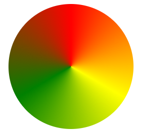
Los degradados cónicos son similares a los degradados radiales, excepto que las paradas de color están en el borde exterior del círculo que se crea.
Ejemplo:
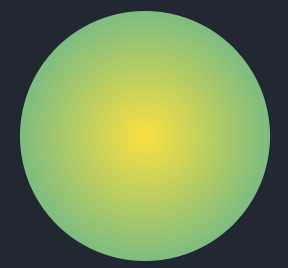
GRADIENTE RADIAL:
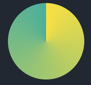
GRADIENTE CONICO:
El siguiente ejemplo ilustra la función conic-gradient() en CSS:
Programa 1:
<!DOCTYPE html>
<html>
<head>
<title>conic gradient</title>
<style>
.box
{
background-color: yellow;
height: 200px;
width: 200px;
float: left;
margin: 20px;
border-radius: 50%;
}
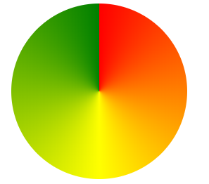
.a
{
background-image:
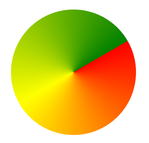
conic-gradient(red, yellow, green);
}
</style>
</head>
<body>
<div class="box a"></div>
</body>
</html>
Producción:
Programa 2:
<!DOCTYPE html>
<html>
<head>
    <title>conic gradient</title>
    <style>
    .box
    {
        background-color: yellow;
        height: 200px;
        width: 200px;
        float: left;
        margin: 20px;
        border-radius: 50%;
    }
    .b
    {
        background-image: conic-gradient(
              from 60deg, red, yellow, green);
    }
    </style>
</head>
<body>
    <div class="box b"></div>
</body>
</html>
Producción:
Programa 3:
<!DOCTYPE html>
<html>
<head>
    <title>conic gradient</title>
    <style>
    .box
    {
        background-color: yellow;
        height: 200px;
        width: 200px;
        float: left;
        margin: 20px;
        border-radius: 50%;
    }
    .c
    {
        background-image:
            conic-gradient(red, yellow, green, red);
    }
    </style>
</head>
<body>
    <div class="box c"></div>
</body>
</html
Producción:
Programa 4:
<!DOCTYPE html>
<html>
<head>
<title>conic gradient</title>
<style>
.box
{
background-color: yellow;
height: 200px;
width: 200px;
float: left;
margin: 20px;
border-radius: 50%;
}
.d
{
background-image:
repeating-conic-gradient(
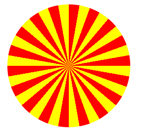
red 0deg, red 10deg, yellow 10deg, yellow 20deg);
}
</style>
</head>
<body>
<div class="box d"></div>
</body>
</html>
Producción:
Programa 5:
<!DOCTYPE html>
<html>
<head>
<title>conic gradient</title>
<style>
.box
{
background-color: yellow;
height: 200px;
width: 200px;
float: left;
margin: 20px;
border-radius: 50%;
}
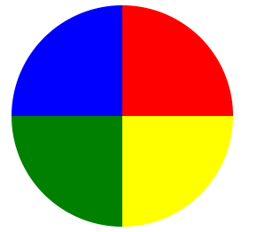
.e
{
background-image:
conic-gradient(
red 0deg, red 90deg,
yellow 90deg, yellow 180deg,
green 180deg, green 270deg,
blue 270deg, blue 360deg);
}
</style>
</head>
<body>
<div class="box e"></div>
</body>
</html>
Producción: