Bootstrap nos proporciona una serie de clases que se pueden usar para aplicar varios estilos a las tablas, como cambiar la apariencia del encabezado, hacer que las filas se rayen, agregar o eliminar bordes y hacer que las filas se puedan desplazar. Bootstrap también proporciona clases para hacer que las tablas respondan.
Tabla sin bordes: para hacer que la tabla no tenga bordes, use la clase table-borderless junto con la clase de tabla class dentro de la etiqueta <table> . También podemos hacer que la tabla oscura no tenga bordes usando la combinación de clases table , table-dark y table-borderless dentro de la etiqueta <table> . Consulte el siguiente ejemplo para obtener una ilustración.
Ejemplo:
HTML
<!DOCTYPE html>
<html lang="en">
<head>
    <!-- Required meta tags -->
    <meta charset="utf-8">
    <meta name="viewport" content="width=device-width,
            initial-scale=1, shrink-to-fit=no">
    <!-- Bootstrap CSS -->
    <link rel="stylesheet" href=
"https://stackpath.bootstrapcdn.com/bootstrap/4.2.1/css/bootstrap.min.css"
        integrity=
"sha384-GJzZqFGwb1QTTN6wy59ffF1BuGJpLSa9DkKMp0DgiMDm4iYMj70gZWKYbI706tWS"
        crossorigin="anonymous">
    <title>Bootstrap | Tables</title>
    <style>
        h1 {
            color: green;
            text-align: center;
        }
        div {
            margin-top: 10px;
        }
    </style>
</head>
<body>
    <div class="container">
        <h1>GeeksForGeeks</h1>
        <!-- table, table-borderless -->
        <table class="table table-borderless">
            <thead>
                <tr>
                    <th scope="col">S. No.</td>
                    <th scope="col">Name</td>
                    <th scope="col">City</td>
                    <th scope="col">Age</td>
                </tr>
            </thead>
            <tbody>
                <tr>
                    <th scope="row">1</td>
                    <td>Ajay</td>
                    <td>Patna</td>
                    <td>20</td>
                </tr>
                <tr>
                    <th scope="row">2</td>
                    <td>Rahul</td>
                    <td>Chandigarh</td>
                    <td>17</td>
                </tr>
                <tr>
                    <th scope="row">3</td>
                    <td>Parush</td>
                    <td>Kolkata</td>
                    <td>22</td>
                </tr>
            </tbody>
        </table>
        <!-- table, table-borderless, table-dark -->
        <table class="table table-borderless table-dark">
            <thead>
                <tr>
                    <th scope="col">S. No.</td>
                    <th scope="col">Name</td>
                    <th scope="col">City</td>
                    <th scope="col">Age</td>
                </tr>
            </thead>
            <tbody>
                <tr>
                    <th scope="row">1</td>
                    <td>Ajay</td>
                    <td>Patna</td>
                    <td>20</td>
                </tr>
                <tr>
                    <th scope="row">2</td>
                    <td>Rahul</td>
                    <td>Chandigarh</td>
                    <td>17</td>
                </tr>
                <tr>
                    <th scope="row">3</td>
                    <td>Parush</td>
                    <td>Kolkata</td>
                    <td>22</td>
                </tr>
            </tbody>
        </table>
    </div>
</body>
</html>
Producción:
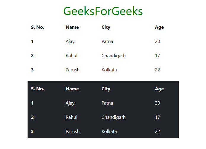
Tabla que se puede desplazar: para hacer que las filas de la tabla se puedan desplazar, use el desplazamiento de la tabla de clase junto con la tabla de clase dentro de la etiqueta <table> . También podemos hacer que las filas de las tablas oscuras se puedan desplazar usando la combinación de clases table , table-hover y table-dark dentro de la etiqueta <table> . Consulte el siguiente ejemplo para obtener una ilustración.
Ejemplo:
HTML
<!DOCTYPE html>
<html lang="en">
<head>
    <!-- Required meta tags -->
    <meta charset="utf-8">
    <meta name="viewport" content="width=device-width,
            initial-scale=1, shrink-to-fit=no">
    <!-- Bootstrap CSS -->
    <link rel="stylesheet" href=
"https://stackpath.bootstrapcdn.com/bootstrap/4.2.1/css/bootstrap.min.css"
        integrity=
"sha384-GJzZqFGwb1QTTN6wy59ffF1BuGJpLSa9DkKMp0DgiMDm4iYMj70gZWKYbI706tWS"
        crossorigin="anonymous">
    <title>Bootstrap | Tables</title>
    <style>
        h1 {
            color: green;
            text-align: center;
        }
        div {
            margin-top: 10px;
        }
    </style>
</head>
<body>
    <div class="container">
        <h1>GeeksForGeeks</h1>
        <!-- table, table-hover -->
        <table class="table table-hover">
            <thead>
                <tr>
                    <th scope="col">S. No.</td>
                    <th scope="col">Name</td>
                    <th scope="col">City</td>
                    <th scope="col">Age</td>
                </tr>
            </thead>
            <tbody>
                <tr>
                    <th scope="row">1</td>
                    <td>Ajay</td>
                    <td>Patna</td>
                    <td>20</td>
                </tr>
                <tr>
                    <th scope="row">2</td>
                    <td>Rahul</td>
                    <td>Chandigarh</td>
                    <td>17</td>
                </tr>
                <tr>
                    <th scope="row">3</td>
                    <td>Parush</td>
                    <td>Kolkata</td>
                    <td>22</td>
                </tr>
            </tbody>
        </table>
        <!-- table, table-hover, table-dark -->
        <table class="table table-hover table-dark">
            <thead>
                <tr>
                    <th scope="col">S. No.</td>
                    <th scope="col">Name</td>
                    <th scope="col">City</td>
                    <th scope="col">Age</td>
                </tr>
            </thead>
            <tbody>
                <tr>
                    <th scope="row">1</td>
                    <td>Ajay</td>
                    <td>Patna</td>
                    <td>20</td>
                </tr>
                <tr>
                    <th scope="row">2</td>
                    <td>Rahul</td>
                    <td>Chandigarh</td>
                    <td>17</td>
                </tr>
                <tr>
                    <th scope="row">3</td>
                    <td>Parush</td>
                    <td>Kolkata</td>
                    <td>22</td>
                </tr>
            </tbody>
        </table>
    </div>
</body>
</html>
Producción:

Tabla pequeña: para reducir el tamaño de la tabla, use la clase table-sm junto con la tabla de clase dentro de la etiqueta <table> . Esto reduce el relleno de la celda a la mitad. Para reducir el tamaño de la tabla oscura, use la combinación de clases table , table-sm y table-dark dentro de la etiqueta <table> . Consulte el siguiente ejemplo para obtener una ilustración.
Ejemplo:
HTML
<!DOCTYPE html>
<html lang="en">
<head>
    <!-- Required meta tags -->
    <meta charset="utf-8">
    <meta name="viewport" content="width=device-width,
            initial-scale=1, shrink-to-fit=no">
    <!-- Bootstrap CSS -->
    <link rel="stylesheet" href=
"https://stackpath.bootstrapcdn.com/bootstrap/4.2.1/css/bootstrap.min.css"
        integrity=
"sha384-GJzZqFGwb1QTTN6wy59ffF1BuGJpLSa9DkKMp0DgiMDm4iYMj70gZWKYbI706tWS"
        crossorigin="anonymous">
    <title>Bootstrap | Tables</title>
    <style>
        h1 {
            color: green;
            text-align: center;
        }
        div {
            margin-top: 10px;
        }
    </style>
</head>
<body>
    <div class="container">
        <h1>GeeksForGeeks</h1>
        <!-- table, table-sm -->
        <table class="table table-sm">
            <thead>
                <tr>
                    <th scope="col">S. No.</td>
                    <th scope="col">Name</td>
                    <th scope="col">City</td>
                    <th scope="col">Age</td>
                </tr>
            </thead>
            <tbody>
                <tr>
                    <th scope="row">1</td>
                    <td>Ajay</td>
                    <td>Patna</td>
                    <td>20</td>
                </tr>
                <tr>
                    <th scope="row">2</td>
                    <td>Rahul</td>
                    <td>Chandigarh</td>
                    <td>17</td>
                </tr>
                <tr>
                    <th scope="row">3</td>
                    <td>Parush</td>
                    <td>Kolkata</td>
                    <td>22</td>
                </tr>
            </tbody>
        </table>
        <!-- table, table-sm, table-dark -->
        <table class="table table-sm table-dark">
            <thead>
                <tr>
                    <th scope="col">S. No.</td>
                    <th scope="col">Name</td>
                    <th scope="col">City</td>
                    <th scope="col">Age</td>
                </tr>
            </thead>
            <tbody>
                <tr>
                    <th scope="row">1</td>
                    <td>Ajay</td>
                    <td>Patna</td>
                    <td>20</td>
                </tr>
                <tr>
                    <th scope="row">2</td>
                    <td>Rahul</td>
                    <td>Chandigarh</td>
                    <td>17</td>
                </tr>
                <tr>
                    <th scope="row">3</td>
                    <td>Parush</td>
                    <td>Kolkata</td>
                    <td>22</td>
                </tr>
            </tbody>
        </table>
    </div>
</body>
</html>
Producción:

Tabla coloreada: Bootstrap nos proporciona una serie de clases contextuales que se pueden usar para colorear toda la fila o una sola celda de la tabla. Estas clases se deben utilizar con mesa clara y no con mesa oscura para una mejor apariencia. Para colorear tablas oscuras, podemos usar las clases de color de fondo de Bootstrap. Las clases contextuales se dan a continuación. Vea el ejemplo para la ilustración.
| tabla-primaria | secundaria de mesa | mesa-éxito |
| peligro de mesa | advertencia de mesa | información de la tabla |
| luz de mesa | mesa oscura | tabla-activa |
HTML
<!DOCTYPE html>
<html lang="en">
<head>
    <!-- Required meta tags -->
    <meta charset="utf-8">
    <meta name="viewport" content="width=device-width,
            initial-scale=1, shrink-to-fit=no">
    <!-- Bootstrap CSS -->
    <link rel="stylesheet" href=
"https://stackpath.bootstrapcdn.com/bootstrap/4.2.1/css/bootstrap.min.css"
        integrity=
"sha384-GJzZqFGwb1QTTN6wy59ffF1BuGJpLSa9DkKMp0DgiMDm4iYMj70gZWKYbI706tWS"
        crossorigin="anonymous">
    <title>Bootstrap | Tables</title>
    <style>
        h1 {
            color: green;
            text-align: center;
        }
        div {
            margin-top: 10px;
        }
    </style>
</head>
<body>
    <div class="container">
        <h1>GeeksForGeeks</h1>
        <!-- table, table-primary, table-warning, table-danger -->
        <table class="table">
            <thead>
                <tr>
                    <th scope="col">S. No.</td>
                    <th scope="col">Name</td>
                    <th scope="col">City</td>
                    <th scope="col">Age</td>
                </tr>
            </thead>
            <tbody>
                <tr class="table-primary">
                    <th scope="row">1</td>
                    <td>Ajay</td>
                    <td>Patna</td>
                    <td>20</td>
                </tr>
                <tr class="table-warning">
                    <th scope="row">2</td>
                    <td>Rahul</td>
                    <td>Chandigarh</td>
                    <td>17</td>
                </tr>
                <tr class="table-danger">
                    <th scope="row">3</td>
                    <td>Parush</td>
                    <td>Kolkata</td>
                    <td>22</td>
                </tr>
            </tbody>
        </table>
        <!-- table, bg-danger, bg-primary, table-dark -->
        <table class="table table-dark">
            <thead>
                <tr>
                    <th scope="col">S. No.</td>
                    <th scope="col">Name</td>
                    <th scope="col">City</td>
                    <th scope="col">Age</td>
                </tr>
            </thead>
            <tbody>
                <tr class="bg-danger">
                    <th scope="row">1</td>
                    <td>Ajay</td>
                    <td>Patna</td>
                    <td>20</td>
                </tr>
                <tr>
                    <th scope="row">2</td>
                    <td>Rahul</td>
                    <td>Chandigarh</td>
                    <td>17</td>
                </tr>
                <tr class="bg-primary">
                    <th scope="row">3</td>
                    <td>Parush</td>
                    <td>Kolkata</td>
                    <td>22</td>
                </tr>
            </tbody>
        </table>
    </div>
</body>
</html>
Producción:

Tablas receptivas: para hacer que la tabla responda en todos los tamaños de ventana gráfica, envuelva la tabla dentro de una etiqueta <div> de apertura y cierre , que tenga la clase table-responsive dentro de la etiqueta <div> de apertura . De manera similar, para hacer que la tabla responda según el tamaño de la ventana gráfica, usamos la clase table-responsive{-sm|-md|-lg|-xl} , de acuerdo con el tamaño de la ventana gráfica según el cual queremos que nuestra tabla responda.
En las tablas receptivas, aparecerá una barra de desplazamiento horizontal si la tabla no cabe dentro de la ventana gráfica del tamaño actual.
En el caso de una tabla receptiva específica de la ventana gráfica, la tabla se volverá receptiva si el tamaño de la ventana gráfica es menor que la ventana gráfica especificada por la clase table-responsive{-sm|-md|-lg|-xl} . Vea los ejemplos a continuación para la ilustración.
Ejemplo 1: tabla sensible
HTML
<!DOCTYPE html>
<html lang="en">
<head>
    <!-- Required meta tags -->
    <meta charset="utf-8">
    <meta name="viewport" content="width=device-width,
            initial-scale=1, shrink-to-fit=no">
    <!-- Bootstrap CSS -->
    <link rel="stylesheet" href=
"https://stackpath.bootstrapcdn.com/bootstrap/4.2.1/css/bootstrap.min.css"
        integrity=
"sha384-GJzZqFGwb1QTTN6wy59ffF1BuGJpLSa9DkKMp0DgiMDm4iYMj70gZWKYbI706tWS"
        crossorigin="anonymous">
    <title>Bootstrap | Tables</title>
    <style>
        h1 {
            color: green;
            text-align: center;
        }
        div {
            margin-top: 10px;
        }
    </style>
</head>
<body>
    <div class="container">
        <h1>GeeksForGeeks</h1>
        <!-- table-responsive -->
        <div class="table-responsive">
            <!-- table -->
            <table class="table">
                <thead>
                    <tr>
                        <th scope="col">Head</td>
                        <th scope="col">Head</td>
                        <th scope="col">Head</td>
                        <th scope="col">Head</td>
                        <th scope="col">Head</td>
                        <th scope="col">Head</td>
                        <th scope="col">Head</td>
                        <th scope="col">Head</td>
                        <th scope="col">Head</td>
                        <th scope="col">Head</td>
                        <th scope="col">Head</td>
                        <th scope="col">Head</td>
                    </tr>
                </thead>
                <tbody>
                    <tr>
                        <td>Data</td>
                        <td>Data</td>
                        <td>Data</td>
                        <td>Data</td>
                        <td>Data</td>
                        <td>Data</td>
                        <td>Data</td>
                        <td>Data</td>
                        <td>Data</td>
                        <td>Data</td>
                        <td>Data</td>
                        <td>Data</td>
                    </tr>
                </tbody>
            </table>
        </div>
    </div>
</body>
</html>
Producción:

Ejemplo 2: tabla-responsive-md
HTML
<!DOCTYPE html>
<html lang="en">
<head>
    <!-- Required meta tags -->
    <meta charset="utf-8">
    <meta name="viewport" content="width=device-width,
            initial-scale=1, shrink-to-fit=no">
    <!-- Bootstrap CSS -->
    <link rel="stylesheet" href=
"https://stackpath.bootstrapcdn.com/bootstrap/4.2.1/css/bootstrap.min.css"
        integrity=
"sha384-GJzZqFGwb1QTTN6wy59ffF1BuGJpLSa9DkKMp0DgiMDm4iYMj70gZWKYbI706tWS"
        crossorigin="anonymous">
    <title>Bootstrap | Tables</title>
    <style>
        h1 {
            color: green;
            text-align: center;
        }
        div {
            margin-top: 10px;
        }
    </style>
</head>
<body>
    <div class="container">
        <h1>GeeksForGeeks</h1>
        <!-- table-responsive-md -->
        <div class="table-responsive-md">
            <!-- table -->
            <table class="table">
                <thead>
                    <tr>
                        <th scope="col">Head</td>
                        <th scope="col">Head</td>
                        <th scope="col">Head</td>
                        <th scope="col">Head</td>
                        <th scope="col">Head</td>
                        <th scope="col">Head</td>
                        <th scope="col">Head</td>
                        <th scope="col">Head</td>
                        <th scope="col">Head</td>
                        <th scope="col">Head</td>
                        <th scope="col">Head</td>
                        <th scope="col">Head</td>
                    </tr>
                </thead>
                <tbody>
                    <tr>
                        <td>Data</td>
                        <td>Data</td>
                        <td>Data</td>
                        <td>Data</td>
                        <td>Data</td>
                        <td>Data</td>
                        <td>Data</td>
                        <td>Data</td>
                        <td>Data</td>
                        <td>Data</td>
                        <td>Data</td>
                        <td>Data</td>
                    </tr>
                    <tr>
                        <td>Data</td>
                        <td>Data</td>
                        <td>Data</td>
                        <td>Data</td>
                        <td>Data</td>
                        <td>Data</td>
                        <td>Data</td>
                        <td>Data</td>
                        <td>Data</td>
                        <td>Data</td>
                        <td>Data</td>
                        <td>Data</td>
                    </tr>
                    <tr>
                        <td>Data</td>
                        <td>Data</td>
                        <td>Data</td>
                        <td>Data</td>
                        <td>Data</td>
                        <td>Data</td>
                        <td>Data</td>
                        <td>Data</td>
                        <td>Data</td>
                        <td>Data</td>
                        <td>Data</td>
                        <td>Data</td>
                    </tr>
                </tbody>
            </table>
        </div>
    </div>
</body>
</html>
Producción:

Navegador compatible:
- Google Chrome
- explorador de Internet
- Firefox
- Ópera
- Safari