Los gráficos de barras divergentes se utilizan para facilitar la comparación de varios grupos. Su diseño nos permite comparar valores numéricos en varios grupos. También nos ayuda a visualizar rápidamente las respuestas favorables y desfavorables o positivas y negativas. El gráfico de barras consistía en una combinación de dos barras horizontales que comenzaban desde el medio: una barra se extiende de derecha a izquierda y la otra se extiende de izquierda a derecha. La longitud de la barra corresponde al valor numérico que representa.
Comúnmente las dos barras divergentes se representan con colores diferentes. Los valores a la izquierda son generalmente, pero no necesariamente, respuestas negativas o insatisfactorias.
Python no tiene una función particular para trazar gráficos de barras divergentes. La forma alternativa es usar la función hlines para dibujar líneas horizontales con un cierto valor de ancho de línea para representarlas como barras horizontales.
Conjuntos de datos en uso:
Método 1: Usando Matplotlib
Acercarse :
- Módulo de importación
- Importar o crear datos
- Preprocesar el conjunto de datos y eliminar el ruido innecesario
- Especifique los colores para representar las barras horizontales
- Ordenar los valores en orden ascendente
- Establezca las etiquetas para el eje x y el eje y, así como el título del gráfico
- Mostrar el gráfico de barras divergentes
Ejemplo 1:
Python
import pandas as pd
import matplotlib.pyplot as plt
import string as str
# Creating a DataFrame from the CSV Dataset
df = pd.read_csv("car_sales.csv", sep=';')
# Separating the Date and Mercedes-Benz Cars unit sales (USA)
df['car_sales_z'] = df.loc[:, ['Mercedes-Benz Cars unit sales (USA)']]
df['car_sales_z'] = df['car_sales_z'] .str.replace(
',', '').astype(float)
# Removing null value
df.drop(df.tail(1).index, inplace=True)
for i in range(35):
# Colour of bar chart is set to red if the sales
# is < 60000 and green otherwise
df['colors'] = ['red' if float(
x) < 60000 else 'green' for x in df['car_sales_z']]
# Sort values from lowest to highest
df.sort_values('car_sales_z', inplace=True)
# Resets initial index in Dataframe to None
df.reset_index(inplace=True)
# Draw plot
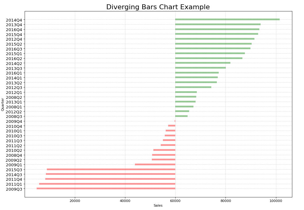
plt.figure(figsize=(14, 10), dpi=80)
# Plotting the horizontal lines
plt.hlines(y=df.index, xmin=60000, xmax=df.car_sales_z,
color=df.colors, alpha=0.4, linewidth=5)
# Decorations
# Setting the labels of x-axis and y-axis
plt.gca().set(ylabel='Quarter', xlabel='Sales')
# Setting Date to y-axis
plt.yticks(df.index, df.Date, fontsize=12)
# Title of Bar Chart
plt.title('Diverging Bars Chart Example', fontdict={
'size': 20})
# Optional grid layout
plt.grid(linestyle='--', alpha=0.5)
# Displaying the Diverging Bar Chart
plt.show()
Producción:
Método 2: Usar Plotly
Acercarse:
- Importar bibliotecas requeridas
- Crear o importar datos
- Preprocesar el conjunto de datos y eliminar el ruido innecesario
- Trace el gráfico usando plotly.graph_objects
- Establezca las etiquetas para el eje x y el eje y, así como la leyenda
- Mostrar el gráfico de barras divergentes
Ejemplo:
Python
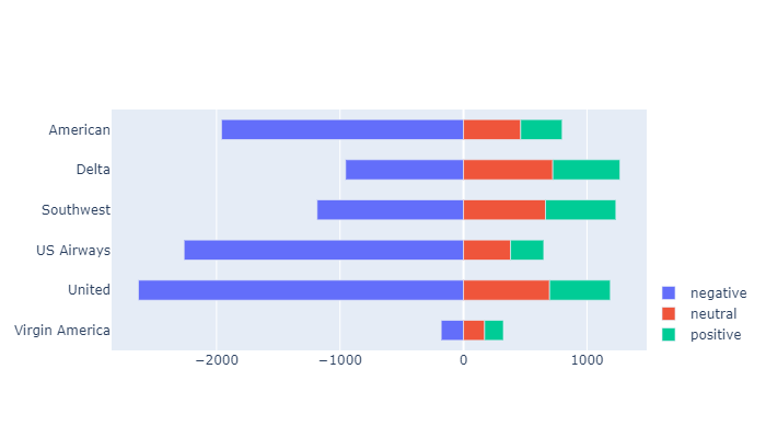
import pandas as pd
import plotly.graph_objects as go


df = pd.read_csv("Tweets.csv")
df.head()

# Preprocessing the dataset to extract only
# the necessary columns
categories = [
    'negative',
    'neutral',
    'positive'
]

# Construct a pivot table with the column
# 'airline' as the index and the sentiments
# as the columns
gfg = pd.pivot_table(
    df,
    index='airline',
    columns='airline_sentiment',
    values='tweet_id',
    aggfunc='count'
)

# Include the sentiments - negative, neutral
# and positive
gfg = gfg[categories]

# Representing negative sentiment with negative
# numbers
gfg.negative = gfg.negative * -1

df = gfg

# Creating a Figure
Diverging = go.Figure()

# Iterating over the columns
for col in df.columns[4:]:

    # Adding a trace and specifying the parameters
    # for negative sentiment
    Diverging.add_trace(go.Bar(x=-df[col].values,
                               y=df.index,
                               orientation='h',
                               name=col,
                               customdata=df[col],
                               hovertemplate="%{y}: %{customdata}"))
for col in df.columns:

    # Adding a trace and specifying the parameters
    # for positive and neutral sentiment
    Diverging.add_trace(go.Bar(x=df[col],
                               y=df.index,
                               orientation='h',
                               name=col,
                               hovertemplate="%{y}: %{x}"))

# Specifying the layout of the plot
Diverging.update_layout(barmode='relative',
                        height=400,
                        width=700,
                        yaxis_autorange='reversed',
                        bargap=0.5,
                        legend_orientation='v',
                        legend_x=1, legend_y=0
                        )
Diverging
Producción:
Publicación traducida automáticamente
Artículo escrito por deepthimgs y traducido por Barcelona Geeks. The original can be accessed here. Licence: CCBY-SA