Requisito previo: crear y escribir en una hoja de Excel
XlsxWriteres una biblioteca de Python con la que se pueden realizar múltiples operaciones en archivos de Excel, como crear, escribir, operaciones aritméticas y trazar gráficos. Veamos cómo trazar diferentes variedades de gráficos de anillos utilizando datos en tiempo real.
Los gráficos se componen de al menos una serie de uno o más puntos de datos. Las series en sí mismas se componen de referencias a rangos de celdas. Para trazar los gráficos en una hoja de Excel, en primer lugar, cree un objeto de gráfico de un tipo de gráfico específico (es decir, gráfico de anillos, etc.). Después de crear objetos de gráfico, inserte datos en él y, por último, agregue ese objeto de gráfico en el objeto de hoja.
Código n.º 1: Trace el gráfico de anillos simple.
Para trazar el gráfico circular simple en una hoja de Excel, use el add_chart() método con el argumento de palabra clave tipo ‘donut’ de un objeto de libro de trabajo.
# import xlsxwriter module
import xlsxwriter

# Workbook() takes one, non-optional, argument
# which is the filename that we want to create.
workbook = xlsxwriter.Workbook('chart_doughnut1.xlsx')

# The workbook object is then used to add new
# worksheet via the add_worksheet() method.
worksheet = workbook.add_worksheet()


# Create a new Format object to formats cells
# in worksheets using add_format() method .

# here we create bold format object .
bold = workbook.add_format({'bold': 1})

# Add the worksheet data that the charts will refer to.
headings = ['Category', 'Values']
data = [
    ['Glazed', 'Chocolate', 'Cream'],
    [50, 35, 15],
]


# Write a row of data starting from 'A1'
# with bold format .
worksheet.write_row('A1', headings, bold)

# Write a column of data starting from
# 'A2', 'B2' respectively .
worksheet.write_column('A2', data[0])
worksheet.write_column('B2', data[1])

# Create a chart object that can be added
# to a worksheet using add_chart() method.

# here we create a doughnut chart object .
chart1 = workbook.add_chart({'type': 'doughnut'})

# Add a data series to a chart
# using add_series method.

# Configure the first series.
# syntax to define ranges
# [sheetname, first_row, first_col, last_row, last_col].
chart1.add_series({
    'name':       'Doughnut sales data',
    'categories': ['Sheet1', 1, 0, 3, 0],
    'values':     ['Sheet1', 1, 1, 3, 1],
})

# Add a chart title
chart1.set_title({'name': 'Popular Doughnut Types'})

# Set an Excel chart style. Colors
# with white outline and shadow.
chart1.set_style(10)

# add chart to the worksheet with an offset,
# at the top-left corner of a chart
# is anchored to cell C2 .
worksheet.insert_chart('C2', chart1, {'x_offset': 25, 'y_offset': 10})

# Finally, close the Excel file
# via the close() method.
workbook.close()
Salida: 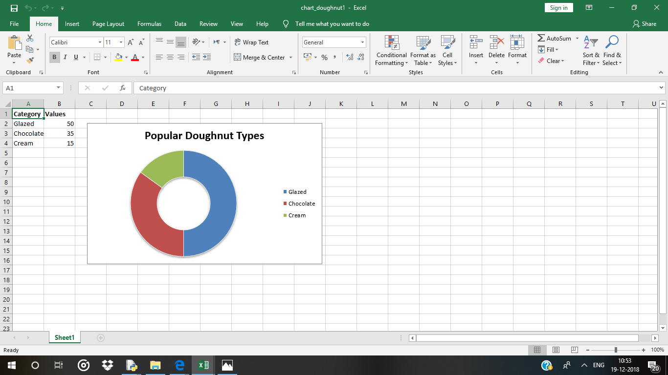
Código n.º 2: Trazar un gráfico de anillos con colores de segmento definidos por el usuario.
Para trazar el gráfico circular con colores de segmento definidos por el usuario en una hoja de Excel, use el add_series()método con argumento de palabra clave de puntos de un objeto de gráfico.
# import xlsxwriter module
import xlsxwriter

# Workbook() takes one, non-optional, argument
# which is the filename that we want to create.
workbook = xlsxwriter.Workbook('chart_doughnut2.xlsx')

# The workbook object is then used to add new
# worksheet via the add_worksheet() method.
worksheet = workbook.add_worksheet()


# Create a new Format object to formats cells
# in worksheets using add_format() method .

# here we create bold format object .
bold = workbook.add_format({'bold': 1})

# Add the worksheet data that the charts will refer to.
headings = ['Category', 'Values']
data = [
    ['Glazed', 'Chocolate', 'Cream'],
    [50, 35, 15],
]


# Write a row of data starting from 'A1'
# with bold format .
worksheet.write_row('A1', headings, bold)

# Write a column of data starting from
# 'A2', 'B2' respectively .
worksheet.write_column('A2', data[0])
worksheet.write_column('B2', data[1])

# Create a chart object that can be added
# to a worksheet using add_chart() method.

# here we create a doughnut chart object .
chart2 = workbook.add_chart({'type': 'doughnut'})

# Note use of alternative syntax to define ranges.
# = Sheet1 !$A$1 is equivalent to ['Sheet1', 0, 0].
# Configure the series and add user defined segment colors.
chart2.add_series({
    'name': 'Doughnut sales data',
    'categories': '= Sheet1 !$A$2:$A$4',
    'values':     '= Sheet1 !$B$2:$B$4',
    'points': [
        {'fill': {'color': '# FA58D0'}},
        {'fill': {'color': '# 61210B'}},
        {'fill': {'color': '# F5F6CE'}},
    ],
})

# Add a chart title
chart2.set_title({'name': 'Doughnut Chart with user defined colors'})

# add chart to the worksheet with an offset,
# at the top-left corner of a chart
# is anchored to cell C2 .
worksheet.insert_chart('C2', chart2, {'x_offset': 25, 'y_offset': 10})

# Finally, close the Excel file
# via the close() method.
workbook.close()
Salida: 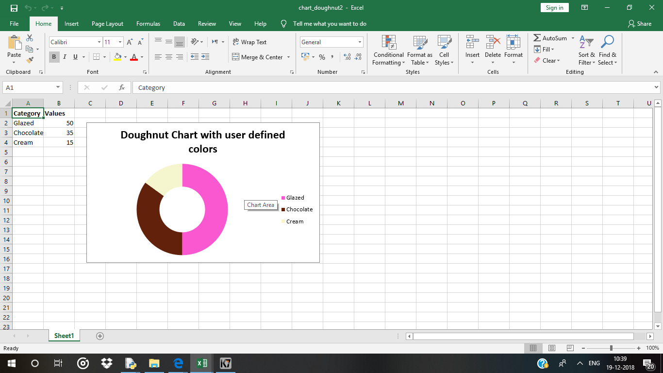
Código n.º 3: Trace un gráfico de anillos con rotación de los segmentos.
Para trazar un gráfico circular con rotación de los segmentos en una hoja de Excel, use el set_rotation()método con un argumento de ángulo definido del objeto del gráfico.
# import xlsxwriter module
import xlsxwriter

# Workbook() takes one, non-optional, argument
# which is the filename that we want to create.
workbook = xlsxwriter.Workbook('chart_doughnut3.xlsx')

# The workbook object is then used to add new
# worksheet via the add_worksheet() method.
worksheet = workbook.add_worksheet()

# Create a new Format object to formats cells
# in worksheets using add_format() method .

# here we create bold format object .
bold = workbook.add_format({'bold': 1})

# Add the worksheet data that the charts will refer to.
headings = ['Category', 'Values']
data = [
    ['Glazed', 'Chocolate', 'Cream'],
    [50, 35, 15],
]

# Write a row of data starting from 'A1'
# with bold format .
worksheet.write_row('A1', headings, bold)

# Write a column of data starting from
# 'A2', 'B2' respectively .
worksheet.write_column('A2', data[0])
worksheet.write_column('B2', data[1])

# Create a chart object that can be added
# to a worksheet using add_chart() method.

# here we create a doughnut chart object .
chart3 = workbook.add_chart({'type': 'doughnut'})

# Configure the series.
chart3.add_series({
    'name': 'Doughnut sales data',
    'categories': '= Sheet1 !$A$2:$A$4',
    'values':     '= Sheet1 !$B$2:$B$4',
})

# Add a chart title.
chart3.set_title({'name': 'Doughnut Chart with segment rotation'})

# Change the angle / rotation of the first segment.
chart3.set_rotation(90)

# add chart to the worksheet with an offset,
# at the top-left corner of a chart
# is anchored to cell C2 .
worksheet.insert_chart('C2', chart3, {'x_offset': 25, 'y_offset': 10})

# Finally, close the Excel file
# via the close() method.
workbook.close()
Salida: 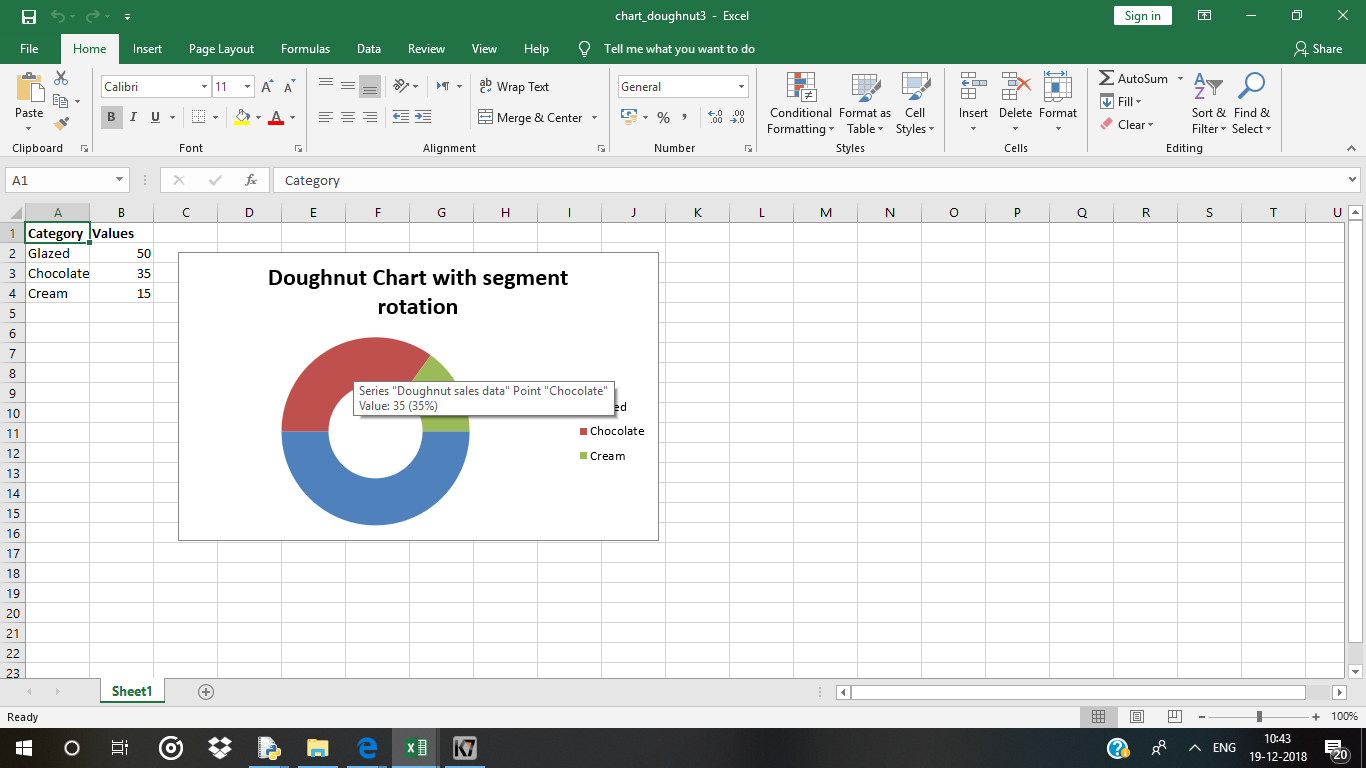
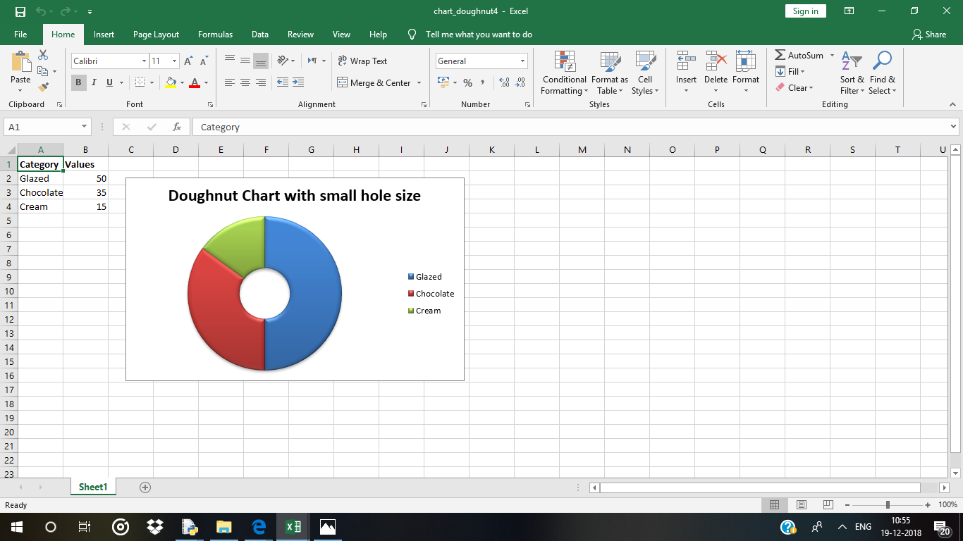
Código n.º 4: Trace un gráfico de anillos con un tamaño de agujero definido por el usuario.
Para trazar un gráfico circular con un tamaño de orificio definido por el usuario en una hoja de Excel, use el set_hole_size()método con el argumento de valor definido (radio) del objeto del gráfico.
# import xlsxwriter module
import xlsxwriter

# Workbook() takes one, non-optional, argument
# which is the filename that we want to create.
workbook = xlsxwriter.Workbook('chart_doughnut4.xlsx')

# The workbook object is then used to add new
# worksheet via the add_worksheet() method.
worksheet = workbook.add_worksheet()


# Create a new Format object to formats cells
# in worksheets using add_format() method .

# here we create bold format object .
bold = workbook.add_format({'bold': 1})

# Add the worksheet data that the charts will refer to.
headings = ['Category', 'Values']
data = [
    ['Glazed', 'Chocolate', 'Cream'],
    [50, 35, 15],
]


# Write a row of data starting from 'A1'
# with bold format .
worksheet.write_row('A1', headings, bold)

# Write a column of data starting from
# 'A2', 'B2' respectively .
worksheet.write_column('A2', data[0])
worksheet.write_column('B2', data[1])

# Create a chart object that can be added
# to a worksheet using add_chart() method.

# here we create a doughnut chart object .
chart4 = workbook.add_chart({'type': 'doughnut'})

# Configure the series.
chart4.add_series({
    'name': 'Doughnut sales data',
    'categories': '= Sheet1 !$A$2:$A$4',
    'values':     '= Sheet1 !$B$2:$B$4',
})

# Set a 3D style.
chart4.set_style(26)

# Add a title.
chart4.set_title({'name': 'Doughnut Chart with small hole size'})

# Change the hole size.
chart4.set_hole_size(33)

# Insert the chart into the worksheet (with an offset).
worksheet.insert_chart('C2', chart4, {'x_offset': 25, 'y_offset': 10})

# Finally, close the Excel file
# via the close() method.
workbook.close()
Producción :