Requisito previo: trazado de gráficos en una hoja de Excel usando el conjunto de módulos openpyxl – 1 | Conjunto: 2
Openpyxl es una biblioteca de Python con la que se pueden realizar múltiples operaciones en archivos de Excel, como lectura, escritura, operaciones aritméticas y trazado de gráficos.
Los gráficos se componen de al menos una serie de uno o más puntos de datos. Las series en sí mismas se componen de referencias a rangos de celdas. Veamos cómo trazar Doughnot, Radar, Surface, 3D Surface Chart en una hoja de Excel usando openpyxl.
Para trazar los gráficos en una hoja de Excel, en primer lugar, cree un objeto de gráfico de una clase de gráfico específica (es decir, SurfaceChart, RadarChart, etc.). Después de crear objetos de gráfico, inserte datos en él y, por último, agregue ese objeto de gráfico en el objeto de hoja. Veamos cómo trazar diferentes gráficos utilizando datos en tiempo real.
Código n.º 1: Trace el gráfico
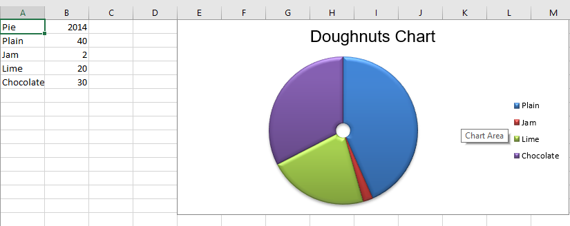
de anillos Los gráficos de anillos son similares a los gráficos circulares, excepto que utilizan un anillo en lugar de un círculo. También pueden trazar varias series de datos como anillos concéntricos. Para trazar el gráfico Donut en una hoja de Excel, use la clase DoughnutChart del submódulo openpyxl.chart.
Python3
# import Workbook from openpyxl
from openpyxl import Workbook

# import DoughnutChart, Reference from openpyxl.chart sub_module .
from openpyxl.chart import DoughnutChart, Reference

# import DataPoint from openpyxl.chart.series class
from openpyxl.chart.series import DataPoint

# Call a Workbook() function of openpyxl
# to create a new blank Workbook object
wb = Workbook()

# Get workbook active sheet
# from the active attribute.
ws = wb.active

# data given
data = [
    ['Pie', 2014],
    ['Plain', 40],
    ['Jam', 2],
    ['Lime', 20],
    ['Chocolate', 30],
]

# write content of each row in 1st and 2nd
# column of the active sheet respectively .
for row in data:
    ws.append(row)

# Create object of DoughnutChart class
chart = DoughnutChart()

# create data for plotting
labels = Reference(ws, min_col = 1, min_row = 2, max_row = 5)
data = Reference(ws, min_col = 2, min_row = 1, max_row = 5)

# adding data to the Doughnut chart object
chart.add_data(data, titles_from_data = True)

# set labels in the chart object
chart.set_categories(labels)

# set the title of the chart
chart.title = "Doughnuts Chart"

# set style of the chart
chart.style = 26

# add chart to the sheet
# the top-left corner of a chart
# is anchored to cell E1 .
ws.add_chart(chart, "E1")

# save the file
wb.save("doughnut.xlsx")
Producción:
Código n.° 2: Trazar el gráfico de radar
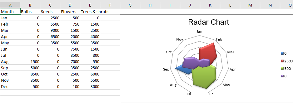
Los datos que se organizan en columnas o filas en una hoja de trabajo se pueden trazar en un gráfico de radar. Los gráficos de radar comparan los valores agregados de varias series de datos. Es efectivamente una proyección de un gráfico de área en un eje x circular. Para trazar el gráfico de radar en una hoja de Excel, use la clase RadarChart del submódulo openpyxl.chart.
Python3
# import Workbook from openpyxl
from openpyxl import Workbook

# import RadarChart, Reference from openpyxl.chart sub_module .
from openpyxl.chart import RadarChart, Reference

# Call a Workbook() function of openpyxl
# to create a new blank Workbook object
wb = Workbook()

# Get workbook active sheet
# from the active attribute.
ws = wb.active

# data given
data = [
    ['Month', "Bulbs", "Seeds", "Flowers", "Trees & shrubs"],
    ['Jan', 0, 2500, 500, 0, ],
    ['Feb', 0, 5500, 750, 1500],
    ['Mar', 0, 9000, 1500, 2500],
    ['Apr', 0, 6500, 2000, 4000],
    ['May', 0, 3500, 5500, 3500],
    ['Jun', 0, 0, 7500, 1500],
    ['Jul', 0, 0, 8500, 800],
    ['Aug', 1500, 0, 7000, 550],
    ['Sep', 5000, 0, 3500, 2500],
    ['Oct', 8500, 0, 2500, 6000],
    ['Nov', 3500, 0, 500, 5500],
    ['Dec', 500, 0, 100, 3000 ],
]

# write content of each row in 1st and 2nd
# column of the active sheet respectively .
for row in data:
    ws.append(row)

# Create object of RadarChart class
chart = RadarChart()

# filled type of radar chart
chart.type = "filled"

# create data for plotting
labels = Reference(ws, min_col = 1, min_row = 2, max_row = 13)
data = Reference(ws, min_col = 2, max_col = 5, min_row = 2, max_row = 13)

# adding data to the Radar chart object
chart.add_data(data, titles_from_data = True)

# set labels in the chart object
chart.set_categories(labels)

# set the title of the chart
chart.title = "Radar Chart"

# set style of the chart
chart.style = 26

# delete y axis from the chart
chart.y_axis.delete = True

# add chart to the sheet
# the top-left corner of a chart
# is anchored to cell G2 .
ws.add_chart(chart, "G2")

# save the file
wb.save("Radar.xlsx")
Producción:
Código n.º 3: Trazar el gráfico de superficie Los
datos que se organizan en columnas o filas en una hoja de cálculo se pueden trazar en un gráfico de superficie. Un gráfico de superficie es útil cuando desea encontrar combinaciones óptimas entre dos conjuntos de datos. Como en un mapa topográfico, los colores y patrones indican áreas que están en el mismo rango de valores. Para trazar el gráfico de superficie en una hoja de Excel, use la clase SurfaceChart del submódulo openpyxl.chart.
Python3
# import Workbook from openpyxl
from openpyxl import Workbook

# import SurfaceChart, Reference, Series from openpyxl.chart sub_module .
from openpyxl.chart import SurfaceChart, Reference, Series

# Call a Workbook() function of openpyxl
# to create a new blank Workbook object
wb = Workbook()

# Get workbook active sheet
# from the active attribute.
ws = wb.active

# given data
data = [
    [None, 10, 20, 30, 40, 50, ],
    [0.1, 15, 65, 105, 65, 15, ],
    [0.2, 35, 105, 170, 105, 35, ],
    [0.3, 55, 135, 215, 135, 55, ],
    [0.4, 75, 155, 240, 155, 75, ],
    [0.5, 80, 190, 245, 190, 80, ],
    [0.6, 75, 155, 240, 155, 75, ],
    [0.7, 55, 135, 215, 135, 55, ],
    [0.8, 35, 105, 170, 105, 35, ],
    [0.9, 15, 65, 105, 65, 15],
]

# write content of each row in 1st and 2nd
# column of the active sheet respectively .
for row in data:
    ws.append(row)

# Create object of SurfaceChart class
chart = SurfaceChart()

# create data for plotting
labels = Reference(ws, min_col = 1, min_row = 2, max_row = 10)
data = Reference(ws, min_col = 2, max_col = 6, min_row = 1, max_row = 10)

# adding data to the Surface chart object
chart.add_data(data, titles_from_data = True)

# set labels in the chart object
chart.set_categories(labels)

# set the title of the chart
chart.title = "Surface Chart"

# set style of the chart
chart.style = 26

# add chart to the sheet
# the top-left corner of a chart
# is anchored to cell H2 .
ws.add_chart(chart, "H2")

# save the file
wb.save("Surface.xlsx")
Producción:
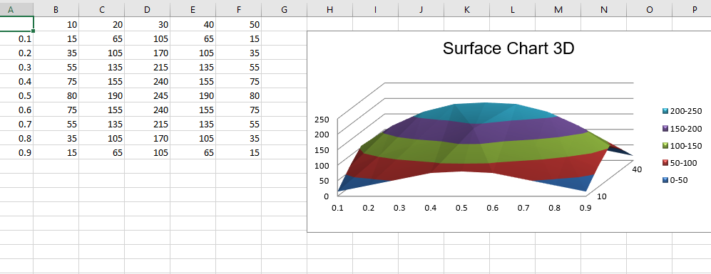
Código n.º 4: Trazar el gráfico 3D de la superficie
Para trazar el gráfico 3D de la superficie en una hoja de Excel, utilice la clase SurfaceChart3D del submódulo openpyxl.chart.
Python3
# import Workbook from openpyxl
from openpyxl import Workbook

# import SurfaceChart3D, Reference, Series from openpyxl.chart sub_module .
from openpyxl.chart import SurfaceChart3D, Reference, Series

# Call a Workbook() function of openpyxl
# to create a new blank Workbook object
wb = Workbook()

# Get workbook active sheet
# from the active attribute.
ws = wb.active

# given data
data = [
    [None, 10, 20, 30, 40, 50, ],
    [0.1, 15, 65, 105, 65, 15, ],
    [0.2, 35, 105, 170, 105, 35, ],
    [0.3, 55, 135, 215, 135, 55, ],
    [0.4, 75, 155, 240, 155, 75, ],
    [0.5, 80, 190, 245, 190, 80, ],
    [0.6, 75, 155, 240, 155, 75, ],
    [0.7, 55, 135, 215, 135, 55, ],
    [0.8, 35, 105, 170, 105, 35, ],
    [0.9, 15, 65, 105, 65, 15],
]

# write content of each row in 1st and 2nd
# column of the active sheet respectively .
for row in data:
    ws.append(row)

# Create object of SurfaceChart3D class
chart = SurfaceChart3D()

# create data for plotting
labels = Reference(ws, min_col = 1, min_row = 2, max_row = 10)
data = Reference(ws, min_col = 2, max_col = 6, min_row = 1, max_row = 10)

# adding data to the Surface chart 3D object
chart.add_data(data, titles_from_data = True)

# set labels in the chart object
chart.set_categories(labels)

# set the title of the chart
chart.title = "Surface Chart 3D"

# set style of the chart
chart.style = 26

# add chart to the sheet
# the top-left corner of a chart
# is anchored to cell H2 .
ws.add_chart(chart, "H2")

# save the file
wb.save("Surface3D.xlsx")
Producción :