Requisito previo: crear y escribir en una hoja de Excel
XlsxWriter es una biblioteca de Python con la que se pueden realizar múltiples operaciones en archivos de Excel, como crear, escribir, operaciones aritméticas y trazar gráficos. Veamos cómo trazar gráficos combinados utilizando datos en tiempo real.
Los gráficos se componen de al menos una serie de uno o más puntos de datos. Las series en sí mismas se componen de referencias a rangos de celdas. Para trazar los gráficos en una hoja de Excel, en primer lugar, cree un objeto de gráfico de tipos de gráficos específicos (es decir, gráfico de líneas, de columnas, etc.). Después de crear objetos de gráfico, inserte datos en él y, por último, agregue ese objeto de gráfico en el objeto de hoja.
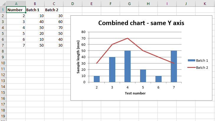
Código n.º 1: trace un gráfico combinado de columnas y líneas que comparta los mismos ejes X e Y.
Para trazar el gráfico combinado en una hoja de Excel, utilice el método combine() del objeto de gráfico para combinar dos objetos de gráfico.
Python3
# import xlsxwriter module
import xlsxwriter

# Workbook() takes one, non-optional, argument
# which is the filename that we want to create.
workbook = xlsxwriter.Workbook('chart_combined.xlsx')

# The workbook object is then used to add new
# worksheet via the add_worksheet() method.
worksheet = workbook.add_worksheet()

# Create a new Format object to formats cells
# in worksheets using add_format() method .

# here we create bold format object .
bold = workbook.add_format({'bold': True})

# Add the worksheet data that the charts will refer to.
headings = ['Number', 'Batch 1', 'Batch 2']
data = [
    [2, 3, 4, 5, 6, 7],
    [10, 40, 50, 20, 10, 50],
    [30, 60, 70, 50, 40, 30],
]

# Write a row of data starting from 'A1'
# with bold format .
worksheet.write_row('A1', headings, bold)

# Write a column of data starting from
# 'A2', 'B2', 'C2' respectively .
worksheet.write_column('A2', data[0])
worksheet.write_column('B2', data[1])
worksheet.write_column('C2', data[2])

# Create a chart object that can be added
# to a worksheet using add_chart() method.

# here we create a column chart object .
# This will use as the primary chart.
column_chart1 = workbook.add_chart({'type': 'column'})

# Add a data series to a chart
# using add_series method.

# Configure the first series.
# = Sheet1 !$A$1 is equivalent to ['Sheet1', 0, 0].

# note : spaces is not inserted in b / w
# = and Sheet1, Sheet1 and !
# if space is inserted it throws warning.
column_chart1.add_series({
    'name':       '= Sheet1 !$B$1',
    'categories': '= Sheet1 !$A$2:$A$7',
    'values':     '= Sheet1 !$B$2:$B$7',
})

# Create a new line chart.
# This will use as the secondary chart.
line_chart1 = workbook.add_chart({'type': 'line'})

# Configure the data series for the secondary chart.
line_chart1.add_series({
    'name':       '= Sheet1 !$C$1',
    'categories': '= Sheet1 !$A$2:$A$7',
    'values':     '= Sheet1 !$C$2:$C$7',
})

# Combine both column and line charts together.
column_chart1.combine(line_chart1)

# Add a chart title
column_chart1.set_title({ 'name': 'Combined chart - same Y axis'})

# Add x-axis label
column_chart1.set_x_axis({'name': 'Test number'})

# Add y-axis label
column_chart1.set_y_axis({'name': 'Sample length (mm)'})

# add chart to the worksheet with given
# offset values at the top-left corner of
# a chart is anchored to cell D2
worksheet.insert_chart('D2', column_chart1, {'x_offset': 25, 'y_offset': 10})

# Finally, close the Excel file
# via the close() method.
workbook.close()
Producción :
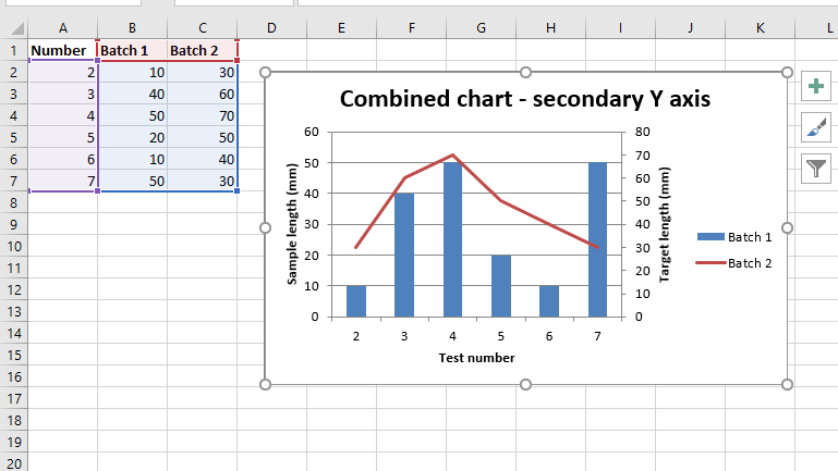
Código n.º 2: trace un gráfico combinado de columnas y líneas en el que el gráfico secundario tendrá un eje Y secundario.
Para trazar el gráfico combinado con el eje Y secundario en una hoja de Excel, configuramos un eje Y secundario a través de ‘y2_axis’. argumento de palabra clave del método add_series() del objeto de gráfico respectivo.
Python3
# import xlsxwriter module
import xlsxwriter

# Workbook() takes one, non-optional, argument
# which is the filename that we want to create.
workbook = xlsxwriter.Workbook('combined_chart_secondaryAxis.xlsx')

# The workbook object is then used to add new
# worksheet via the add_worksheet() method.
worksheet = workbook.add_worksheet()

# Create a new Format object to formats cells
# in worksheets using add_format() method .

# here we create bold format object .
bold = workbook.add_format({'bold': True})

# Add the worksheet data that the charts will refer to.
headings = ['Number', 'Batch 1', 'Batch 2']
data = [
    [2, 3, 4, 5, 6, 7],
    [10, 40, 50, 20, 10, 50],
    [30, 60, 70, 50, 40, 30],
]

# Write a row of data starting from 'A1'
# with bold format .
worksheet.write_row('A1', headings, bold)

# Write a column of data starting from
# 'A2', 'B2', 'C2' respectively .
worksheet.write_column('A2', data[0])
worksheet.write_column('B2', data[1])
worksheet.write_column('C2', data[2])

# Create a chart object that can be added
# to a worksheet using add_chart() method.

# here we create a column chart object .
# This will use as the primary chart.
column_chart2 = workbook.add_chart({'type': 'column'})

# Add a data series to a chart
# using add_series method.

# Configure the first series.
# = Sheet1 !$A$1 is equivalent to ['Sheet1', 0, 0].

# note : spaces is not inserted in b / w
# = and Sheet1, Sheet1 and !
# if space is inserted it throws warning.
column_chart2.add_series({
    'name':       '= Sheet1 !$B$1',
    'categories': '= Sheet1 !$A$2:$A$7',
    'values':     '= Sheet1 !$B$2:$B$7',
})

# Create a new line chart.
# This will use as the secondary chart.
line_chart2 = workbook.add_chart({'type': 'line'})

# Configure the data series for the secondary chart.
# We also set a secondary Y axis via (y2_axis).
line_chart2.add_series({
    'name':       '= Sheet1 !$C$1',
    'categories': '= Sheet1 !$A$2:$A$7',
    'values':     '= Sheet1 !$C$2:$C$7',
     'y2_axis':    True,
})

# Combine both column and line charts together.
column_chart2.combine(line_chart2)

# Add a chart title
column_chart2.set_title({ 'name': 'Combined chart - secondary Y axis'})

# Add x-axis label
column_chart2.set_x_axis({'name': 'Test number'})

# Add y-axis label
column_chart2.set_y_axis({'name': 'Sample length (mm)'})

# Note: the y2 properties are on the secondary chart.
line_chart2.set_y2_axis({'name': 'Target length (mm)'})

# add chart to the worksheet with given
# offset values at the top-left corner of
# a chart is anchored to cell D2
worksheet.insert_chart('D2', column_chart2, {'x_offset': 25, 'y_offset': 10})

# Finally, close the Excel file
# via the close() method.
workbook.close()
Producción :