En este artículo, vamos a discutir la asignación de títulos y la alineación usando el módulo plotly .
Para alinear títulos en la visualización usando el módulo plotly , vamos a usar el método update_layout() .
Sintaxis:
plotly.graph_objects.Figure.update_layout(title_text, title_x, title_y)
Parámetros:
- title: acepta el valor de string como el título de la visualización.
- title_x: este parámetro se utiliza para alinear el título en un movimiento horizontal y acepta un valor de 0 a 1.
- title_y: este parámetro se utiliza para alinear el título en un movimiento vertical y acepta un valor de 0 a 1.
Implementemos el método en los siguientes ejemplos:
Ejemplo 1
Python3
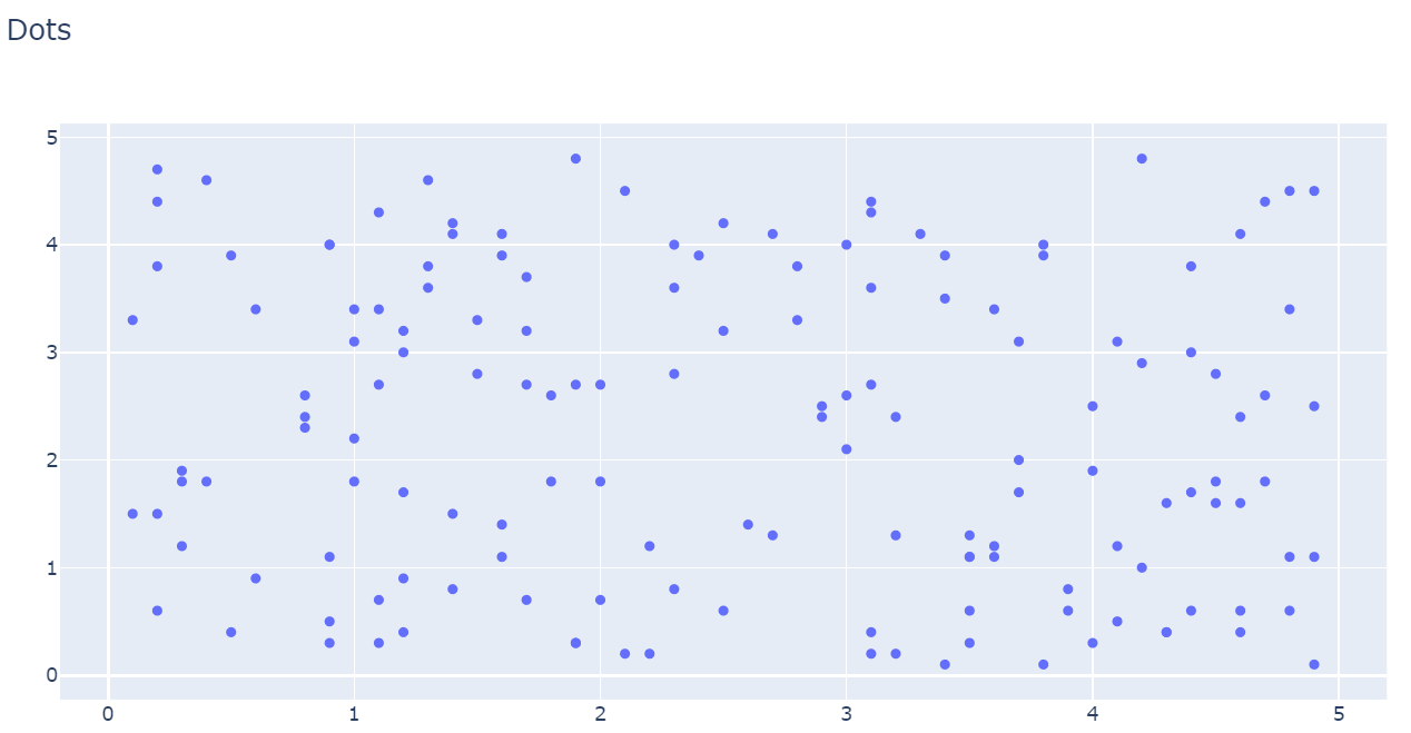
# import all required libraries
import numpy as np
import plotly
import plotly.graph_objects as go
import plotly.offline as pyo
from plotly.offline import init_notebook_mode

init_notebook_mode(connected=True)

# generating 150 random integers
# from 1 to 50
x = np.random.randint(low=1, high=50, size=150)*0.1

# generating 150 random integers
# from 1 to 50
y = np.random.randint(low=1, high=50, size=150)*0.1

# plotting scatter plot
fig = go.Figure(data=go.Scatter(x=x, y=y, mode='markers'))

# title alignment
fig.update_layout(title_text='Dots')

fig.show()
Producción:
Ejemplo 2
Python3
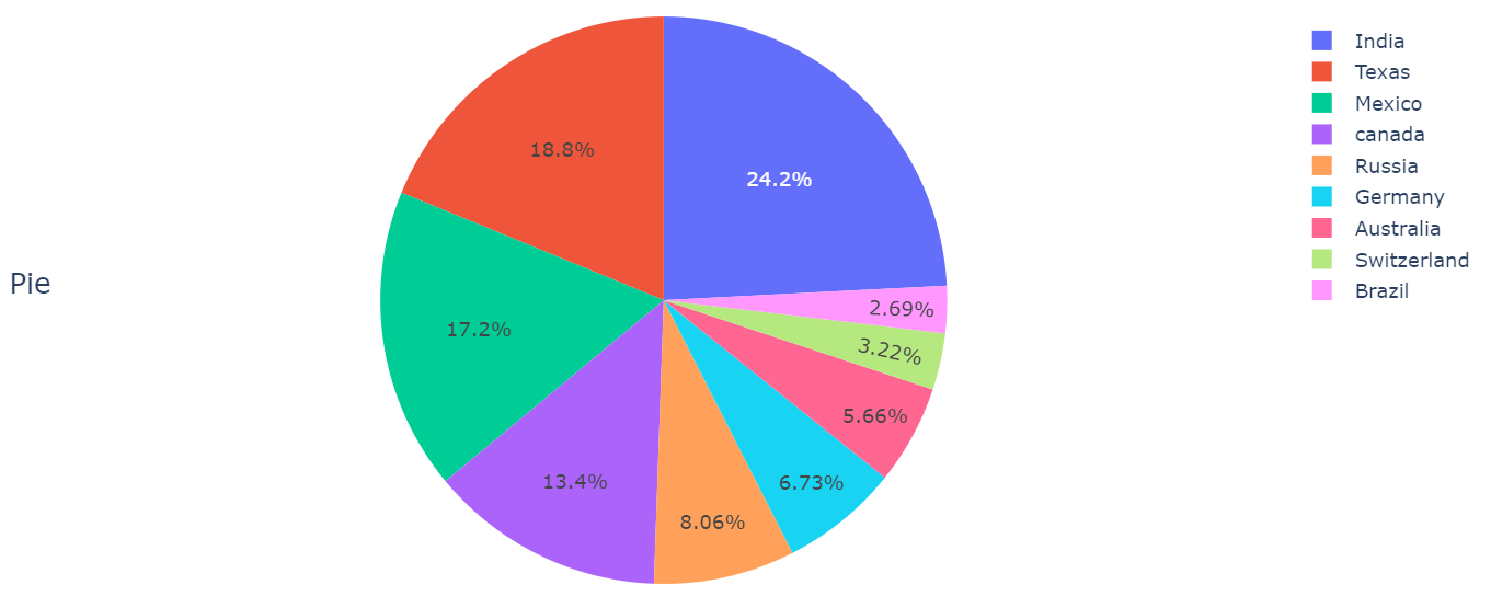
# import all required libraries
import numpy as np
import plotly
import plotly.graph_objects as go
import plotly.offline as pyo
from plotly.offline import init_notebook_mode

init_notebook_mode(connected = True)

# different individual parts in
# total chart
countries=['India', 'canada',
        'Australia','Brazil',
        'Mexico','Russia',
        'Germany','Switzerland',
        'Texas']

# values corresponding to each
# individual country present in
# countries
values = [4500, 2500, 1053, 500,
        3200, 1500, 1253, 600, 3500]

# plotting pie chart
fig = go.Figure(data=[go.Pie(labels=countries,
                    values=values)])

# title alignment
fig.update_layout(title_text='Pie',title_y=0.5)

fig.show()
Producción:
Con title_y=0.5 , el título debe estar en el centro.
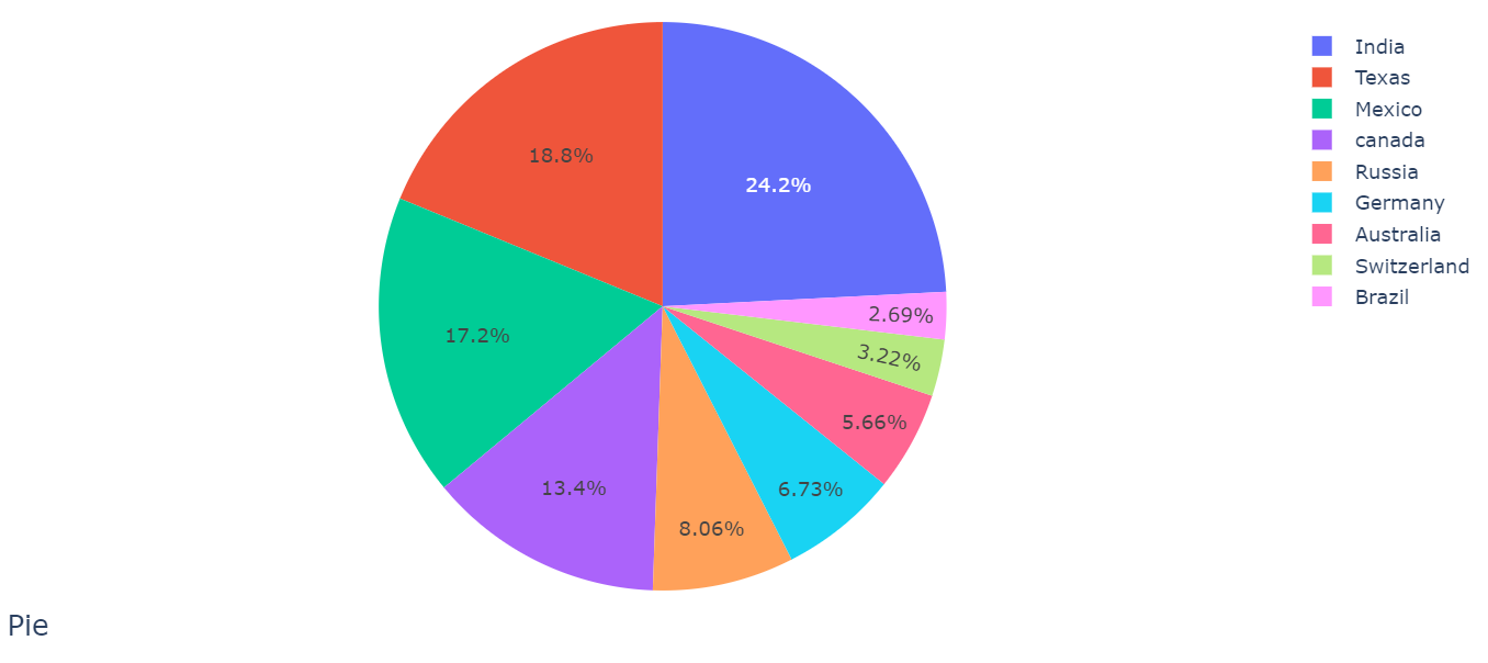
Cuando titulo_y = 0.1
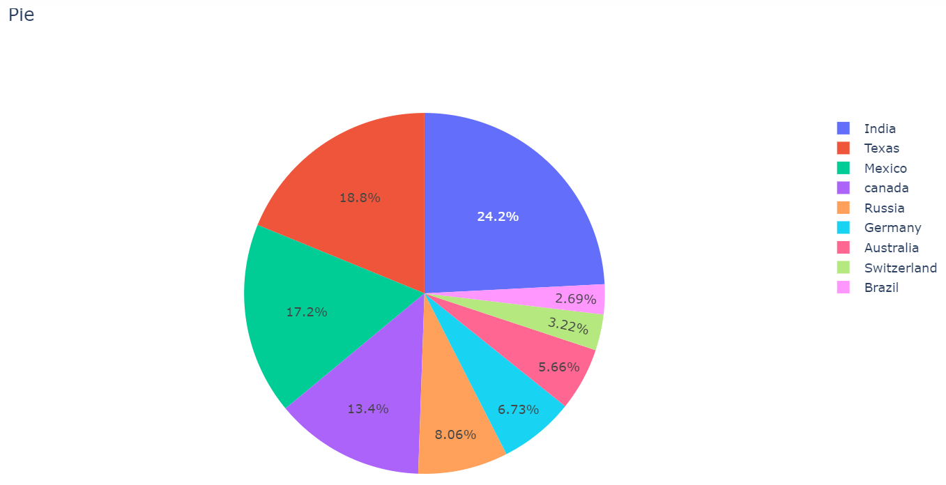
Cuando titulo_y = 1
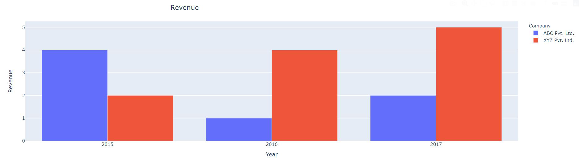
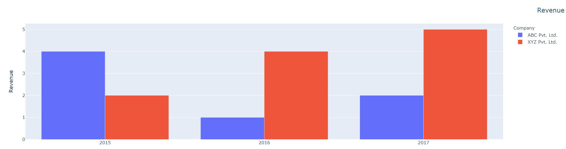
Ejemplo 3
Python3
# import required libraries
import dash
import dash_core_components as dcc
import dash_html_components as html
import plotly.express as px
import pandas as pd

external_stylesheets = ['https://codepen.io/chriddyp/pen/bWLwgP.css']

app = dash.Dash(__name__, external_stylesheets=external_stylesheets)

# assume you have a "long-form" data frame
df = pd.DataFrame({
    "Year": ["2015", "2016", "2017", "2015", "2016", "2017"],
    "Revenue": [4, 1, 2, 2, 4, 5],
    "Company": ["ABC Pvt. Ltd.", "ABC Pvt. Ltd.", "ABC Pvt. Ltd.", "XYZ Pvt. Ltd.", "XYZ Pvt. Ltd.", "XYZ Pvt. Ltd."]
})

# depict visualization
fig = px.bar(df, x="Year", y="Revenue", color="Company", barmode="group")

app.layout = html.Div(children=[

    dcc.Graph(
        id='example-graph',
        figure=fig
    )
])

# align title
fig.update_layout(title_text='Revenue', title_x=0.5)

if __name__ == '__main__':
    app.run_server(debug=True)
Producción:
Con title_x=0.5 , el título debe estar en el centro.
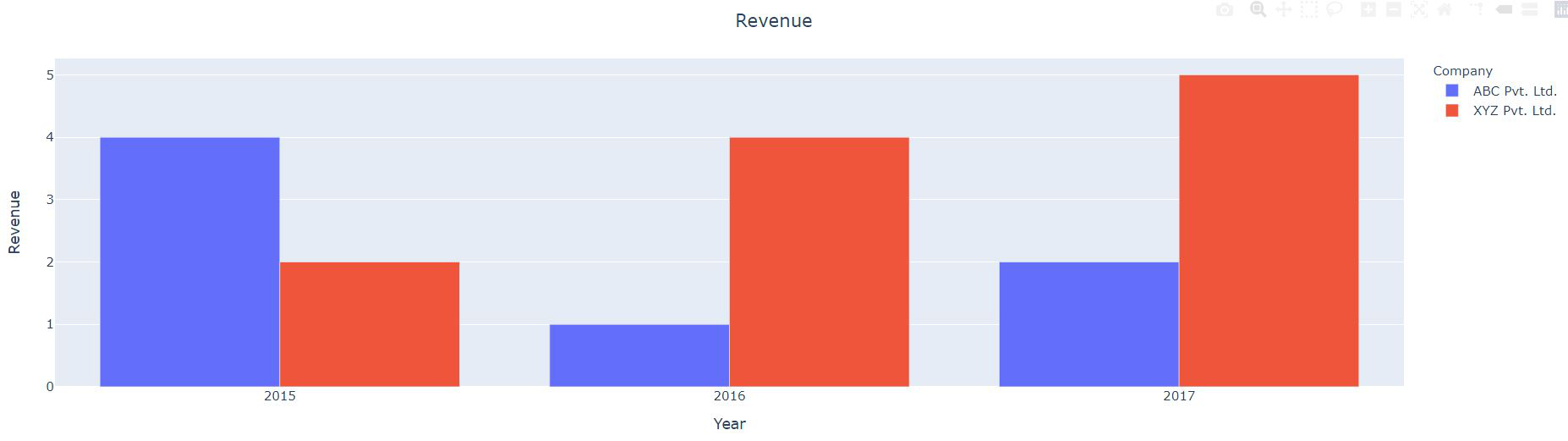
Cuando titulo_x = 0.3
Cuando titulo_x = 1
Publicación traducida automáticamente
Artículo escrito por parasmadan15 y traducido por Barcelona Geeks. The original can be accessed here. Licence: CCBY-SA