MUI o Material-UI es una biblioteca de interfaz de usuario que proporciona componentes robustos y personalizables predefinidos para React para facilitar el desarrollo web. El diseño de MUI se basa en la parte superior de Material Design de Google.
En este artículo, discutiremos la API React MUI TabPanel. Las pestañas se utilizan para que la navegación sea más fácil y útil. Podemos cambiar fácilmente entre las vistas. El TabContext se usa para contener el índice de la pestaña actual. La API proporciona muchas funcionalidades y aprenderemos a implementarlas.
Importar API TabContext:
import TabContext from '@mui/lab/TabContext';
// or
import { TabContext } from '@mui/lab';
Lista de accesorios: aquí está la lista de diferentes accesorios utilizados con este componente. Podemos acceder a ellos y modificarlos según nuestras necesidades.
- children (Node): Es un componente similar a la fila de la tabla.
- valor (string): el valor de índice de pestaña seleccionado actualmente.
Sintaxis: use el TabContext en las pestañas de la siguiente manera:
<TabContext value={value}>
    ...
</TabContext>
Instalar y crear la aplicación React y agregar las dependencias de MUI:
Paso 1: Cree un proyecto de reacción usando el siguiente comando.
npx create-react-app gfg_tutorial
Paso 2 : Entrar en el directorio del proyecto
cd gfg_tutorial
Paso 3: instale las dependencias de MUI de la siguiente manera:
npm install @mui/material @emotion/react @emotion/styled @mui/lab
Paso 4: Ejecute el proyecto de la siguiente manera:
npm start
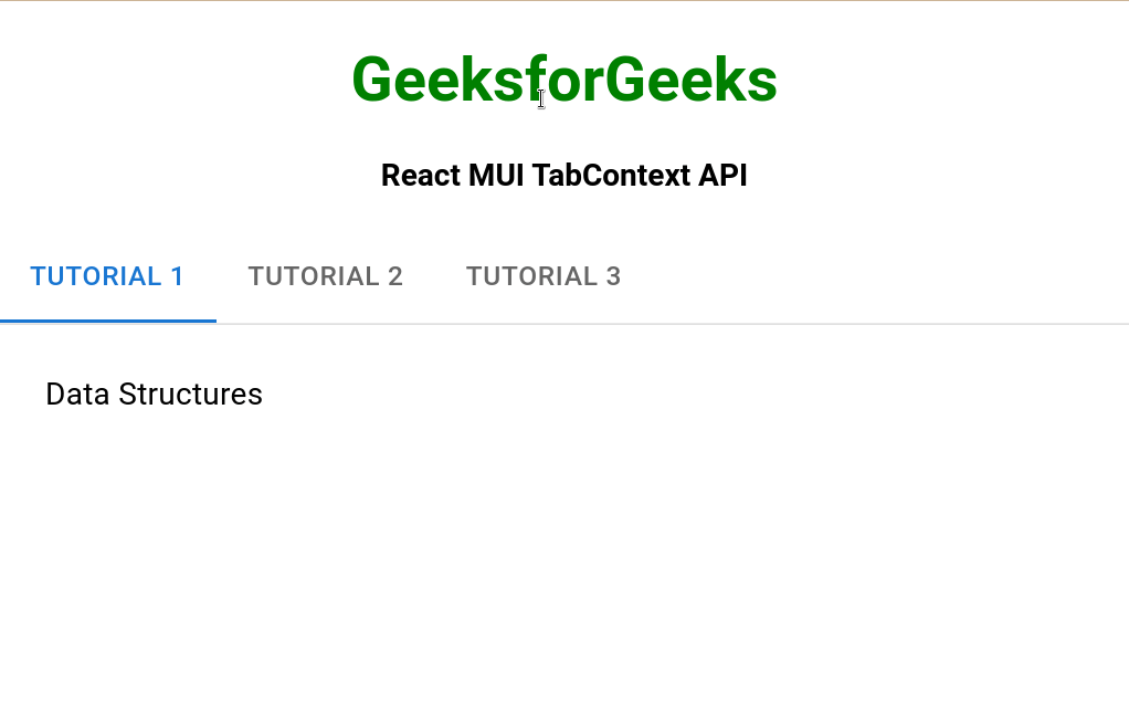
Ejemplo 1: en el siguiente ejemplo, tenemos un TabContext con pestañas dentro.
App.js
import "./App.css";
import * as React from "react";
import Box from "@mui/material/Box";
import Tab from "@mui/material/Tab";
import TabContext from "@mui/lab/TabContext";
import TabList from "@mui/lab/TabList";
import TabPanel from "@mui/lab/TabPanel";
function App() {
  const [value, setValue] = React.useState("1");

  const handleChange = (event, newValue) => {
    setValue(newValue);
  };

  return (
    <div className="App">
      <div
        className="head"
        style={{
          width: "fit-content",
          margin: "auto",
        }}
      >
        <h1
          style={{
            color: "green",
          }}
        >
          GeeksforGeeks
        </h1>
      </div>
      <div
        style={{
          width: "fit-content",
          margin: "auto",
        }}
      >
        <strong>React MUI TabContext API</strong>
      </div>
      <br />
      <div
        style={{
          margin: "auto",
          display: "flex",
          justifyContent: "space-evenly",
        }}
      >
        <Box sx={{ width: "100%", typography: "body1" }}>
          <TabContext value={value}>
            <Box sx={{ borderBottom: 1, borderColor: "divider" }}>
              <TabList onChange={handleChange}>
                <Tab label="Tutorial 1" value="1" />
                <Tab label="Tutorial 2" value="2" />
                <Tab label="Tutorial 3" value="3" />
              </TabList>
            </Box>
            <TabPanel value="1">Data Structures</TabPanel>
            <TabPanel value="2">Algorithms</TabPanel>
            <TabPanel value="3">Web Development</TabPanel>
          </TabContext>
        </Box>
      </div>
    </div>
  );
}

export default App;
Producción:
Ejemplo 2: En el siguiente ejemplo, modificaremos el valor provisto en TabContext usando mod 3 +1 para que se seleccione una pestaña diferente.
App.js
import "./App.css";
import * as React from "react";
import Box from "@mui/material/Box";
import Tab from "@mui/material/Tab";
import TabContext from "@mui/lab/TabContext";
import TabList from "@mui/lab/TabList";
import TabPanel from "@mui/lab/TabPanel";
function App() {
  const [value, setValue] = React.useState("1");

  const handleChange = (event, newValue) => {
    setValue(newValue);
  };

  return (
    <div className="App">
      <div
        className="head"
        style={{
          width: "fit-content",
          margin: "auto",
        }}
      >
        <h1
          style={{
            color: "green",
          }}
        >
          GeeksforGeeks
        </h1>
      </div>
      <div
        style={{
          width: "fit-content",
          margin: "auto",
        }}
      >
        <strong>React MUI TabContext API</strong>
      </div>
      <br />
      <div
        style={{
          margin: "auto",
          display: "flex",
          justifyContent: "space-evenly",
        }}
      >
        <Box sx={{ width: "100%", typography: "body1" }}>
          <TabContext value={((parseInt(value) % 3) + 1).toString()}>
            <Box sx={{ borderBottom: 1, borderColor: "divider" }}>
              <TabList onChange={handleChange}>
                <Tab label="Tutorial 1" value="1" />
                <Tab label="Tutorial 2" value="2" />
                <Tab label="Tutorial 3" value="3" />
              </TabList>
            </Box>
            <TabPanel value="1">Data Structures</TabPanel>
            <TabPanel value="2">Algorithms</TabPanel>
            <TabPanel value="3">Web Development</TabPanel>
          </TabContext>
        </Box>
      </div>
    </div>
  );
}

export default App;
Producción

Referencia: https://mui.com/material-ui/api/tab-context/
Publicación traducida automáticamente
Artículo escrito por RajeevSarkar y traducido por Barcelona Geeks. The original can be accessed here. Licence: CCBY-SA