A veces, al analizar cualquier dato a través de gráficos, necesitamos dos ejes x o y para obtener más información sobre los datos. La biblioteca Matplotlib de Python es la biblioteca de visualización de datos más popular y podemos generar cualquier tipo de gráfico en Matplotlib. Podemos crear una gráfica que tenga dos ejes y y podemos proporcionar diferentes etiquetas para ambos ejes. Podemos hacer una gráfica con dos ejes y diferentes creando o usando dos objetos de ejes diferentes con la ayuda de la función twinx() . Primero, creamos objetos de figura y eje y hacemos la primera gráfica. Y también configuramos las etiquetas de los ejes x e y con la ayuda del objeto de eje creado.
Objeto de ejes: los ejes son la unidad más básica y flexible para crear subparcelas. Los ejes se utilizan para la colocación de parcelas en cualquier lugar de la figura. Una figura dada de la trama puede contener muchos ejes, pero un objeto de ejes dado solo puede estar en una figura de la trama.
Acercarse:
- Importar paquetes.
- Utilice el objeto de ejes y cree una subparcela.
- Usando twinx() define los valores de la trama.
- Ahora etiqueta el eje.
- Mostrar trama.
Ejemplo 1:
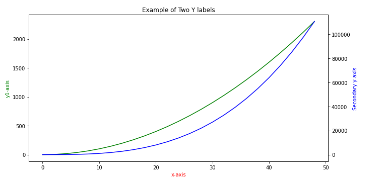
En este ejemplo, hemos creado una gráfica con dos ejes y diferentes usando dos objetos de ejes diferentes a y a2 con la ayuda de la función twinx(). ax.twinx() crea un nuevo objeto Axes ax2 para un eje y opuesto al eje y original. El segundo objeto de ejes ax2 se usa para hacer la gráfica de la segunda variable del eje y y para actualizar su etiqueta.
Python3
# Adding a Y-Axis Label to the Secondary Y-Axis in Matplotlib
# importing the libraries
import numpy as np
import matplotlib.pyplot as plt

# creating data for plot
# data arrangement between 0 and 50
# with the difference of 2
# x-axis
x = np.arange(0, 50, 2)

# y-axis values
y1 = x**2

# secondary y-axis values
y2 = x**3

# plotting figures by creating aexs object
# using subplots() function
fig, ax = plt.subplots(figsize = (10, 5))
plt.title('Example of Two Y labels')

# using the twinx() for creating another
# axes object for secondary y-Axis
ax2 = ax.twinx()
ax.plot(x, y1, color = 'g')
ax2.plot(x, y2, color = 'b')

# giving labels to the axises
ax.set_xlabel('x-axis', color = 'r')
ax.set_ylabel('y1-axis', color = 'g')

# secondary y-axis label
ax2.set_ylabel('Secondary y-axis', color = 'b')

# defining display layout
plt.tight_layout()

# show plot
plt.show()
Producción:
Ejemplo 2:
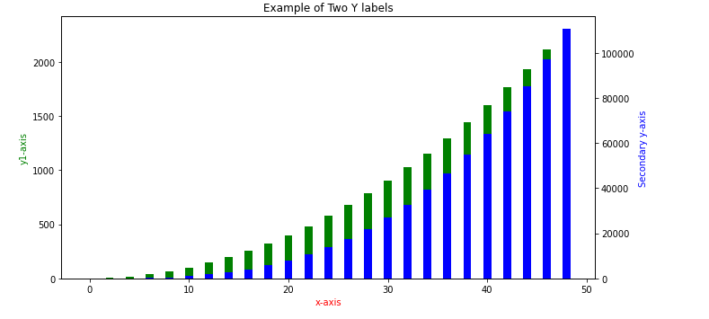
En este ejemplo, hemos creado un gráfico de barras usando el mismo método.
Python3
# Adding a Y-Axis Label to the
# Secondary Y-Axis in Matplotlib
# importing the libraries
import numpy as np
import matplotlib.pyplot as plt

# creating data for plot
# data arrangement between 0 and 50 with the difference of 2
# x-axis values
x = np.arange(0, 50, 2)

#y-axis values
y1 = x**2

# secondary y-axis values
y2 = x**3

# plotting figures by creating aexs object
# using subplots() function
fig, ax = plt.subplots(figsize = (10, 5))
plt.title('Example of Two Y labels')

# using the twinx() for creating
# another axes object for secondary y-Axis
ax2 = ax.twinx()
# creating a bar plot
ax.bar(x, y1, color = 'g')
ax2.bar(x, y2, color = 'b')

# giving labels to the axises
ax.set_xlabel('x-axis', color = 'r')
ax.set_ylabel('y1-axis', color = 'g')

# secondary y-axis label
ax2.set_ylabel('Secondary y-axis', color = 'b')

# defining display layout
plt.tight_layout()

# show plot
plt.show()
Producción:
Ejemplo 3:
También podemos agregar una etiqueta de eje y al eje y secundario en pandas. Generando un gráfico desde DataFrame y también sin usar la función twinx(). En este ejemplo, usaremos la función simple DataFrame.plot() con algunos parámetros para especificar la trama.
Cuando establecemos el parámetro second_y en True en el método DataFrame.plot, devuelve diferentes ejes que se pueden usar para establecer las etiquetas.
Python3
# Adding a Y-Axis Label to
# the Secondary Y-Axis in Matplotlib
# importing the libraries
import pandas as pd
import matplotlib.pyplot as plt

#creating dataframe for plot
dataset = pd.DataFrame({'Name':['Rohit', 'Seema',
                                'Meena', 'Geeta',
                                'Rajat'],

                   'Height': [155,129,138,164,145],
                   'Weight': [60,40,45,55,60]})

# creating axes object and defining plot
ax = dataset.plot(kind = 'line', x = 'Name',
                  y = 'Height', color = 'Blue',
                  linewidth = 3)

ax2 = dataset.plot(kind = 'line', x = 'Name',
                   y = 'Weight', secondary_y = True,
                   color = 'Red',  linewidth = 3,
                   ax = ax)

#title of the plot
plt.title("Student Data")

#labeling x and y-axis
ax.set_xlabel('Name', color = 'g')
ax.set_ylabel('Height', color = "b")
ax2.set_ylabel('Weight', color = 'r')

#defining display layout
plt.tight_layout()

#show plot
plt.show()
Producción:
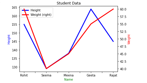
En el ejemplo anterior, el gráfico se crea sin usar la función twinx(), pero hemos creado dos objetos de eje ax y ax2 como se indica en otros ejemplos para dos ejes y para hacer el gráfico con dos ejes y actualizar su etiqueta.
Publicación traducida automáticamente
Artículo escrito por neelutiwari y traducido por Barcelona Geeks. The original can be accessed here. Licence: CCBY-SA