CSS Animation: CSS Animations es una técnica para cambiar la apariencia y el comportamiento de varios elementos en las páginas web. Se utiliza para controlar los elementos cambiando sus movimientos o visualización. Tiene dos partes, una que contiene las propiedades CSS que describen la animación de los elementos y la otra contiene ciertos fotogramas clave que indican las propiedades de animación del elemento y los intervalos de tiempo específicos en los que deben ocurrir.
La regla @keyframes : Los fotogramas clave son la base con la ayuda de la cual funciona CSS Animations. Definen la visualización de la animación en las etapas respectivas de toda su duración. Por ejemplo: en el siguiente código, el párrafo cambia de color con el tiempo. Al 0% de finalización es rojo, al 50% de finalización es de color naranja y al 100% de finalización es marrón.
Ejemplo: este ejemplo describe la animación CSS utilizando la regla @keyframe.
HTML
<!DOCTYPE html>
<html>

<head>
    <style>
    #gfg {
        animation-name: color;
        animation-duration: 25s;
        padding-top: 30px;
        padding-bottom: 30px;
        font-family: Times New Roman;
    }

    #geeks {
        font-size: 40px;
        text-align: center;
        font-weight: bold;
        color: #090;
        padding-bottom: 5px;
    }

    #geeks1 {
        font-size: 17px;
        font-weight: bold;
        text-align: center;
    }

    @keyframes color {
        0% {
            background-color: red;
        }
        50% {
            background-color: orange;
        }
        100% {
            background-color: brown;
        }
    }
    </style>
</head>

<body>
    <div id="gfg">
        <div id="geeks">GeeksforGeeks</div>
        <div id="geeks1">A computer science portal for geeks</div>
    </div>
</body>

</html>
Producción:

Propiedades de animación: hay ciertas propiedades de animación que se indican a continuación:
animation-name : se utiliza para especificar el nombre de los @keyframes que describen la animación.
animation-name: animation_name;
animation-duration : se utiliza para especificar el tiempo que tarda la animación en completar un ciclo.
Ejemplo: este ejemplo describe las propiedades de animación CSS utilizando la propiedad animation-duration.
HTML
<html>

<head>
    <style>
    #gfg1 {
        animation-name: text;
        animation-duration: 5s;
        animation-iteration-count: infinite;
    }

    #geek1 {
        font-size: 40px;
        text-align: center;
        font-weight: bold;
        color: #090;
        padding-bottom: 5px;
    }

    #geek2 {
        font-size: 17px;
        font-weight: bold;
        text-align: center;
    }

    @keyframes text {
        from {
            margin-top: 400px;
        }
        to {
            margin-top: 0px;
        }
    }
    </style>
</head>

<body>
    <div id="gfg1">
        <div id="geek1">GeeksforGeeks</div>
        <div id="geek2">A computer science portal for geeks</div>
    </div>
</body>

</html>
Producción:

La animación se verá así:

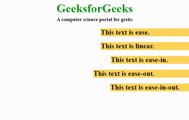
animation-timing-function : especifica cómo la animación realiza transiciones a través de fotogramas clave. Puede tener los siguientes valores:
- facilidad: la animación comienza lentamente, luego rápido y finalmente termina lentamente (este es el valor predeterminado)
- lineal: la animación se reproduce con la misma velocidad de principio a fin
- Facilidad de entrada: la animación se reproduce con un comienzo lento .
- Eaceleración: la animación se reproduce con un final lento .
- Facilidad de entrada y salida: la animación comienza y finaliza lentamente.
Ejemplo: este ejemplo describe las propiedades de animación CSS utilizando la propiedad animation-timing-function.
HTML
<!DOCTYPE html>
<html>

<head>
    <style>
    .geeks {
        font-size: 40px;
        text-align: center;
        font-weight: bold;
        color: #090;
        padding-bottom: 5px;
        font-family: Times New Roman;
    }

    .geeks1 {
        font-size: 17px;
        font-weight: bold;
        text-align: center;
        font-family: Times New Roman;
    }

    h2 {
        width: 350px;
        animation-name: text;
        animation-duration: 4s;
        animation-iteration-count: infinite;
        background-color: rgb(255, 210, 85);
    }

    #one {
        animation-timing-function: ease;
    }

    #two {
        animation-timing-function: linear;
    }

    #three {
        animation-timing-function: ease-in;
    }

    #four {
        animation-timing-function: ease-out;
    }

    #five {
        animation-timing-function: ease-in-out;
    }

    @keyframes text {
        from {
            margin-left: 60%;
        }
        to {
            margin-left: 0%;
        }
    }
    </style>
</head>

<body>
    <div class="geeks">GeeksforGeeks</div>
    <div class="geeks1">A computer science portal for geeks</div>
    <h2 id="one">This text is ease.</h2>
    <h2 id="two">This text is linear.</h2>
    <h2 id="three">This text is ease-in.</h2>
    <h2 id="four">This text is ease-out.</h2>
    <h2 id="five">This text is ease-in-out.</h2>
</body>

</html>
Producción:
animation-delay : se utiliza para especificar el retraso cuando comienza la animación.
Ejemplo: este ejemplo describe las propiedades de animación CSS utilizando la propiedad animation-delay.
HTML
<!DOCTYPE html>
<html>

<head>
    <style>
    .geeks {
        font-size: 40px;
        text-align: center;
        font-weight: bold;
        color: #090;
        padding-bottom: 5px;
        font-family: Times New Roman;
    }

    .geeks1 {
        font-size: 17px;
        font-weight: bold;
        text-align: center;
        font-family: Times New Roman;
    }

    #one {
        animation-name: example;
        animation-duration: 10s;
    }

    #two {
        animation-name: example;
        animation-duration: 10s;
        animation-delay: 10s;
    }

    @keyframes example {
        from {
            background-color: orange;
        }
        to {
            background-color: white;
        }
    }
    </style>
</head>

<body>
    <div class="geeks">GeeksforGeeks</div>
    <div class="geeks1">A computer science portal for geeks</div>
    <h2 id="one">Text animation without delayed.</h2>
    <h2 id="two">Text animation with 10 second delay.</h2> </body>

</html>
Producción:

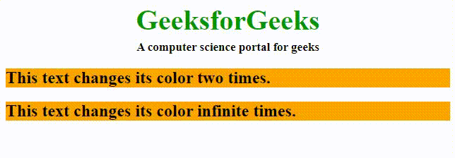
animation-iteration-count : se utiliza para especificar el número de veces que se repetirá la animación. Puede especificar como infinito para repetir la animación indefinidamente.
Ejemplo: este ejemplo describe las propiedades de animación CSS utilizando una propiedad animation-iteration-count.
HTML
<!DOCTYPE html>
<html>

<head>
    <style>
    .geeks {
        font-size: 40px;
        text-align: center;
        font-weight: bold;
        color: #090;
        padding-bottom: 5px;
        font-family: Times New Roman;
    }

    .geeks1 {
        font-size: 17px;
        font-weight: bold;
        text-align: center;
        font-family: Times New Roman;
    }

    #one {
        animation-name: example;
        animation-duration: 2s;
        animation-iteration-count: 2;
    }

    #two {
        animation-name: example;
        animation-duration: 2s;
        animation-iteration-count: infinite;
    }

    @keyframes example {
        from {
            background-color: orange;
        }
        to {
            background-color: white;
        }
    }
    </style>
</head>

<body>
    <div class="geeks">GeeksforGeeks</div>
    <div class="geeks1">A computer science portal for geeks</div>
    <h2 id="one">This text changes its color two times.</h2>
    <h2 id="two">This text changes its color infinite times.</h2>
</body>

</html>
Producción:
animation-direction : especifica la dirección de la animación. Puede tener los siguientes valores:
- normal: la animación se reproduce hacia delante. Este es el valor predeterminado.
- inversa: La animación se reproduce en la dirección inversa, es decir, hacia atrás.
- alternativo: la animación se reproduce primero hacia adelante y luego hacia atrás.
- Alterno-reverso: la animación se reproduce primero hacia atrás y luego hacia adelante.
Ejemplo: este ejemplo describe las propiedades de animación CSS utilizando la propiedad animation-direction.
HTML
<!DOCTYPE html>
<html>

<head>
    <style>
    .geeks {
        font-size: 40px;
        text-align: center;
        font-weight: bold;
        color: #090;
        padding-bottom: 5px;
        font-family: Times New Roman;
    }

    .geeks1 {
        font-size: 17px;
        font-weight: bold;
        text-align: center;
        font-family: Times New Roman;
    }

    h2 {
        width: 100%;
        animation-name: text;
        animation-duration: 2s;
        animation-iteration-count: infinite;
    }

    #one {
        animation-direction: normal;
    }

    #two {
        animation-direction: reverse;
    }

    #three {
        animation-direction: alternate;
    }

    #four {
        animation-direction: alternate-reverse;
    }

    @keyframes text {
        from {
            margin-left: 60%;
        }
        to {
            margin-left: 0%;
        }
    }
    </style>
</head>

<body>
    <div class="geeks">GeeksforGeeks</div>
    <div class="geeks1">A computer science portal for geeks</div>
    <h2 id="one">This text is normal.</h2>
    <h2 id="two">This text is reverse.</h2>
    <h2 id="three">This text is alternate.</h2>
    <h2 id="four">This text is alternate-reverse.</h2>
</body>

</html>
Producción:

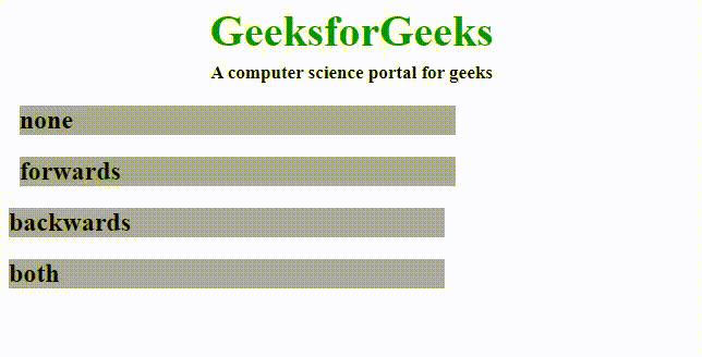
animation-fill-mode : especifica qué valores aplica la animación antes y después de ejecutarla.
- ninguno: la animación no aplicará ninguna propiedad al elemento antes o después de que se ejecute. Este es el valor predeterminado.
- adelante: el elemento conservará las mismas propiedades de animación del último fotograma clave después de que se complete la animación.
- Hacia atrás: el elemento obtendrá las propiedades del primer fotograma clave antes del inicio de la animación.
- ambos: la animación seguirá las reglas para avanzar y retroceder, es decir, obtendrá las propiedades definidas para el fotograma clave inicial antes del inicio y conservará el valor del último fotograma clave después de la finalización de la animación.
Ejemplo: este ejemplo describe las propiedades de animación de CSS utilizando una propiedad de modo de relleno de animación.
HTML
<!DOCTYPE html>
<html>

<head>
    <style>
    .geeks {
        font-size: 40px;
        text-align: center;
        font-weight: bold;
        color: #090;
        padding-bottom: 5px;
        font-family: Times New Roman;
    }

    .geeks1 {
        font-size: 17px;
        font-weight: bold;
        text-align: center;
        font-family: Times New Roman;
    }

    h2 {
        width: 400px;
        background-color: orange;
        animation-name: text;
        animation-duration: 3s;
    }

    #one {
        animation-fill-mode: none;
    }

    #two {
        animation-fill-mode: forwards;
    }

    #three {
        animation-fill-mode: backwards;
        animation-delay: 2s;
    }

    #four {
        animation-fill-mode: both;
        animation-delay: 2s;
    }

    @keyframes text {
        from {
            margin-left: 0%;
            background-color: #aaaaaa;
        }
        to {
            margin-left: 60%;
            background-color: #008000;
        }
    }
    </style>
</head>

<body>
    <div class="geeks">GeeksforGeeks</div>
    <div class="geeks1">A computer science portal for geeks</div>
    <h2 id="one">none</h2>
    <h2 id="two">forwards</h2>
    <h2 id="three">backwards</h2>
    <h2 id="four">both</h2>
</body>

</html>
Producción:
animation-play-state : Esto le permite reproducir/pausar la animación.
Propiedad abreviada de animación: es una forma abreviada de implicar las propiedades de animación para un código más rápido. Las propiedades deben estar en el siguiente orden:
animation: [animation-name] [animation-duration] [animation-timing-function] [animation-delay]
          [animation-iteration-count] [animation-direction] [animation-fill-mode]
          [animation-play-state];
Por ejemplo, normalmente el código de animación sería así:
Ejemplo: este ejemplo describe las propiedades de animación CSS utilizando una propiedad animation-play-state, sin la propiedad abreviada de animación.
HTML
<!DOCTYPE html>
<html>

<head>
    <style>
    #g4g {
        width: 400px;
        height: 100px;
        position: relative;
        animation-name: GFG;
        animation-duration: 5s;
        animation-timing-function: linear;
        animation-delay: 1s;
        animation-iteration-count: infinite;
        animation-direction: alternate;
    }

    @keyframes GFG {
        0% {
            left: 0px;
            top: 0px;
        }
        25% {
            left: 200px;
            top: 200px;
        }
        50% {
            left: 200px;
            top: 0px;
        }
        75% {
            left: 0px;
            top: 200px;
        }
        100% {
            left: 0px;
            top: 0px;
        }
    }
    </style>
</head>

<body>
    <img id="g4g" src=
"https://media.geeksforgeeks.org/wp-content/cdn-uploads/GeeksforGeeksLogoHeader.png">
</body>

</html>
Producción:

Ejemplo: este ejemplo describe las propiedades de animación CSS utilizando una propiedad animation-play-state, con la propiedad abreviada de animación.
HTML
<!DOCTYPE html>
<html>

<head>
    <style>
    #geeks4g {
        width: 400px;
        height: 100px;
        position: relative;
        animation: GFG 5s linear 1s infinite alternate;
    }

    @keyframes GFG {
        0% {
            left: 0px;
            top: 0px;
        }
        25% {
            left: 200px;
            top: 200px;
        }
        50% {
            left: 200px;
            top: 0px;
        }
        75% {
            left: 0px;
            top: 200px;
        }
        100% {
            left: 0px;
            top: 0px;
        }
    }
    </style>
</head>

<body>
    <img id="geeks4g" src=
"https://media.geeksforgeeks.org/wp-content/cdn-uploads/GeeksforGeeksLogoHeader.png">
</body>

</html>
Producción:

Navegadores compatibles:
- Google Chrome 43.0
- Microsoft Edge 12.0
- Firefox 16.0
- Safari 9.0
- Ópera 30.0