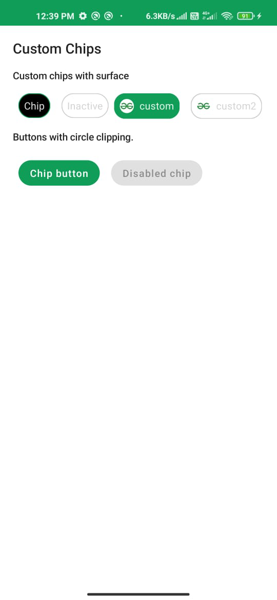
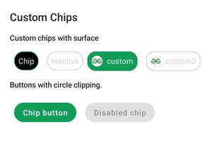
Los chips en Android son uno de los componentes que se utilizan para elegir filtros, acciones y mostrar las opciones seleccionables en el área compacta de la ventana de Android. En este artículo, usaremos Jetpack Compose de Android para crear esos chips. A continuación se muestra una imagen de muestra para dar una idea de lo que vamos a construir. Tenga en cuenta que vamos a implementar este proyecto utilizando el lenguaje Kotlin.
Implementación paso a paso
Paso 1: crear un nuevo proyecto
Para crear un nuevo proyecto en la versión Canary de Android Studio, consulte Cómo crear un nuevo proyecto en la versión Canary de Android Studio con Jetpack Compose.
Paso 2: trabajar con el archivo MainActivity.kt
Vaya a la aplicación > java > el nombre del paquete de su aplicación y abra el archivo MainActivity.kt. Dentro de ese archivo, agregue el siguiente código. Se agregan comentarios dentro del código para comprender el código con más detalle.
Kotlin
import android.os.Bundle
import androidx.activity.ComponentActivity
import androidx.activity.compose.setContent
import androidx.compose.foundation.BorderStroke
import androidx.compose.foundation.Image
import androidx.compose.foundation.layout.*
import androidx.compose.foundation.shape.CircleShape
import androidx.compose.foundation.shape.RoundedCornerShape
import androidx.compose.material.Button
import androidx.compose.material.MaterialTheme
import androidx.compose.material.MaterialTheme.typography
import androidx.compose.material.Surface
import androidx.compose.material.Text
import androidx.compose.runtime.Composable
import androidx.compose.ui.Modifier
import androidx.compose.ui.draw.clip
import androidx.compose.ui.graphics.Color
import androidx.compose.ui.res.painterResource
import androidx.compose.ui.text.style.TextAlign
import androidx.compose.ui.tooling.preview.Preview
import androidx.compose.ui.unit.dp
import com.example.jetpackcomposepractice.ui.theme.JetpackComposePracticeTheme

class MainActivity : ComponentActivity() {
    override fun onCreate(savedInstanceState: Bundle?) {
        super.onCreate(savedInstanceState)
        setContent {
            JetpackComposePracticeTheme {
                // A surface container using
                  // the 'background' color from the theme
                Surface(color = Color.White) {
                    Column(modifier = Modifier.padding(10.dp)) {
                        // call the function which
                          // contains all the chips
                        Chips()
                    }
                }
            }
        }
    }
}

// Function for Custom Chip
// Later we will reuse it to
// create chips wherever needed
// selected : Boolean - to Check
// whether it is checked or not
// text - To show the data
@Composable
fun CustomChip(
    selected: Boolean,
    text: String,
    modifier: Modifier = Modifier
) {
    // define properties to the chip
    // such as color, shape, width
    Surface(
        color = when {
            selected -> MaterialTheme.colors.onSurface
            else -> Color.Transparent
        },
        contentColor = when {
            selected -> MaterialTheme.colors.onPrimary
            else -> Color.LightGray
        },
        shape = CircleShape,
        border = BorderStroke(
            width = 1.dp,
            color = when {
                selected -> MaterialTheme.colors.primary
                else -> Color.LightGray
            }
        ),
        modifier = modifier
    ) {
        // Add text to show the data that we passed
        Text(
            text = text,
            textAlign = TextAlign.Center,
            style = MaterialTheme.typography.body2,
            modifier = Modifier.padding(8.dp)
        )

    }
}

// Function to create a Custom Image Chip with text
// text - For showing data on the chip
// imageId - For showing the image that we want to use
// selected : Boolean - to check if it is selected or not
@Composable
private fun CustomImageChip(
    text: String,
    imageId: Int,
    selected: Boolean,
    modifier: Modifier = Modifier
) {
    // define properties to the chip
    // such as color, shape, width
    Surface(
        color = when {
            selected -> MaterialTheme.colors.primary
            else -> Color.Transparent
        },
        contentColor = when {
            selected -> MaterialTheme.colors.onPrimary
            else -> Color.LightGray
        },
        shape = RoundedCornerShape(16.dp),
        border = BorderStroke(
            width = 1.dp,
            color = when {
                selected -> MaterialTheme.colors.primary
                else -> Color.LightGray
            }
        ),
        modifier = modifier
    ) {
        // Inside a Row pack the Image and text together to
        // show inside the chip
        Row(modifier = Modifier) {
            Image(
                painter = painterResource(imageId),
                contentDescription = null,
                modifier = Modifier
                    .padding(8.dp)
                    .size(20.dp)
                    .clip(CircleShape)
            )
            Text(
                text = text,
                style = typography.body2,
                modifier = Modifier.padding(end = 8.dp, top = 8.dp, bottom = 8.dp)
            )
        }
    }
}

@Preview
@Composable
fun Chips() {
    Text(text = "Custom Chips", style = typography.h6, modifier = Modifier.padding(8.dp))
    SubtitleText(subtitle = "Custom chips with surface")
    // Call the functions that we defined
      // above and pass the actual data
    Column {
        Row(modifier = Modifier.padding(8.dp)) {
            // creates a custom chip for active state
            CustomChip(
                selected = true,
                text = "Chip",
                modifier = Modifier.padding(horizontal = 8.dp)
            )
            // Creates a custom chip for inactive state
            CustomChip(
                selected = false,
                text = "Inactive",
                modifier = Modifier.padding(horizontal = 8.dp)
            )
            // Create a custom image chip whose state is active
            CustomImageChip(
                text = "custom",
                imageId = R.drawable.gfg_logo,
                selected = true
            )
            Spacer(modifier = Modifier.padding(8.dp))
            // Create a custom image chip whose state is inactive
            CustomImageChip(
                text = "custom2",
                imageId = R.drawable.gfg_logo,
                selected = false
            )
        }
        SubtitleText(subtitle = "Buttons with circle clipping.")
        // We can also use a circular shape button as a chip
        Row(modifier = Modifier.padding(8.dp)) {
            // Creates an active state chip using button
            Button(
                onClick = {},
                modifier = Modifier
                    .padding(8.dp)
                    .clip(CircleShape)
            ) {
                Text(text = "Chip button")
            }
            // Creates an inactive state chip using button
            Button(
                onClick = {},
                enabled = false,
                modifier = Modifier
                    .padding(8.dp)
                    .clip(CircleShape)
            ) {
                Text(text = "Disabled chip")
            }
        }
    }
}

// Function to show a text message
@Composable
fun SubtitleText(subtitle: String, modifier: Modifier = Modifier) {
    Text(text = subtitle, style = typography.subtitle2, modifier = modifier.padding(8.dp))
}
Producción: