Bokeh es una visualización de datos interactiva de Python. Representa sus tramas usando HTML y JavaScript. Se dirige a los navegadores web modernos para presentaciones que proporcionan una construcción elegante y concisa de gráficos novedosos con interactividad de alto rendimiento.
Veamos cómo trazar un gráfico circular en Bokeh. No nos proporciona un módulo para trazar directamente un gráfico circular, pero podemos usar los glifos de cuña para hacer el gráfico circular. Las cuñas se pueden trazar usando la bokeh.plotting.figure.wedge()función.
En la wedge()función, los parámetros principales son las coordenadas xy de la cuña, el , el y la de la cuña. Para trazar las cuñas de tal manera que se vean como un gráfico circular, los parámetros , y de todas las cuñas serán los mismos. Solo ajustaremos el y el .y radiusstart_angle end_anglexyradius start_angleend_angle
Ejemplo 1 :
# importing the modules
from bokeh.plotting import figure, output_file, show

# file to save the model
output_file("gfg.html")

# instantiating the figure object
graph = figure(title = "Bokeh Pie Chart")

# center of the pie chart
x = 0
y = 0

# radius of the glyphs
radius = 1

# starting angle values
start_angle = [0, 1.8, 2.5,
               3.7, 5.6]

# ending angle values
end_angle = [1.8, 2.5, 3.7,
             5.6, 0]

# color of the wedges
color = ["violet", "blue", "green",
          "yellow", "red"]

# plotting the graph
graph.wedge(x, y, radius,
            start_angle,
            end_angle,
            color = color)

# displaying the graph
show(graph)
Producción :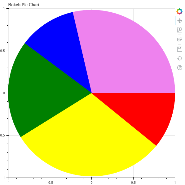
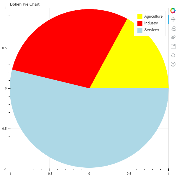
Ejemplo 2: En este ejemplo, visualizaremos algunos datos. En los datos, se nos proporciona la participación de los sectores en el VAB durante 2017-18 en India. Las acciones son:
Agriculture - 17.1%
Industry - 29.1%
Services - 53.8%
Para encontrar el start_angle y el end_angle necesitaremos convertir los porcentajes en radianes usando la siguiente fórmula:
math.radians((percent / 100) * 360)
# importing the modules
from bokeh.plotting import figure, output_file, show
import math

# file to save the model
output_file("gfg.html")

# instantiating the figure object
graph = figure(title = "Bokeh Pie Chart")

# name of the sectors
sectors = ["Agriculture", "Industry", "Services"]

# % tage weightage of the sectors
percentages = [17.1, 29.1, 53.8]

# converting into radians
radians = [math.radians((percent / 100) * 360) for percent in percentages]

# starting angle values
start_angle = [math.radians(0)]
prev = start_angle[0]
for i in radians[:-1]:
    start_angle.append(i + prev)
    prev = i + prev

# ending angle values
end_angle = start_angle[1:] + [math.radians(0)]

# center of the pie chart
x = 0
y = 0

# radius of the glyphs
radius = 1

# color of the wedges
color = ["yellow", "red", "lightblue"]

# plotting the graph
for i in range(len(sectors)):
    graph.wedge(x, y, radius,
                start_angle = start_angle[i],
                end_angle = end_angle[i],
                color = color[i],
                legend_label = sectors[i])

# displaying the graph
show(graph)
Producción :