En este artículo, veamos cómo agregar varios ejes Y de diferentes escalas en los gráficos de Plotly en Python.
Actualmente, Plotly Express no admite múltiples ejes Y en una sola figura. Entonces, usaremos Plotly go. Plotly proporciona una función llamada make_subplots() para trazar gráficos con múltiples ejes Y.
Sintaxis:
plotly.subplots.make_subplots(filas=1, columnas=1, especificaciones=Ninguna)
Parámetro:
- filas: un número de filas en la cuadrícula de la subparcela. (filas > 0). predeterminado 1
- cols: un número de columnas en la cuadrícula de la subparcela. (columnas > 0). predeterminado 1
- especificaciones: (lista de listas de dict o Ninguno (predeterminado Ninguno)). Especificaciones por subparcela del tipo de subparcela, extensión de fila/columna y espaciado.
Primero, importe las funciones necesarias del paquete Plotly y cree los ejes secundarios usando el parámetro de especificaciones en la función make_subplots() como se muestra. Trace un diagrama de dispersión con múltiples ejes y . Haga que el gráfico sea legible agregando títulos a los ejes x e y .
Ejemplo: Sumar 2 ejes y
Python3
# import graph_objects from plotly package
import plotly.graph_objects as go

# import make_subplots function from plotly.subplots
# to make grid of plots
from plotly.subplots import make_subplots

# use specs parameter in make_subplots function
# to create secondary y-axis
fig = make_subplots(specs=[[{"secondary_y": True}]])

# plot a scatter chart by specifying the x and y values
# Use add_trace function to specify secondary_y axes.
fig.add_trace(
    go.Scatter(x=[10, 20, 30], y=[400, 500, 600], name="yaxis values"),
    secondary_y=False)

# Use add_trace function and specify secondary_y axes = True.
fig.add_trace(
    go.Scatter(x=[20, 30, 40], y=[40, 50, 60], name="yaxis2 values"),
    secondary_y=True,)

# Adding title text to the figure
fig.update_layout(
    title_text="Multiple Y Axis in Plotly"
)

# Naming x-axis
fig.update_xaxes(title_text="X - axis")

# Naming y-axes
fig.update_yaxes(title_text="<b>Main</b> Y - axis ", secondary_y=False)
fig.update_yaxes(title_text="<b>secondary</b> Y - axis ", secondary_y=True)
Producción:
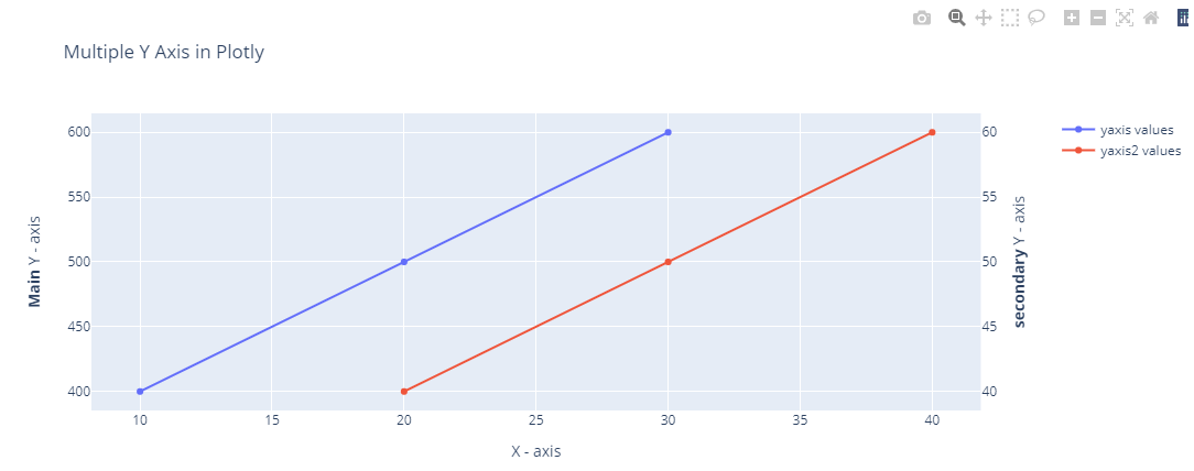
Gráfico de dispersión Plotly con múltiples ejes y
Ejemplo: Sumar 2 ejes y
Python3
# import graph_objects from plotly package
import plotly.graph_objects as go

# import make_subplots function from plotly.subplots
# to make grid of plots
from plotly.subplots import make_subplots

# use specs parameter in make_subplots function
# to create secondary y-axis
fig = make_subplots(specs=[[{"secondary_y": True}]])

# plot a bar chart by specifying the x and y values
# Use add_trace function to specify secondary_y axes.
fig.add_trace(
    go.Bar(x=[10, 20, 30], y=[40, 50, 60], name="yaxis values"),
    secondary_y=False)

# Use add_trace function and specify secondary_y axes = True.
fig.add_trace(
    go.Bar(x=[20, 30, 40], y=[400, 500, 600], name="yaxis2 values"),
    secondary_y=True,)

# Adding title text to the figure
fig.update_layout(
    title_text="Multiple Y Axis in Plotly"
)

# Naming x-axis
fig.update_xaxes(title_text="X - axis")

# Naming y-axes
fig.update_yaxes(title_text="<b>Main</b> Y - axis ", secondary_y=False)
fig.update_yaxes(title_text="<b>secondary</b> Y - axis ", secondary_y=True)
Producción:
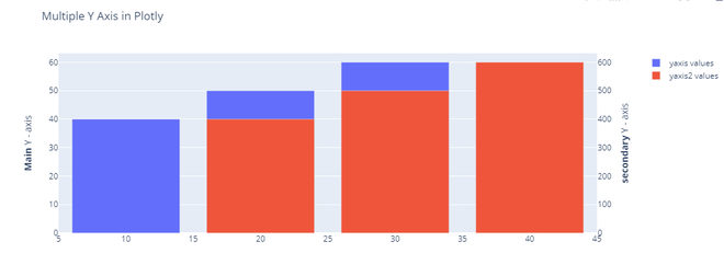
Gráfico de barras plotly con varios ejes y
Gráfico plotly con múltiples ejes Y
Ahora, veamos cómo trazar un gráfico de dispersión con más de 2 ejes Y o varios ejes Y. El procedimiento es el mismo que el anterior, el cambio se produce en la parte del diseño de la figura para que el gráfico sea más agradable a la vista.
Importe las funciones necesarias del paquete Plotly. Cree los ejes secundarios usando el parámetro de especificaciones en la función make_subplots como se muestra. Trace un diagrama de dispersión con múltiples ejes y.
Ejemplo: agregar más de varios ejes y
Python3
# import the graph_objects function from
# plotly package
import plotly.graph_objects as go

# initialize a Figure object and store it in
# a variable fig
fig = go.Figure()

# add x and y values for the 1st scatter
# plot and name the yaxis as yaxis1 values
fig.add_trace(go.Scatter(
    x=[10, 12, 13],
    y=[41, 58, 60],
    name="yaxis1 values"
))

# add x and y values for the 2nd scatter
# plot and name the yaxis as yaxis2 values
fig.add_trace(go.Scatter(
    x=[12, 13, 14],
    y=[401, 501, 610],
    name="yaxis2 values",
    yaxis="y2"
))

# add x and y values for the 3rd scatter
# plot and name the yaxis as yaxis3 values
fig.add_trace(go.Scatter(
    x=[14, 15, 16],
    y=[42000, 53000, 65000],
    name="yaxis3 values",
    yaxis="y3"
))

# add x and y values for the 4th scatter plot
# and name the yaxis as yaxis4 values
fig.add_trace(go.Scatter(
    x=[15, 16, 17],
    y=[2000, 5000, 7000],
    name="yaxis4 values",
    yaxis="y4"
))

# Create axis objects
fig.update_layout(
    # split the x-axis to fraction of plots in
    # proportions
    xaxis=dict(
        domain=[0.3, 0.7]
    ),

    # pass the y-axis title, titlefont, color
    # and tickfont as a dictionary and store
    # it an variable yaxis
    yaxis=dict(
        title="yaxis 1",
        titlefont=dict(
            color="#0000ff"
        ),
        tickfont=dict(
            color="#0000ff"
        )
    ),

    # pass the y-axis 2 title, titlefont, color and
    # tickfont as a dictionary and store it an
    # variable yaxis 2
    yaxis2=dict(
        title="yaxis 2",
        titlefont=dict(
            color="#FF0000"
        ),
        tickfont=dict(
            color="#FF0000"
        ),
        anchor="free",  # specifying x - axis has to be the fixed
        overlaying="y",  # specifyinfg y - axis has to be separated
        side="left",  # specifying the side the axis should be present
        position=0.2  # specifying the position of the axis
    ),

    # pass the y-axis 3 title, titlefont, color and
    # tickfont as a dictionary and store it an
    # variable yaxis 3
    yaxis3=dict(
        title="yaxis 3",
        titlefont=dict(
            color="#006400"
        ),
        tickfont=dict(
            color="#006400"
        ),
        anchor="x",     # specifying x - axis has to be the fixed
        overlaying="y",  # specifyinfg y - axis has to be separated
        side="right"  # specifying the side the axis should be present
    ),

    # pass the y-axis 4 title, titlefont, color and
    # tickfont as a dictionary and store it an
    # variable yaxis 4
    yaxis4=dict(
        title="yaxis 4",
        titlefont=dict(
            color="#8f00ff"
        ),
        tickfont=dict(
            color="#8f00ff"
        ),
        anchor="free",  # specifying x - axis has to be the fixed
        overlaying="y",  # specifyinfg y - axis has to be separated
        side="right",  # specifying the side the axis should be present
        position=0.8  # specifying the position of the axis
    )
)


# Update layout of the plot namely title_text, width
# and place it in the center using title_x parameter
# as shown
fig.update_layout(
    title_text="4 y-axes scatter plot in plotly",
    width=1000,
    title_x=0.5
)
Producción:
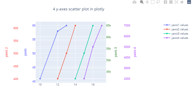
Gráfico de dispersión Plotly con múltiples ejes y
Publicación traducida automáticamente
Artículo escrito por jssuriyakumar y traducido por Barcelona Geeks. The original can be accessed here. Licence: CCBY-SA