Requisito previo: Python trabajando con pandas y xlsxwriter | serie 1
Python Pandas es una biblioteca de análisis de datos. Puede leer, filtrar y reorganizar conjuntos de datos pequeños y grandes y generarlos en una variedad de formatos, incluido Excel.
Pandas escribe archivos de Excel utilizando los módulos XlsxWriter.
XlsxWriteres un módulo de Python para escribir archivos en el formato de archivo XLSX. Se puede usar para escribir texto, números y fórmulas en varias hojas de trabajo. Además, admite funciones como formato, imágenes, gráficos, configuración de página, filtros automáticos, formato condicional y muchos otros.
Código n.º 1: Trace un gráfico de columnas con Pandas y XlsxWriter.
# import pandas library as pd
import pandas as pd

# Create a Pandas dataframe from some data.
dataframe = pd.DataFrame({
                    'Subject': ["Math", "Physics", "Computer",
                                "Hindi", "English", "chemistry"],
                   'Mid Exam Score' :  [90, 78, 60, 80, 60, 90],
                   'End Exam Score' : [45, 39, 30, 40, 30, 60] })

# Create a Pandas Excel writer
# object using XlsxWriter as the engine.
writer_object = pd.ExcelWriter('pandas_column_chart.xlsx',
                                     engine ='xlsxwriter')

# Write a dataframe to the worksheet.
dataframe.to_excel(writer_object, sheet_name ='Sheet1')

# Create xlsxwriter workbook object .
workbook_object = writer_object.book

# Create xlsxwriter worksheet object
worksheet_object = writer_object.sheets['Sheet1']

# set width of the B and C column
worksheet_object.set_column('B:C', 20)

# Create a chart object that can be added
# to a worksheet using add_chart() method.

# here we create a column chart object .
chart_object = workbook_object.add_chart({'type': 'column'})

# Add a data series to a chart
# using add_series method.

# Configure the first series.
# syntax to define ranges is :
# [sheetname, first_row, first_col, last_row, last_col].
chart_object.add_series({
    'name':       ['Sheet1', 0, 2],
    'categories': ['Sheet1', 1, 3, 6, 3],
    'values':     ['Sheet1', 1, 2, 6, 2],
    })

# Configure a second series.
chart_object.add_series({
    'name':       ['Sheet1', 0, 1],
    'categories': ['Sheet1', 1, 3, 6, 3],
    'values':     ['Sheet1', 1, 1, 6, 1],
    })

# Add a chart title.
chart_object.set_title({'name': 'Exam Score Distribution'})

# Add x-axis label
chart_object.set_x_axis({'name': 'Subjects'})

# Add y-axis label
chart_object.set_y_axis({'name': 'Marks'})

# add chart to the worksheet with given
# offset values at the top-left corner of
# a chart is anchored to cell E2
worksheet_object.insert_chart('E2', chart_object,
                {'x_offset': 20, 'y_offset': 5})

# Close the Pandas Excel writer
# object and output the Excel file.
writer_object.save()
Salida: 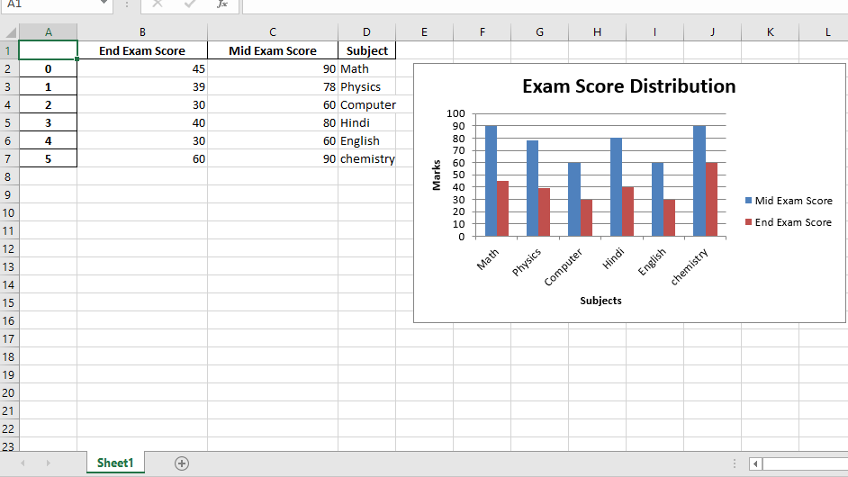
Código #2: Trace un gráfico de líneas usando Pandas y XlsxWriter.
# import pandas library as pd
import pandas as pd

# Create a Pandas dataframe from some data.
dataframe = pd.DataFrame({
                    'Subject': ["Math", "Physics", "Computer",
                                "Hindi", "English", "chemistry"],
                   'Mid Exam Score' :  [95, 78, 80, 80, 60, 95],
                   'End Exam Score' : [90, 67, 78, 70, 63, 90]
                    })

# Create a Pandas Excel writer
# object using XlsxWriter as the engine.
writer_object = pd.ExcelWriter('pandas_line_chart.xlsx',
                                   engine ='xlsxwriter')

# Write a dataframe to the worksheet.
dataframe.to_excel(writer_object, sheet_name ='Sheet1')

# Create xlsxwriter workbook object .
workbook_object = writer_object.book

# Create xlsxwriter worksheet object
worksheet_object = writer_object.sheets['Sheet1']

# set width of the B and C column
worksheet_object.set_column('B:C', 20)


# Create a chart object that can be added
# to a worksheet using add_chart() method.

# here we create a line chart object .
chart_object = workbook_object.add_chart({'type': 'line'})

# Add a data series to a chart
# using add_series method.

# Configure the first series.
# syntax to define ranges is :
# [sheetname, first_row, first_col, last_row, last_col].
chart_object.add_series({
    'name':       ['Sheet1', 0, 2],
    'categories': ['Sheet1', 1, 3, 6, 3],
    'values':     ['Sheet1', 1, 2, 6, 2],
    })

# Configure a second series.
chart_object.add_series({
    'name':       ['Sheet1', 0, 1],
    'categories': ['Sheet1', 1, 3, 6, 3],
    'values':     ['Sheet1', 1, 1, 6, 1],
    })

# Add a chart title.
chart_object.set_title({'name': 'Exam Score Distribution'})

# Add x-axis label
chart_object.set_x_axis({'name': 'Subjects'})

# Add y-axis label
chart_object.set_y_axis({'name': 'Marks'})

# add chart to the worksheet with given
# offset values at the top-left corner of
# a chart is anchored to cell E2
worksheet_object.insert_chart('E2', chart_object,
                 {'x_offset': 20, 'y_offset': 5})

# Close the Pandas Excel writer
# object and output the Excel file.
writer_object.save()
Salida: 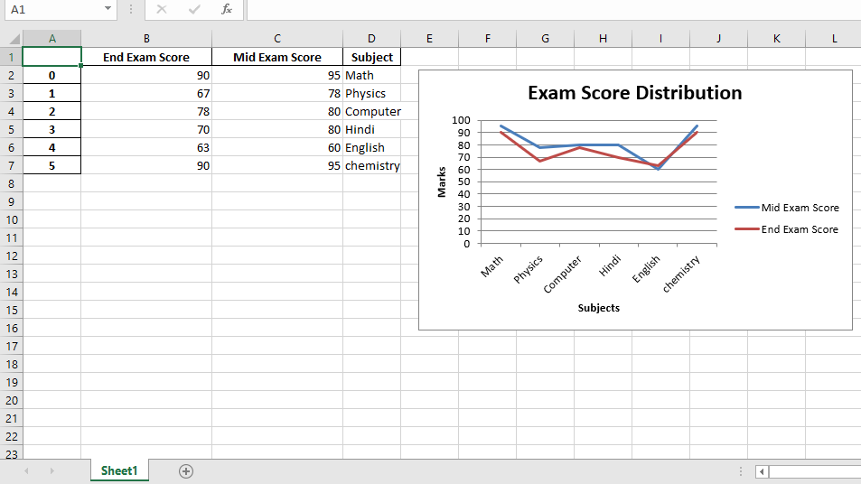
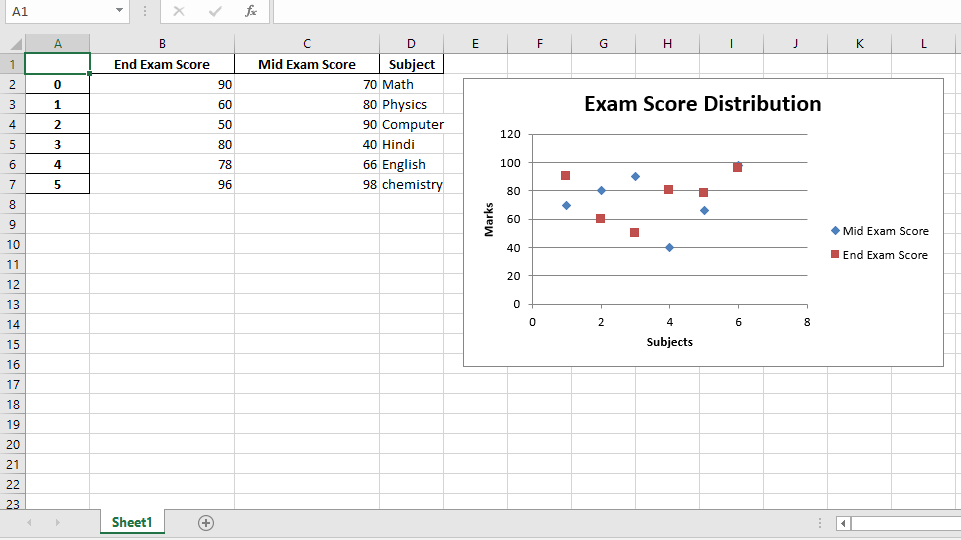
Código #3: Trace un gráfico de dispersión usando Pandas y XlsxWriter.
# import pandas library as pd
import pandas as pd

# Create a Pandas dataframe from some data.
dataframe = pd.DataFrame({
                    'Subject': ["Math", "Physics", "Computer",
                             "Hindi", "English", "chemistry"],
                   'Mid Exam Score' :  [70, 80, 90, 40, 66, 98],
                   'End Exam Score' : [90, 60, 50, 80, 78, 96]
                    })

# Create a Pandas Excel writer
# object using XlsxWriter as the engine.
writer_object = pd.ExcelWriter('pandas_Scatter_chart.xlsx',
                                      engine ='xlsxwriter')

# Write a dataframe to the worksheet.
dataframe.to_excel(writer_object, sheet_name ='Sheet1')

# Create xlsxwriter workbook object .
workbook_object = writer_object.book

# Create xlsxwriter worksheet object
worksheet_object = writer_object.sheets['Sheet1']

# set width of the B and C column
worksheet_object.set_column('B:C', 20)


# Create a chart object that can be added
# to a worksheet using add_chart() method.

# here we create a scatter chart object .
chart_object = workbook_object.add_chart({'type': 'scatter'})

# Add a data series to a chart
# using add_series method.

# Configure the first series.
# syntax to define ranges is :
# [sheetname, first_row, first_col, last_row, last_col].
chart_object.add_series({
    'name':       ['Sheet1', 0, 2],
    'categories': ['Sheet1', 1, 3, 6, 3],
    'values':     ['Sheet1', 1, 2, 6, 2],
    })

# Configure a second series.
chart_object.add_series({
    'name':       ['Sheet1', 0, 1],
    'categories': ['Sheet1', 1, 3, 6, 3],
    'values':     ['Sheet1', 1, 1, 6, 1],
    })

# Add a chart title.
chart_object.set_title({'name': 'Exam Score Distribution'})

# Add x-axis label
chart_object.set_x_axis({'name': 'Subjects'})

# Add y-axis label
chart_object.set_y_axis({'name': 'Marks'})

# add chart to the worksheet with given
# offset values at the top-left corner of
# a chart is anchored to cell E2
worksheet_object.insert_chart('E2', chart_object,
                {'x_offset': 20, 'y_offset': 5})

# Close the Pandas Excel writer
# object and output the Excel file.
writer_object.save()
Producción :