Requisito previo: crear y escribir en una hoja de Excel
XlsxWriteres una biblioteca de Python con la que se pueden realizar múltiples operaciones en archivos de Excel, como crear, escribir, operaciones aritméticas y trazar gráficos. Veamos cómo trazar diferentes tipos de gráficos de estilo, utilizando datos en tiempo real.
Los gráficos se componen de al menos una serie de uno o más puntos de datos. Las series en sí mismas se componen de referencias a rangos de celdas. Para trazar los gráficos en una hoja de Excel, en primer lugar, cree un objeto de gráfico de un tipo de gráfico específico (es decir, gráfico de líneas, columnas, etc.). Después de crear objetos de gráfico, inserte datos en él y, por último, agregue ese objeto de gráfico en el objeto de hoja.
Código: Trace diferentes tipos de gráficos de estilo.
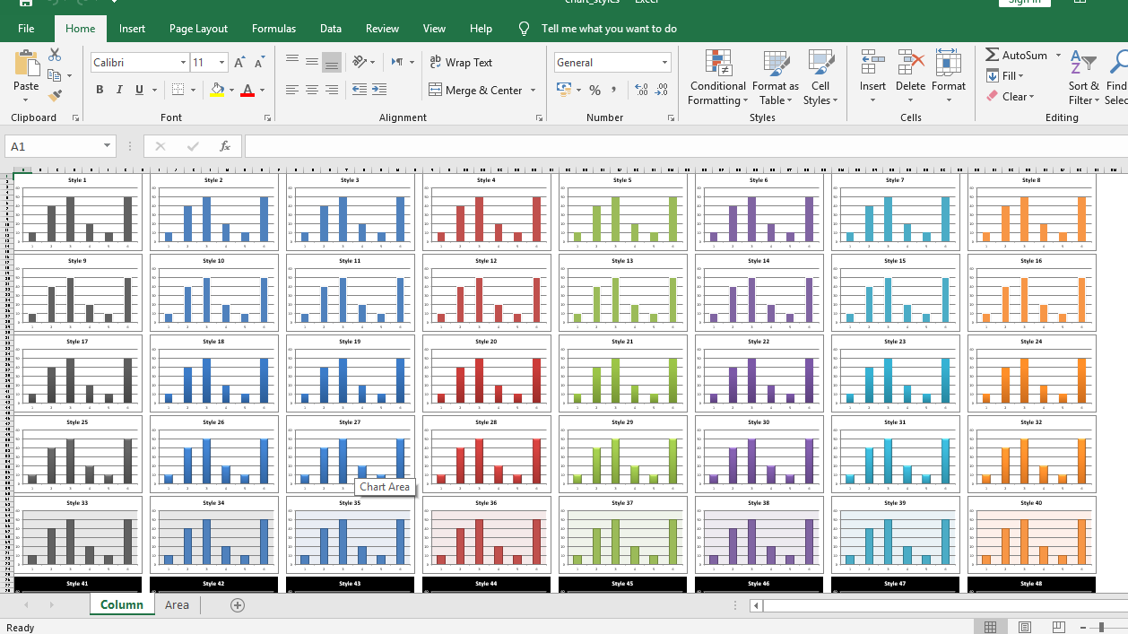
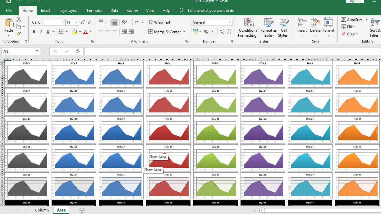
Para trazar diferentes tipos de gráficos de estilo en una hoja de Excel, use set_style()método del objeto de gráfico con la identificación de estilo respectiva.
# import xlsxwriter module
import xlsxwriter

# Workbook() takes one, non-optional, argument
# which is the filename that we want to create.
workbook = xlsxwriter.Workbook('chart_styles.xlsx')

# Show the styles for column and area chart types.
chart_types = ['column', 'area']

for chart_type in chart_types:

    # The workbook object is then used to add new
    # worksheet via the add_worksheet() method.
    # Add a worksheet for each chart type
    worksheet = workbook.add_worksheet(chart_type.title())

    # set zoom option
    worksheet.set_zoom(30)

    # initialize style
    style_number = 1

    # Create 48 built-in styles, each with a different style.
    # each chart dimension is 15 X 8.
    for row_num in range(0, 90, 15):
        for col_num in range(0, 64, 8):

            # Create a chart object that can be added
            # to a worksheet using add_chart() method.

            # here we create a respective chart object .
            chart = workbook.add_chart({'type': chart_type})

            # Add a data series to a chart
            # using add_series method.
            chart.add_series({'values': '= Data !$A$1:$A$6'})

            # Add a chart title
            chart.set_title ({'name': 'Style % d' % style_number})

            # Turn off the chart legend.
            chart.set_legend({'none': True})

            # Set an Excel chart style.
            chart.set_style(style_number)

            # add chart to the worksheet
            # at the top-left corner of
            # a chart is anchored to
            # respective position of cell.
            worksheet.insert_chart(row_num, col_num, chart)

            # do increment
            style_number += 1

# The workbook object is then used to add new
# worksheet via the add_worksheet() method.
# create a worksheet for writing data.
data_worksheet = workbook.add_worksheet('Data')

# create a data list .
data = [10, 40, 50, 20, 10, 50]

# Write a column of data starting from 'A1'
data_worksheet.write_column('A1', data)

# hide the data worksheet
data_worksheet.hide()

# Finally, close the Excel file
# via the close() method.
workbook.close()
Producción :