Requisito previo: crear y escribir en una hoja de Excel
XlsxWriter es una biblioteca de Python con la que se pueden realizar múltiples operaciones en archivos de Excel, como crear, escribir, operaciones aritméticas y trazar gráficos. Veamos cómo trazar gráficos con tablas de datos usando datos en tiempo real.
Los gráficos se componen de al menos una serie de uno o más puntos de datos. Las series en sí mismas se componen de referencias a rangos de celdas. Para trazar los gráficos en una hoja de Excel, en primer lugar, cree un objeto de gráfico de un tipo de gráfico específico (es decir, gráfico de columnas, etc.). Después de crear objetos de gráfico, inserte datos en él y, por último, agregue ese objeto de gráfico en el objeto de hoja.
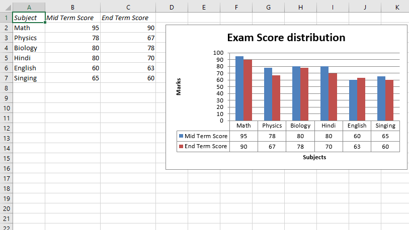
Código n.º 1: Trace un gráfico de columnas con la tabla de datos predeterminada.
Para trazar este tipo de gráfico en una hoja de Excel, use el método set_table() del objeto gráfico.
Python3
# import xlsxwriter module
import xlsxwriter

# Workbook() takes one, non-optional, argument
# which is the filename that we want to create.
workbook = xlsxwriter.Workbook('Ex_chart2.xlsx')

# The workbook object is then used to add new
# worksheet via the add_worksheet() method.
worksheet = workbook.add_worksheet()

# Create a new Format object to formats cells
# in worksheets using add_format() method .

# here we create italic format object
bold = workbook.add_format({'italic': 1})

# Add the worksheet data that the charts will refer to.
Data1 = ['Subject', 'Mid Term Score', 'End Term Score']
Data2 = [["Math", "Physics", "Biology", "Hindi", "English", "Singing"],
         [95, 78, 80, 80, 60, 65],
         [90, 67, 78, 70, 63, 60]]

# Write a row of data starting from 'A1'
# with bold format .
worksheet.write_row('A1', Data1, bold)

# Write a column of data starting from
# 'A2', 'B2', 'C2' respectively .
worksheet.write_column('A2', Data2[0])
worksheet.write_column('B2', Data2[1])
worksheet.write_column('C2', Data2[2])

# set the width of B and C column
worksheet.set_column('B:C', 15)

# Create a chart object that can be added
# to a worksheet using add_chart() method.

# here we create a column chart object .
chart1 = workbook.add_chart({'type': 'column'})

# Add a data series to a chart
# using add_series method.

# Configure the first series.
# = Sheet1 !$A$1 is equivalent to ['Sheet1', 0, 0].

# note : spaces is not inserted in b/w
# = and Sheet1, Sheet1 and !
# if space is inserted it throws warning.
chart1.add_series({
    'name':       '= Sheet1 !$B$1',
    'categories': '= Sheet1 !$A$2:$A$7',
    'values':     '= Sheet1 !$B$2:$B$7', })

# Configure a second series.
# Note use of alternative syntax to define ranges.
# [sheetname, first_row, first_col, last_row, last_col].
chart1.add_series({
    'name':       ['Sheet1', 0, 2],
    'categories': ['Sheet1', 1, 0, 6, 0],
    'values':     ['Sheet1', 1, 2, 6, 2], })

# Add a chart title
chart1.set_title({'name': 'Exam Score distribution'})

# Add x-axis label
chart1.set_x_axis({'name': 'Subjects'})

# Add y-axis label
chart1.set_y_axis({'name': 'Marks'})

# set the style of the chart.
chart1.set_style(14)

# set the plot area layout of chart
chart1.set_plotarea({
    'layout': {
        'x':      0.15,
        'y':      0.09,
        'width':  0.63,
        'height': 0.40, } })

# Set a data table on the X-Axis
# with the legend keys shown.
chart1.set_table()

# add chart to the worksheet with given
# offset values at the top-left corner of
# a chart is anchored to cell D2 .
worksheet.insert_chart('D2', chart1,
    {'x_offset': 20, 'y_offset': 5})

# Finally, close the Excel file
# via the close() method.
workbook.close()
Producción :
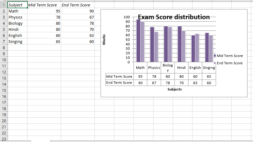
Código n.º 2: trace un gráfico de columnas con una tabla de datos predeterminada con claves de leyenda.
Para trazar este tipo de gráfico en una hoja de Excel, use el método set_table() con el argumento de palabra clave ‘show_keys’ del objeto del gráfico.
Python3
# import xlsxwriter module
import xlsxwriter

# Workbook() takes one, non-optional, argument
# which is the filename that we want to create.
workbook = xlsxwriter.Workbook('Ex_chart1.xlsx')

# The workbook object is then used to add new
# worksheet via the add_worksheet() method.
worksheet = workbook.add_worksheet()

# Create a new Format object to formats cells
# in worksheets using add_format() method .

# here we create italic format object
bold = workbook.add_format({'italic': 1})

# Add the worksheet data that the charts will refer to.
Data1 = ['Subject', 'Mid Term Score', 'End Term Score']
Data2 = [ ["Math", "Physics", "Biology", "Hindi", "English", "Singing"],
          [95, 78, 80, 80, 60, 65],
          [90, 67, 78, 70, 63, 60] ]

# Write a row of data starting from 'A1'
# with bold format .
worksheet.write_row('A1', Data1, bold)

# Write a column of data starting from
# 'A2', 'B2', 'C2' respectively .
worksheet.write_column('A2', Data2[0])
worksheet.write_column('B2', Data2[1])
worksheet.write_column('C2', Data2[2])

# set the width of B and C column
worksheet.set_column('B:C', 15)

# Create a chart object that can be added
# to a worksheet using add_chart() method.

# here we create a column chart object .
chart2 = workbook.add_chart({'type': 'column'})

# Add a data series to a chart
# using add_series method.

# Configure the first series.
# = Sheet1 !$A$1 is equivalent
# to ['Sheet1', 0, 0].

# note : spaces is not inserted in b / w
# = and Sheet1, Sheet1 and !
# if space is inserted it throws warning.
chart2.add_series({
    'name':       '= Sheet1 !$B$1',
    'categories': '= Sheet1 !$A$2:$A$7',
    'values':     '= Sheet1 !$B$2:$B$7', })

# Configure a second series.
# Note use of alternative syntax to define ranges.
# [sheetname, first_row, first_col, last_row, last_col].
chart2.add_series({
    'name':       ['Sheet1', 0, 2],
    'categories': ['Sheet1', 1, 0, 6, 0],
    'values':     ['Sheet1', 1, 2, 6, 2], })

# Add a chart title
chart2.set_title({'name': 'Exam Score distribution'})

# Add x-axis label
chart2.set_x_axis({'name': 'Subjects'})

# Add y-axis label
chart2.set_y_axis({'name': 'Marks'})

# Set a data table on the X-Axis with the legend keys shown.
chart2.set_table({'show_keys': True})

# hide the chart legends.
chart2.set_legend({'position': 'none'})

# add chart to the worksheet with given
# offset values at the top-left corner of
# a chart is anchored to cell D2 .
worksheet.insert_chart('D2', chart2,
     {'x_offset': 20, 'y_offset': 5})

# Finally, close the Excel file
# via the close() method.
workbook.close()
Producción :