Requisito previo: crear y escribir en un archivo de Excel. XlsxWriter es una biblioteca de Python con la que se pueden realizar múltiples operaciones en archivos de Excel, como crear, escribir, operaciones aritméticas y trazar gráficos. Veamos cómo trazar diferentes tipos de gráficos de dispersión utilizando datos en tiempo real. Los gráficos se componen de al menos una serie de uno o más puntos de datos. Las series en sí mismas se componen de referencias a rangos de celdas. Para trazar los gráficos en una hoja de Excel, en primer lugar, cree un objeto de gráfico de un tipo de gráfico específico (es decir, Scatter, etc.). Después de crear objetos de gráfico, inserte datos en él y, por último, agregue ese objeto de gráfico en el objeto de hoja. Código #1:Trace el gráfico de dispersión simple. Para trazar el gráfico de dispersión simple en una hoja de Excel, use el método add_chart() con el argumento de palabra clave de tipo ‘Dispersión’ de un objeto de libro de trabajo.
Python3
# import xlsxwriter module
import xlsxwriter

# Workbook() takes one, non-optional, argument
# which is the filename that we want to create.
workbook = xlsxwriter.Workbook('chart_scatter.xlsx')

# The workbook object is then used to add new
# worksheet via the add_worksheet() method.
worksheet = workbook.add_worksheet()

# Create a new Format object to formats cells
# in worksheets using add_format() method .

# here we create bold format object .
bold = workbook.add_format({'bold': 1})

# create a data list .
headings = ['Number', 'Batch 1', 'Batch 2']

data = [
    [2, 3, 4, 5, 6, 7],
    [80, 80, 100, 60, 50, 100],
    [60, 50, 60, 20, 10, 20],
]

# Write a row of data starting from 'A1'
# with bold format .
worksheet.write_row('A1', headings, bold)

# Write a column of data starting from
# 'A2', 'B2', 'C2' respectively .
worksheet.write_column('A2', data[0])
worksheet.write_column('B2', data[1])
worksheet.write_column('C2', data[2])

# Create a chart object that can be added
# to a worksheet using add_chart() method.

# here we create a scatter chart object .
chart1 = workbook.add_chart({'type': 'scatter'})

# Add a data series to a chart
# using add_series method.

# Configure the first series.
# = Sheet1 !$A$1 is equivalent to ['Sheet1', 0, 0].

# note : spaces is not inserted in b / w
# = and Sheet1, Sheet1 and !
# if space is inserted it throws warning.
chart1.add_series({
    'name':       '= Sheet1 !$B$1',
    'categories': '= Sheet1 !$A$2:$A$7',
    'values':     '= Sheet1 !$B$2:$B$7',
})

# Configure a second series.
# Note use of alternative syntax to define ranges.
# [sheetname, first_row, first_col, last_row, last_col].
chart1.add_series({
    'name':       ['Sheet1', 0, 2],
    'categories': ['Sheet1', 1, 0, 6, 0],
    'values':     ['Sheet1', 1, 2, 6, 2],
})

# Add a chart title
chart1.set_title ({'name': 'Results of data analysis'})

# Add x-axis label
chart1.set_x_axis({'name': 'Test number'})

# Add y-axis label
chart1.set_y_axis({'name': 'Data length (mm)'})

# Set an Excel chart style.
chart1.set_style(11)

# add chart to the worksheet
# the top-left corner of a chart
# is anchored to cell E2 .
worksheet.insert_chart('E2', chart1)

# Finally, close the Excel file
# via the close() method.
workbook.close()
Salida: 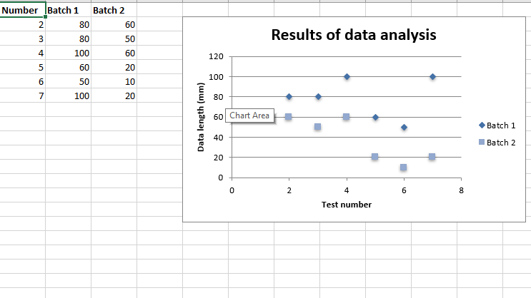 Código #2: Trace el subtipo de gráfico de dispersión con líneas rectas y marcadores. Para trazar este tipo de gráfico en una hoja de Excel, use el método add_chart() con el argumento de palabra clave de tipo ‘scatter’ y subtipo ‘straight_with_markers’ de un objeto de libro de trabajo.
Python3
# import xlsxwriter module
import xlsxwriter

# Workbook() takes one, non-optional, argument
# which is the filename that we want to create.
workbook = xlsxwriter.Workbook('chart_scatter2.xlsx')

# The workbook object is then used to add new
# worksheet via the add_worksheet() method.
worksheet = workbook.add_worksheet()

# Create a new Format object to formats cells
# in worksheets using add_format() method .

# here we create bold format object .
bold = workbook.add_format({'bold': 1})

# create a data list .
headings = ['Number', 'Batch 1', 'Batch 2']

data = [
    [2, 3, 4, 5, 6, 7],
    [80, 80, 100, 60, 50, 100],
    [60, 50, 60, 20, 10, 20],
]

# Write a row of data starting from 'A1'
# with bold format .
worksheet.write_row('A1', headings, bold)

# Write a column of data starting from
# 'A2', 'B2', 'C2' respectively .
worksheet.write_column('A2', data[0])
worksheet.write_column('B2', data[1])
worksheet.write_column('C2', data[2])

# Create a chart object that can be added
# to a worksheet using add_chart() method.

# here we create a  Scatter chart sub-type with
# straight lines and markers object .
chart1 = workbook.add_chart({'type': 'scatter', 'subtype': 'straight_with_markers'})

# Add a data series to a chart
# using add_series method.

# Configure the first series.
# = Sheet1 !$A$1 is equivalent to ['Sheet1', 0, 0].
chart1.add_series({
    'name':       '= Sheet1 !$B$1',
    'categories': '= Sheet1 !$A$2:$A$7',
    'values':     '= Sheet1 !$B$2:$B$7',
})

# Configure a second series.
# Note use of alternative syntax to define ranges.
# [sheetname, first_row, first_col, last_row, last_col].
chart1.add_series({
    'name':       ['Sheet1', 0, 2],
    'categories': ['Sheet1', 1, 0, 6, 0],
    'values':     ['Sheet1', 1, 2, 6, 2],
})

# Add a chart title
chart1.set_title ({'name': 'Results of data analysis'})

# Add x-axis label
chart1.set_x_axis({'name': 'Test number'})

# Add y-axis label
chart1.set_y_axis({'name': 'Data length (mm)'})

# Set an Excel chart style.
chart1.set_style(11)

# add chart to the worksheet
# the top-left corner of a chart
# is anchored to cell E2 .
worksheet.insert_chart('E2', chart1)

# Finally, close the Excel file
# via the close() method.
workbook.close()
Salida: 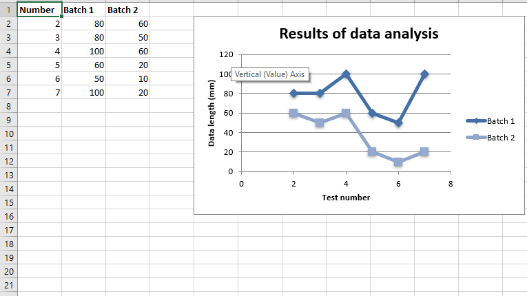 Código #3: Trace el subtipo de gráfico de dispersión con líneas rectas y sin marcadores. Para trazar este tipo de gráfico en una hoja de Excel, use el método add_chart() con el argumento de palabra clave de tipo ‘disperso’ y subtipo ‘directo’ de un objeto de libro de trabajo.
Python3
# import xlsxwriter module
import xlsxwriter

# Workbook() takes one, non-optional, argument
# which is the filename that we want to create.
workbook = xlsxwriter.Workbook('chart_scatter3.xlsx')

# The workbook object is then used to add new
# worksheet via the add_worksheet() method.
worksheet = workbook.add_worksheet()

# Create a new Format object to formats cells
# in worksheets using add_format() method .

# here we create bold format object .
bold = workbook.add_format({'bold': 1})

# create a data list .
headings = ['Number', 'Batch 1', 'Batch 2']

data = [
    [2, 3, 4, 5, 6, 7],
    [80, 80, 100, 60, 50, 100],
    [60, 50, 60, 20, 10, 20],
]

# Write a row of data starting from 'A1'
# with bold format .
worksheet.write_row('A1', headings, bold)

# Write a column of data starting from
# 'A2', 'B2', 'C2' respectively .
worksheet.write_column('A2', data[0])
worksheet.write_column('B2', data[1])
worksheet.write_column('C2', data[2])

# Create a chart object that can be added
# to a worksheet using add_chart() method.

# here we create a  Scatter chart sub-type with
# straight lines and no markers object .
chart1 = workbook.add_chart({'type': 'scatter', 'subtype': 'straight'})

# Add a data series to a chart
# using add_series method.

# Configure the first series.
# = Sheet1 !$A$1 is equivalent to ['Sheet1', 0, 0].
chart1.add_series({
    'name':       '= Sheet1 !$B$1',
    'categories': '= Sheet1 !$A$2:$A$7',
    'values':     '= Sheet1 !$B$2:$B$7',
})

# Configure a second series.
# Note use of alternative syntax to define ranges.
# [sheetname, first_row, first_col, last_row, last_col].
chart1.add_series({
    'name':       ['Sheet1', 0, 2],
    'categories': ['Sheet1', 1, 0, 6, 0],
    'values':     ['Sheet1', 1, 2, 6, 2],
})

# Add a chart title
chart1.set_title ({'name': 'Results of data analysis'})

# Add x-axis label
chart1.set_x_axis({'name': 'Test number'})

# Add y-axis label
chart1.set_y_axis({'name': 'Data length (mm)'})

# Set an Excel chart style.
chart1.set_style(11)

# add chart to the worksheet
# the top-left corner of a chart
# is anchored to cell E2 .
worksheet.insert_chart('E2', chart1)

# Finally, close the Excel file
# via the close() method.
workbook.close()
Salida: 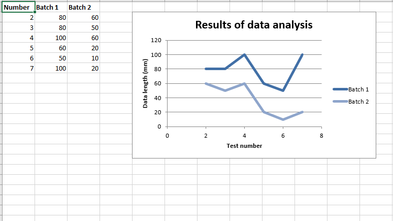 Código #4: Trace el subtipo de gráfico de dispersión con líneas suaves y marcadores. Para trazar este tipo de gráfico en una hoja de Excel, use el método add_chart() con el argumento de palabra clave de tipo ‘disperso’ y subtipo ‘suave_con_marcadores’ de un objeto de libro de trabajo.
Python3
# import xlsxwriter module
import xlsxwriter

# Workbook() takes one, non-optional, argument
# which is the filename that we want to create.
workbook = xlsxwriter.Workbook('chart_scatter4.xlsx')

# The workbook object is then used to add new
# worksheet via the add_worksheet() method.
worksheet = workbook.add_worksheet()

# Create a new Format object to formats cells
# in worksheets using add_format() method .

# here we create bold format object .
bold = workbook.add_format({'bold': 1})

# create a data list .
headings = ['Number', 'Batch 1', 'Batch 2']

data = [
    [2, 3, 4, 5, 6, 7],
    [80, 80, 100, 60, 50, 100],
    [60, 50, 60, 20, 10, 20],
]

# Write a row of data starting from 'A1'
# with bold format .
worksheet.write_row('A1', headings, bold)

# Write a column of data starting from
# 'A2', 'B2', 'C2' respectively .
worksheet.write_column('A2', data[0])
worksheet.write_column('B2', data[1])
worksheet.write_column('C2', data[2])

# Create a chart object that can be added
# to a worksheet using add_chart() method.

# here we create a  Scatter chart sub-type with
# smooth lines and markers object .
chart1 = workbook.add_chart({'type': 'scatter', 'subtype': 'smooth_with_markers'})

# Add a data series to a chart
# using add_series method.

# Configure the first series.
# = Sheet1 !$A$1 is equivalent to ['Sheet1', 0, 0].
chart1.add_series({
    'name':       '= Sheet1 !$B$1',
    'categories': '= Sheet1 !$A$2:$A$7',
    'values':     '= Sheet1 !$B$2:$B$7',
})

# Configure a second series.
# Note use of alternative syntax to define ranges.
# [sheetname, first_row, first_col, last_row, last_col].
chart1.add_series({
    'name':       ['Sheet1', 0, 2],
    'categories': ['Sheet1', 1, 0, 6, 0],
    'values':     ['Sheet1', 1, 2, 6, 2],
})

# Add a chart title
chart1.set_title ({'name': 'Results of data analysis'})

# Add x-axis label
chart1.set_x_axis({'name': 'Test number'})

# Add y-axis label
chart1.set_y_axis({'name': 'Data length (mm)'})

# Set an Excel chart style.
chart1.set_style(11)

# add chart to the worksheet
# the top-left corner of a chart
# is anchored to cell E2 .
worksheet.insert_chart('E2', chart1)

# Finally, close the Excel file
# via the close() method.
workbook.close()
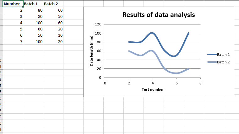
Salida: 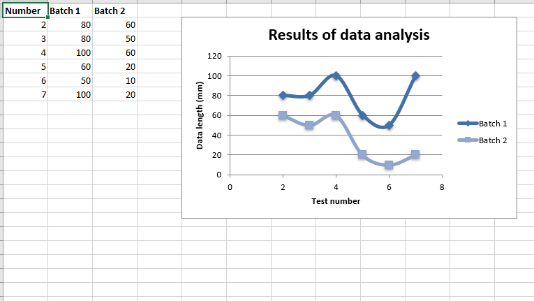 Código #5: Trace el subtipo de gráfico de dispersión con líneas suaves y sin marcadores. Para trazar este tipo de gráfico en una hoja de Excel, use el método add_chart() con el argumento de palabra clave de tipo ‘disperso’ y subtipo ‘suave’ de un objeto de libro de trabajo.
Python3
# import xlsxwriter module
import xlsxwriter

# Workbook() takes one, non-optional, argument
# which is the filename that we want to create.
workbook = xlsxwriter.Workbook('chart_scatter5.xlsx')

# The workbook object is then used to add new
# worksheet via the add_worksheet() method.
worksheet = workbook.add_worksheet()

# Create a new Format object to formats cells
# in worksheets using add_format() method .

# here we create bold format object .
bold = workbook.add_format({'bold': 1})

# create a data list .
headings = ['Number', 'Batch 1', 'Batch 2']

data = [
    [2, 3, 4, 5, 6, 7],
    [80, 80, 100, 60, 50, 100],
    [60, 50, 60, 20, 10, 20],
]

# Write a row of data starting from 'A1'
# with bold format .
worksheet.write_row('A1', headings, bold)

# Write a column of data starting from
# 'A2', 'B2', 'C2' respectively .
worksheet.write_column('A2', data[0])
worksheet.write_column('B2', data[1])
worksheet.write_column('C2', data[2])

# Create a chart object that can be added
# to a worksheet using add_chart() method.

# here we create a  Scatter chart sub-type with
# smooth lines and no markers object .
chart1 = workbook.add_chart({'type': 'scatter', 'subtype': 'smooth'})

# Add a data series to a chart
# using add_series method.

# Configure the first series.
# = Sheet1 !$A$1 is equivalent to ['Sheet1', 0, 0].
chart1.add_series({
    'name':       '= Sheet1 !$B$1',
    'categories': '= Sheet1 !$A$2:$A$7',
    'values':     '= Sheet1 !$B$2:$B$7',
})

# Configure a second series.
# Note use of alternative syntax to define ranges.
# [sheetname, first_row, first_col, last_row, last_col].
chart1.add_series({
    'name':       ['Sheet1', 0, 2],
    'categories': ['Sheet1', 1, 0, 6, 0],
    'values':     ['Sheet1', 1, 2, 6, 2],
})

# Add a chart title
chart1.set_title ({'name': 'Results of data analysis'})

# Add x-axis label
chart1.set_x_axis({'name': 'Test number'})

# Add y-axis label
chart1.set_y_axis({'name': 'Data length (mm)'})

# Set an Excel chart style.
chart1.set_style(11)

# add chart to the worksheet
# the top-left corner of a chart
# is anchored to cell E2 .
worksheet.insert_chart('E2', chart1)

# Finally, close the Excel file
# via the close() method.
workbook.close()
Producción: