Requisito previo: Python | Trazar gráficos en una hoja de Excel usando el módulo openpyxl | Conjunto: 1 Openpyxl es una biblioteca de Python con la que se pueden realizar múltiples operaciones en archivos de Excel, como lectura, escritura, operaciones aritméticas y trazado de gráficos. Los gráficos se componen de al menos una serie de uno o más puntos de datos. Las series en sí mismas se componen de referencias a rangos de celdas. Veamos cómo trazar Scatter, Bubble, Pie, 3D Pie Chart en una hoja de Excel usando openpyxl. Para trazar los gráficos en una hoja de Excel, en primer lugar, cree un objeto de gráfico de una clase de gráfico específica (es decir, ScatterChart, PieChart, etc.). Después de crear objetos de gráfico, inserte datos en él y, por último, agregue ese objeto de gráfico en el objeto de hoja. Veamos cómo trazar diferentes gráficos utilizando datos en tiempo real. Código #1:Trace el gráfico de burbujas. Los gráficos de burbujas son similares a los gráficos de dispersión, pero utilizan una tercera dimensión para determinar el tamaño de las burbujas. Los gráficos pueden incluir varias series. Para trazar el gráfico de burbujas en una hoja de Excel, use la clase BubbleChart del submódulo openpyxl.chart.
Python3
# import openpyxl module
import openpyxl

# import BubbleChart, Reference, Series class
# from openpyxl.chart sub_module
from openpyxl.chart import BubbleChart, Reference, Series

# Call a Workbook() function of openpyxl
# to create a new blank Workbook object
wb = openpyxl.Workbook()

# Get workbook active sheet
# from the active attribute.
sheet = wb.active

rows = [
    ("Number of Products", "Sales in USD", "Market share"),
    (14, 12200, 15),
    (20, 60000, 33),
    (18, 24400, 10),
    (22, 32000, 42),
]

# write content of each row in 1st, 2nd and 3rd
# column of the active sheet respectively.
for row in rows:
    sheet.append(row)

# Create object of BubbleChart class
chart = BubbleChart()

# create data for plotting
xvalues = Reference(sheet, min_col = 1,
                    min_row = 2, max_row = 5)

yvalues = Reference(sheet, min_col = 2,
                    min_row = 2, max_row = 5)

size = Reference(sheet, min_col = 3,
                min_row = 2, max_row = 5)

# create a 1st series of data
series = Series(values = yvalues, xvalues = xvalues,
                      zvalues = size, title ="2013")

# add series data to the chart object
chart.series.append(series)

# set the title of the chart
chart.title = " BUBBLE-CHART "

# set the title of the x-axis
chart.x_axis.title = " X_AXIS "

# set the title of the y-axis
chart.y_axis.title = " Y_AXIS "

# add chart to the sheet
# the top-left corner of a chart
# is anchored to cell E2 .
sheet.add_chart(chart, "E2")

# save the file
wb.save("bubbleChart.xlsx")
Salida: 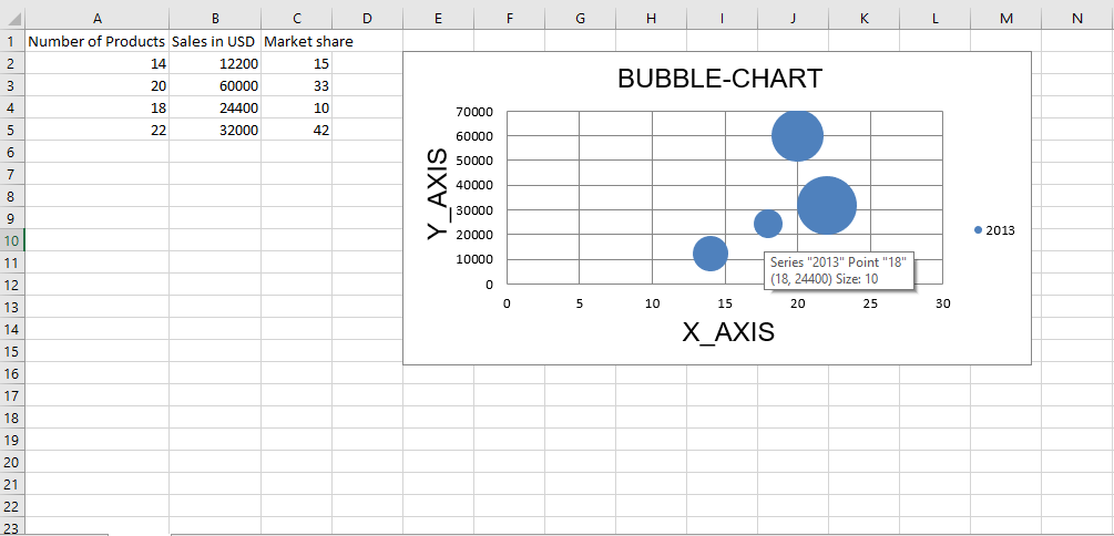 Código n.º 2 : Trace el gráfico de dispersión Los gráficos de dispersión o xy son similares a algunos gráficos de líneas. Para trazar el gráfico de dispersión en una hoja de Excel, use la clase ScatterChart del submódulo openpyxl.chart.
Python3
# import openpyxl module
import openpyxl

# import ScatterChart, Reference, Series
# class from openpyxl.chart sub_module
from openpyxl.chart import ScatterChart, Reference, Series

# Call a Workbook() function of openpyxl
# to create a new blank Workbook object
wb = openpyxl.Workbook()

# Get workbook active sheet
# from the active attribute.
sheet = wb.active

rows = [
    ("Number of Products", "Sales in USD", "Market share"),
    (14, 12200, 15),
    (20, 60000, 33),
    (18, 24400, 10),
    (22, 32000, 42),
]

# write content of each row in 1st, 2nd and 3rd
# column of the active sheet respectively .
for row in rows:
    sheet.append(row)

# Create object of ScatterChart class
chart = ScatterChart()

# create data for plotting
xvalues = Reference(sheet, min_col = 1,
                    min_row = 2, max_row = 5)

yvalues = Reference(sheet, min_col = 2,
                    min_row = 2, max_row = 5)

size = Reference(sheet, min_col = 3,
                 min_row = 2, max_row = 5)

# create a 1st series of data
series = Series(values = yvalues, xvalues = xvalues,
                      zvalues = size, title ="2013")

# add series data to the chart object
chart.series.append(series)

# set the title of the chart
chart.title = " SCATTER-CHART "

# set the title of the x-axis
chart.x_axis.title = " X_AXIS "

# set the title of the y-axis
chart.y_axis.title = " Y_AXIS "

# add chart to the sheet
# the top-left corner of a chart
# is anchored to cell E2 .
sheet.add_chart(chart, "E2")

# save the file
wb.save(" ScatterChart.xlsx")
Salida: 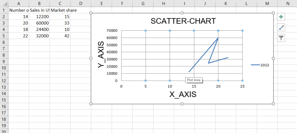 Código n.° 3 : Trace el gráfico circular Los gráficos circulares trazan los datos como porciones de un círculo en el que cada porción representa el porcentaje del total. Los cortes se trazan en el sentido de las agujas del reloj con 0° en la parte superior del círculo. Los gráficos circulares solo pueden tomar una sola serie de datos. Para trazar el gráfico circular en una hoja de Excel, use la clase PieChart del submódulo openpyxl.chart.
Python
# import openpyxl module
import openpyxl

# import PieChart, Reference class
# from openpyxl.chart sub_module
from openpyxl.chart import PieChart, Reference

# Call a Workbook() function of openpyxl
# to create a new blank Workbook object
wb = openpyxl.Workbook()

# Get workbook active sheet
# from the active attribute.
sheet = wb.active

datas = [
    ['Pie', 'Sold'],
    ['Apple', 50],
    ['Cherry', 30],
    ['Pumpkin', 10],
    ['Chocolate', 40],
]

# write content of each row in 1st, 2nd and 3rd
# column of the active sheet respectively .
for row in datas:
    sheet.append(row)

# Create object of PieChart class
chart = PieChart()

# create data for plotting
labels = Reference(sheet, min_col = 1,
                   min_row = 2, max_row = 5)

data = Reference(sheet, min_col = 2,
                   min_row = 1, max_row = 5)

# adding data to the Pie chart object
chart.add_data(data, titles_from_data = True)

# set labels in the chart object
chart.set_categories(labels)

# set the title of the chart
chart.title = " PIE-CHART "

# add chart to the sheet
# the top-left corner of a chart
# is anchored to cell E2 .
sheet.add_chart(chart, "E2")

# save the file
wb.save(" PieChart.xlsx")
Salida: 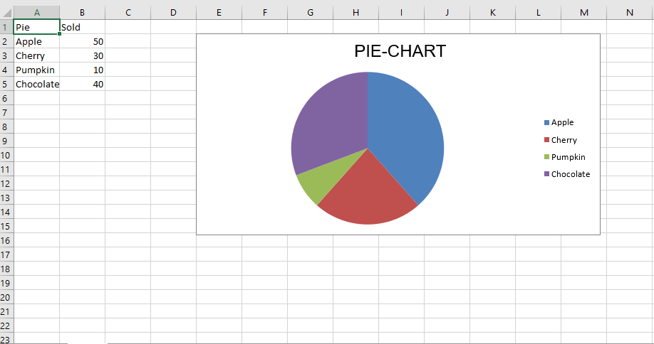 Código n.º 4 : Trazar el gráfico de barras Para trazar el gráfico circular 3D en una hoja de Excel, utilice la clase PieChart3D del submódulo openpyxl.chart.
Python3
# import openpyxl module
import openpyxl

# import PieChart3D, Reference class
# from openpyxl.chart sub_module
from openpyxl.chart import PieChart3D, Reference

# Call a Workbook() function of openpyxl
# to create a new blank Workbook object
wb = openpyxl.Workbook()

# Get workbook active sheet
# from the active attribute.
sheet = wb.active

datas = [
    ['Pie', 'Sold'],
    ['Apple', 50],
    ['Cherry', 30],
    ['Pumpkin', 10],
    ['Chocolate', 40],
]

# write content of each row in 1st, 2nd and 3rd
# column of the active sheet respectively .
for row in datas:
    sheet.append(row)

# Create object of PiChart3D class
chart = PieChart3D()

# create data for plotting
labels = Reference(sheet, min_col = 1,
                   min_row = 2, max_row = 5)
data = Reference(sheet, min_col = 2,
                   min_row = 1, max_row = 5)

# adding data to the Pie chart object
chart.add_data(data, titles_from_data = True)

# set labels in the chart object
chart.set_categories(labels)

# set the title of the chart
chart.title = " 3DPIE-CHART "

# add chart to the sheet
# the top-left corner of a chart
# is anchored to cell E2 .
sheet.add_chart(chart, "E2")

# save the file
wb.save(" 3DPieChart.xlsx")
Producción: 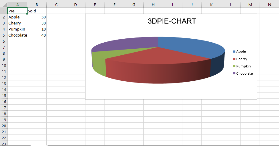
Publicación traducida automáticamente
Artículo escrito por GeeksforGeeks-1 y traducido por Barcelona Geeks. The original can be accessed here. Licence: CCBY-SA