El análisis exploratorio de datos o EDA es un enfoque o técnica estadística para analizar conjuntos de datos con el fin de resumir sus características importantes y principales, generalmente mediante el uso de algunas ayudas visuales. El enfoque EDA se puede utilizar para recopilar conocimientos sobre los siguientes aspectos de los datos:
- Principales características o rasgos de los datos.
- Las variables y sus relaciones.
- Averiguar las variables importantes que se pueden utilizar en nuestro problema.
EDA es un enfoque iterativo que incluye:
- Generando preguntas sobre nuestros datos
- Buscando las respuestas mediante el uso de visualización, transformación y modelado de nuestros datos.
- Usar las lecciones que aprendemos para refinar nuestro conjunto de preguntas o para generar un nuevo conjunto de preguntas.
Análisis exploratorio de datos en R
En R Language , vamos a realizar EDA bajo dos amplias clasificaciones:
- Estadísticas descriptivas, que incluyen media, mediana, moda, rango intercuartílico, etc.
- Métodos gráficos, que incluye histograma, estimación de densidad, diagramas de caja, etc.
Antes de comenzar a trabajar con EDA, debemos realizar la inspección de datos correctamente. Aquí, en nuestro análisis, usaremos loafercreek del paquete soilDB en R. Vamos a inspeccionar nuestros datos para encontrar todos los errores tipográficos y flagrantes. Se puede usar EDA adicional para determinar e identificar los valores atípicos y realizar el análisis estadístico requerido. Para realizar el EDA tendremos que instalar y cargar los siguientes paquetes:
- paquete «aqp»
- Paquete «ggplot2»
- paquete «soilDB»
Podemos instalar estos paquetes desde la consola R usando el comando install.packages() y cargarlos en nuestro R Script usando el comando library() . Ahora veremos cómo inspeccionar nuestros datos y eliminar los errores tipográficos y flagrantes.
Inspección de datos para EDA en R
Para asegurarnos de que estamos tratando con la información correcta, necesitamos una visión clara de sus datos en cada etapa del proceso de transformación. La inspección de datos es el acto de ver los datos con fines de verificación y depuración, antes, durante o después de una traducción. Ahora veamos cómo inspeccionar y eliminar los errores y errores tipográficos de los datos.
Ejemplo:
R
# Data Inspection in EDA
# loading the required packages
library(aqp)
library(soilDB)

# Load from the loafercreek dataset
data("loafercreek")

# Construct generalized horizon designations
n < - c("A", "BAt", "Bt1", "Bt2", "Cr", "R")

# REGEX rules
p < - c("A", "BA|AB", "Bt|Bw", "Bt3|Bt4|2B|C",
        "Cr", "R")

# Compute genhz labels and
# add to loafercreek dataset
loafercreek$genhz < - generalize.hz(
    loafercreek$hzname,
    n, p)

# Extract the horizon table
h < - horizons(loafercreek)

# Examine the matching of pairing of
# the genhz label to the hznames
table(h$genhz, h$hzname)

vars < - c("genhz", "clay", "total_frags_pct",
           "phfield", "effclass")
summary(h[, vars])

sort(unique(h$hzname))
h$hzname < - ifelse(h$hzname == "BT",
                    "Bt", h$hzname)
Producción:
> table(h$genhz, h$hzname)

           2BCt 2Bt1 2Bt2 2Bt3 2Bt4 2Bt5 2CB 2CBt 2Cr 2Crt 2R  A A1 A2 AB ABt Ad Ap  B BA BAt BC BCt Bt Bt1 Bt2 Bt3 Bt4 Bw Bw1 Bw2 Bw3  C
  A           0    0    0    0    0    0   0    0   0    0  0 97  7  7  0   0  1  1  0  0   0  0   0  0   0   0   0   0  0   0   0   0  0
  BAt         0    0    0    0    0    0   0    0   0    0  0  0  0  0  1   0  0  0  0 31   8  0   0  0   0   0   0   0  0   0   0   0  0
  Bt1         0    0    0    0    0    0   0    0   0    0  0  0  0  0  0   2  0  0  0  0   0  0   0  8  94  89   0   0 10   2   2   1  0
  Bt2         1    2    7    8    6    1   1    1   0    0  0  0  0  0  0   0  0  0  0  0   0  5  16  0   0   0  47   8  0   0   0   0  6
  Cr          0    0    0    0    0    0   0    0   4    2  0  0  0  0  0   0  0  0  0  0   0  0   0  0   0   0   0   0  0   0   0   0  0
  R           0    0    0    0    0    0   0    0   0    0  5  0  0  0  0   0  0  0  0  0   0  0   0  0   0   0   0   0  0   0   0   0  0
  not-used    0    0    0    0    0    0   0    0   0    0  0  0  0  0  0   0  0  0  1  0   0  0   0  0   0   0   0   0  0   0   0   0  0

           CBt Cd Cr Cr/R Crt H1 Oi  R Rt
  A          0  0  0    0   0  0  0  0  0
  BAt        0  0  0    0   0  0  0  0  0
  Bt1        0  0  0    0   0  0  0  0  0
  Bt2        6  1  0    0   0  0  0  0  0
  Cr         0  0 49    0  20  0  0  0  0
  R          0  0  0    1   0  0  0 41  1
  not-used   0  0  0    0   0  1 24  0  0

> summary(h[, vars])
      genhz          clay       total_frags_pct    phfield            effclass
 A       :113   Min.   :10.00   Min.   : 0.00   Min.   :4.90   very slight:  0
 BAt     : 40   1st Qu.:18.00   1st Qu.: 0.00   1st Qu.:6.00   slight     :  0
 Bt1     :208   Median :22.00   Median : 5.00   Median :6.30   strong     :  0
 Bt2     :116   Mean   :23.67   Mean   :14.18   Mean   :6.18   violent    :  0
 Cr      : 75   3rd Qu.:28.00   3rd Qu.:20.00   3rd Qu.:6.50   none       : 86
 R       : 48   Max.   :60.00   Max.   :95.00   Max.   :7.00   NA's       :540
 not-used: 26   NA's   :173                     NA's   :381

> sort(unique(h$hzname))
 [1] "2BCt" "2Bt1" "2Bt2" "2Bt3" "2Bt4" "2Bt5" "2CB"  "2CBt" "2Cr"  "2Crt" "2R"   "A"    "A1"   "A2"   "AB"   "ABt"  "Ad"   "Ap"   "B"
[20] "BA"   "BAt"  "BC"   "BCt"  "Bt"   "Bt1"  "Bt2"  "Bt3"  "Bt4"  "Bw"   "Bw1"  "Bw2"  "Bw3"  "C"    "CBt"  "Cd"   "Cr"   "Cr/R" "Crt"
[39] "H1"   "Oi"   "R"    "Rt"
Ahora proceda con el EDA.
Estadística Descriptiva en EDA
Para la Estadística Descriptiva con el fin de realizar EDA en R, dividiremos todas las funciones en las siguientes categorías:
- Medidas de tendencia central
- Medidas de dispersión
- Correlación
Intentaremos determinar los valores del punto medio usando las funciones bajo las Medidas de tendencia central . En esta sección, calcularemos la media, la mediana, la moda y las frecuencias .
Ejemplo 1: Ahora vea las medidas de tendencia central en este ejemplo.
R
# EDA
# Descriptive Statistics
# Measures of Central Tendency

#loading the required packages
library(aqp)
library(soilDB)

# Load from the loafercreek dataset
data("loafercreek")

# Construct generalized horizon designations
n <- c("A", "BAt", "Bt1", "Bt2", "Cr", "R")

# REGEX rules
p <- c("A", "BA|AB", "Bt|Bw", "Bt3|Bt4|2B|C",
       "Cr", "R")

# Compute genhz labels and
# add to loafercreek dataset
loafercreek$genhz <- generalize.hz(
                       loafercreek$hzname,
                       n, p)

# Extract the horizon table
h <- horizons(loafercreek)

# Examine the matching of pairing
# of the genhz label to the hznames
table(h$genhz, h$hzname)

vars <- c("genhz", "clay", "total_frags_pct",
          "phfield", "effclass")
summary(h[, vars])

sort(unique(h$hzname))
h$hzname <- ifelse(h$hzname == "BT",
                   "Bt", h$hzname)

# first remove missing values
# and create a new vector
clay <- na.exclude(h$clay)

mean(clay)
median(clay)
sort(table(round(h$clay)),
     decreasing = TRUE)[1]
table(h$genhz)
# append the table with
# row and column sums
addmargins(table(h$genhz,
                 h$texcl))

# calculate the proportions
# relative to the rows, margin = 1
# calculates for rows, margin = 2 calculates
# for columns, margin = NULL calculates
# for total observations
round(prop.table(table(h$genhz, h$texture_class),
                 margin = 1) * 100)
knitr::kable(addmargins(table(h$genhz, h$texcl)))

aggregate(clay ~ genhz, data = h, mean)
aggregate(clay ~ genhz, data = h, median)
aggregate(clay ~ genhz, data = h, summary)
Producción:
> mean(clay)
[1] 23.6713
> median(clay)
[1] 22
> sort(table(round(h$clay)), decreasing = TRUE)[1]
25
41
> table(h$genhz)
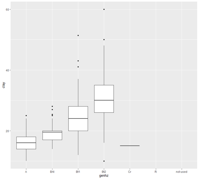
A BAt Bt1 Bt2 Cr R not-used
113 40 208 116 75 48 26
> addmargins(table(h$genhz, h$texcl))
cos s fs vfs lcos ls lfs lvfs cosl sl fsl vfsl l sil si scl cl sicl sc sic c Sum
A 0 0 0 0 0 0 0 0 0 6 0 0 78 27 0 0 0 0 0 0 0 111
BAt 0 0 0 0 0 0 0 0 0 1 0 0 31 4 0 0 2 1 0 0 0 39
Bt1 0 0 0 0 0 0 0 0 0 1 0 0 125 20 0 4 46 5 0 1 2 204
Bt2 0 0 0 0 0 0 0 0 0 0 0 0 28 5 0 5 52 3 0 1 16 110
Cr 0 0 0 0 0 0 0 0 0 0 0 0 0 0 0 0 0 0 0 0 1 1
R 0 0 0 0 0 0 0 0 0 0 0 0 0 0 0 0 0 0 0 0 0 0
not-used 0 0 0 0 0 0 0 0 0 0 0 0 0 0 0 0 1 0 0 0 0 1
Sum 0 0 0 0 0 0 0 0 0 8 0 0 262 56 0 9 101 9 0 2 19 466
> round(prop.table(table(h$genhz, h$texture_class), margin = 1) * 100)
br c cb cl gr l pg scl sic sicl sil sl spm
A 0 0 0 0 0 70 0 0 0 0 24 5 0
BAt 0 0 0 5 0 79 0 0 0 3 10 3 0
Bt1 0 1 0 23 0 61 0 2 0 2 10 0 0
Bt2 0 14 1 46 2 25 1 4 1 3 4 0 0
Cr 98 2 0 0 0 0 0 0 0 0 0 0 0
R 100 0 0 0 0 0 0 0 0 0 0 0 0
not-used 0 0 0 4 0 0 0 0 0 0 0 0 96
> knitr::kable(addmargins(table(h$genhz, h$texcl)))
| | cos| s| fs| vfs| lcos| ls| lfs| lvfs| cosl| sl| fsl| vfsl| l| sil| si| scl| cl| sicl| sc| sic| c| Sum|
|:--------|---:|--:|--:|---:|----:|--:|---:|----:|----:|--:|---:|----:|---:|---:|--:|---:|---:|----:|--:|---:|--:|---:|
|A | 0| 0| 0| 0| 0| 0| 0| 0| 0| 6| 0| 0| 78| 27| 0| 0| 0| 0| 0| 0| 0| 111|
|BAt | 0| 0| 0| 0| 0| 0| 0| 0| 0| 1| 0| 0| 31| 4| 0| 0| 2| 1| 0| 0| 0| 39|
|Bt1 | 0| 0| 0| 0| 0| 0| 0| 0| 0| 1| 0| 0| 125| 20| 0| 4| 46| 5| 0| 1| 2| 204|
|Bt2 | 0| 0| 0| 0| 0| 0| 0| 0| 0| 0| 0| 0| 28| 5| 0| 5| 52| 3| 0| 1| 16| 110|
|Cr | 0| 0| 0| 0| 0| 0| 0| 0| 0| 0| 0| 0| 0| 0| 0| 0| 0| 0| 0| 0| 1| 1|
|R | 0| 0| 0| 0| 0| 0| 0| 0| 0| 0| 0| 0| 0| 0| 0| 0| 0| 0| 0| 0| 0| 0|
|not-used | 0| 0| 0| 0| 0| 0| 0| 0| 0| 0| 0| 0| 0| 0| 0| 0| 1| 0| 0| 0| 0| 1|
|Sum | 0| 0| 0| 0| 0| 0| 0| 0| 0| 8| 0| 0| 262| 56| 0| 9| 101| 9| 0| 2| 19| 466|
> aggregate(clay ~ genhz, data = h, mean)
genhz clay
1 A 16.23113
2 BAt 19.53889
3 Bt1 24.14221
4 Bt2 31.35045
5 Cr 15.00000
> aggregate(clay ~ genhz, data = h, median)
genhz clay
1 A 16.0
2 BAt 19.5
3 Bt1 24.0
4 Bt2 30.0
5 Cr 15.0
> aggregate(clay ~ genhz, data = h, summary)
genhz clay.Min. clay.1st Qu. clay.Median clay.Mean clay.3rd Qu. clay.Max.
1 A 10.00000 14.00000 16.00000 16.23113 18.00000 25.00000
2 BAt 14.00000 17.00000 19.50000 19.53889 20.00000 28.00000
3 Bt1 12.00000 20.00000 24.00000 24.14221 28.00000 51.40000
4 Bt2 10.00000 26.00000 30.00000 31.35045 35.00000 60.00000
5 Cr 15.00000 15.00000 15.00000 15.00000 15.00000 15.00000
Ahora veremos las funciones bajo Medidas de Dispersión . En esta categoría, vamos a determinar los valores de dispersión alrededor del punto medio. Aquí vamos a calcular la varianza, la desviación estándar, el rango, el rango intercuartílico, el coeficiente de varianza y los cuartiles.
Ejemplo 2:
Veremos las medidas de dispersión en este ejemplo.
R
# EDA
# Descriptive Statistics
# Measures of Dispersion

# loading the packages
library(aqp)
library(soilDB)

# Load from the loafercreek dataset
data("loafercreek")

# Construct generalized horizon designations
n <- c("A", "BAt", "Bt1", "Bt2", "Cr", "R")

# REGEX rules
p <- c("A", "BA|AB", "Bt|Bw", "Bt3|Bt4|2B|C",
       "Cr", "R")

# Compute genhz labels and add
# to loafercreek dataset
loafercreek$genhz <- generalize.hz(
                     loafercreek$hzname,
                       n, p)

# Extract the horizon table
h <- horizons(loafercreek)

# Examine the matching of pairing of
# the genhz label to the hznames
table(h$genhz, h$hzname)

vars <- c("genhz", "clay", "total_frags_pct",
          "phfield", "effclass")
summary(h[, vars])

sort(unique(h$hzname))
h$hzname <- ifelse(h$hzname == "BT",
                   "Bt", h$hzname)

# first remove missing values
# and create a new vector
clay <- na.exclude(h$clay)
var(h$clay, na.rm=TRUE)
sd(h$clay, na.rm = TRUE)
cv <- sd(clay) / mean(clay) * 100
cv
quantile(clay)
range(clay)
IQR(clay)
Producción:
> var(h$clay, na.rm=TRUE)
[1] 64.89187

> sd(h$clay, na.rm = TRUE)
[1] 8.055549

> cv
[1] 34.03087

> quantile(clay)
  0%  25%  50%  75% 100%
  10   18   22   28   60

> range(clay)
[1] 10 60

> IQR(clay)
[1] 10
Ahora trabajaremos en Correlación . En esta parte, todos los valores de los coeficientes de correlación calculados de todas las variables se tabulan como la Array de Correlación. Esto nos da una medida cuantitativa para guiar nuestro proceso de toma de decisiones.
Ejemplo 3:
Ahora veremos la correlación en este ejemplo.
R
# EDA
# Descriptive Statistics
# Correlation

# loading the required packages
library(aqp)
library(soilDB)

# Load from the loafercreek dataset
data("loafercreek")

# Construct generalized horizon designations
n <- c("A", "BAt", "Bt1", "Bt2", "Cr", "R")

# REGEX rules
p <- c("A", "BA|AB", "Bt|Bw", "Bt3|Bt4|2B|C",
       "Cr", "R")

# Compute genhz labels and add
# to loafercreek dataset
loafercreek$genhz <- generalize.hz(
                       loafercreek$hzname,
                     n, p)

# Extract the horizon table
h <- horizons(loafercreek)

# Examine the matching of pairing
# of the genhz label to the hznames
table(h$genhz, h$hzname)

vars <- c("genhz", "clay", "total_frags_pct",
          "phfield", "effclass")
summary(h[, vars])

sort(unique(h$hzname))
h$hzname <- ifelse(h$hzname == "BT",
                   "Bt", h$hzname)

# first remove missing values
# and create a new vector
clay <- na.exclude(h$clay)

# Compute the middle horizon depth
h$hzdepm <- (h$hzdepb + h$hzdept) / 2
vars <- c("hzdepm", "clay", "sand",
          "total_frags_pct", "phfield")
round(cor(h[, vars], use = "complete.obs"), 2)
Producción:
                hzdepm  clay  sand total_frags_pct phfield
hzdepm            1.00  0.59 -0.08            0.50   -0.03
clay              0.59  1.00 -0.17            0.28    0.13
sand             -0.08 -0.17  1.00           -0.05    0.12
total_frags_pct   0.50  0.28 -0.05            1.00   -0.16
phfield          -0.03  0.13  0.12           -0.16    1.00
Por lo tanto, las tres clasificaciones anteriores se ocupan de la parte de estadísticas descriptivas de EDA. Ahora pasaremos al método gráfico de representación de EDA.
Método gráfico en EDA
Dado que ya hemos verificado nuestros datos en busca de valores faltantes, errores flagrantes y errores tipográficos, ahora podemos examinar nuestros datos gráficamente para realizar EDA. Veremos la representación gráfica bajo las siguientes categorías:
- Distribuciones
- Gráfico de dispersión y línea
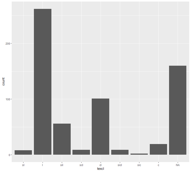
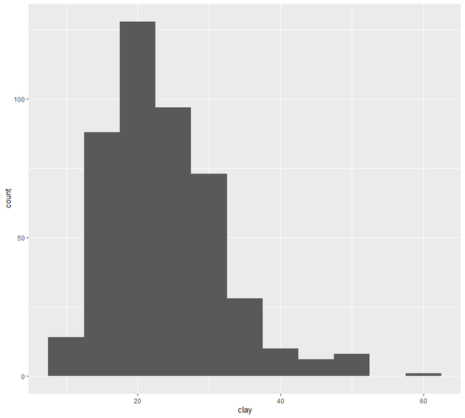
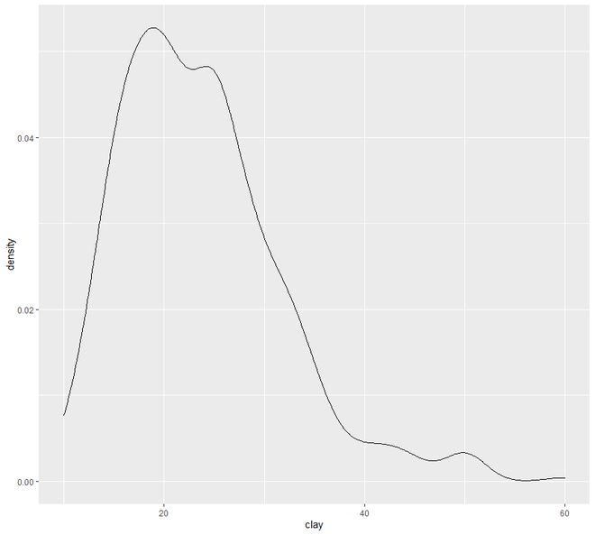
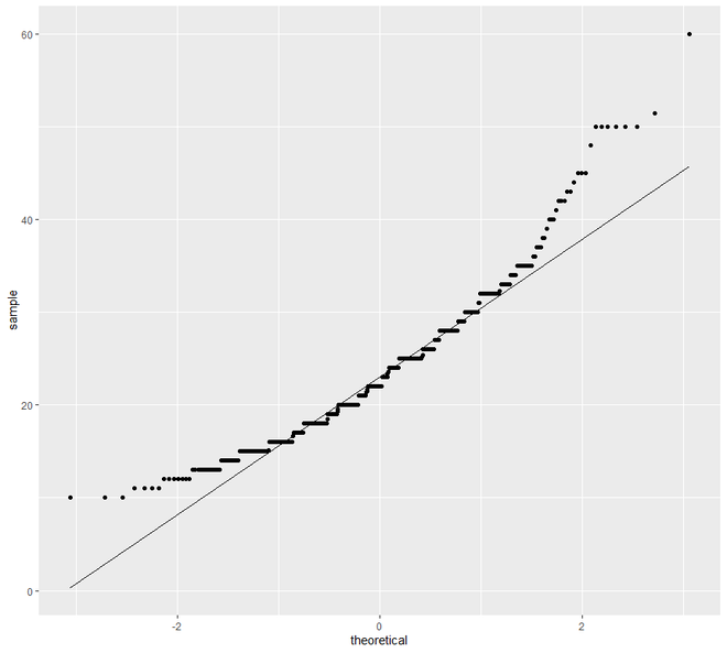
Bajo la Distribución, examinaremos nuestros datos usando el diagrama de barras, Histograma, Curva de densidad, diagramas de caja y QQplot.
Ejemplo 1:
Veremos cómo se pueden usar los gráficos de distribución para examinar datos en EDA en este ejemplo.
R
# EDA Graphical Method Distributions

# loading the required packages
library("ggplot2")
library(aqp)
library(soilDB)

# Load from the loafercreek dataset
data("loafercreek")

# Construct generalized horizon designations
n <- c("A", "BAt", "Bt1", "Bt2", "Cr", "R")

# REGEX rules
p <- c("A", "BA|AB", "Bt|Bw", "Bt3|Bt4|2B|C",
       "Cr", "R")

# Compute genhz labels and add
# to loafercreek dataset
loafercreek$genhz <- generalize.hz(
                       loafercreek$hzname, n, p)

# Extract the horizon table
h <- horizons(loafercreek)

# Examine the matching of pairing
# of the genhz label to the hznames
table(h$genhz, h$hzname)

vars <- c("genhz", "clay", "total_frags_pct",
          "phfield", "effclass")
summary(h[, vars])

sort(unique(h$hzname))
h$hzname <- ifelse(h$hzname == "BT",
                   "Bt", h$hzname)

# graphs
# bar plot
ggplot(h, aes(x = texcl)) +geom_bar()

# histogram
ggplot(h, aes(x = clay)) +
  geom_histogram(bins = nclass.Sturges(h$clay))

# density curve
ggplot(h, aes(x = clay)) + geom_density()

# box plot
ggplot(h, (aes(x = genhz, y = clay))) +
geom_boxplot()

# QQ Plot for Clay
ggplot(h, aes(sample = clay)) +
geom_qq() +
geom_qq_line()
Producción:
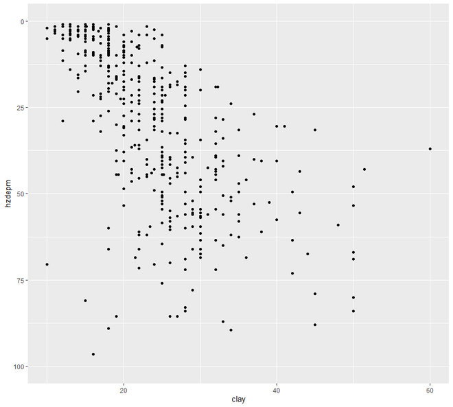
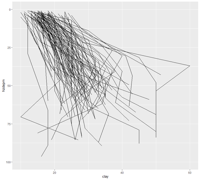
Ahora pasaremos al gráfico de dispersión y línea . En esta categoría, vamos a ver dos tipos de trazado, el gráfico de dispersión y el gráfico de líneas. La representación gráfica de los puntos de una variable de intervalo o relación frente a la variable se conoce como diagrama de dispersión.
Ejemplo 2:
Ahora veremos cómo usar diagramas de dispersión y de líneas para examinar nuestros datos.
R
# EDA
# Graphical Method
# Scatter and Line plot

# loading the required packages
library("ggplot2")
library(aqp)
library(soilDB)

# Load from the loafercreek dataset
data("loafercreek")

# Construct generalized horizon designations
n <- c("A", "BAt", "Bt1", "Bt2", "Cr", "R")

# REGEX rules
p <- c("A", "BA|AB", "Bt|Bw", "Bt3|Bt4|2B|C",
       "Cr", "R")

# Compute genhz labels and add
# to loafercreek dataset
loafercreek$genhz <- generalize.hz(
                       loafercreek$hzname, n, p)

# Extract the horizon table
h <- horizons(loafercreek)

# Examine the matching of pairing
# of the genhz label to the hznames
table(h$genhz, h$hzname)

vars <- c("genhz", "clay", "total_frags_pct",
          "phfield", "effclass")
summary(h[, vars])

sort(unique(h$hzname))
h$hzname <- ifelse(h$hzname == "BT",
                   "Bt", h$hzname)

# graph
# scatter plot
ggplot(h, aes(x = clay, y = hzdepm)) +
  geom_point() +
  ylim(100, 0)

# line plot
ggplot(h, aes(y = clay, x = hzdepm,
                     group = peiid)) +
geom_line() + coord_flip() + xlim(100, 0)
Producción: