Las animaciones en Android juegan un papel importante en la experiencia del usuario. Esto hace que el usuario se centre en el contenido principal, lo que quiere. Y también ayuda en la interactividad del usuario. Las animaciones se comunican con el usuario para involucrarse realmente en el uso de la aplicación. Entonces, en este artículo, se analiza una de las animaciones en Android que es la más popular, la animación de revelación circular . Eche un vistazo a la siguiente imagen para tener una idea de cómo se ve la animación circular.
Pasos para Implementar la Animación Circular en Android
Paso 1: crear un proyecto de actividad vacío
- Cree una actividad vacía Proyecto de Android Studio. O consulte Android | ¿Cómo crear/comenzar un nuevo proyecto en Android Studio? para saber cómo crear un proyecto de Android Studio de actividad vacía. Tenga en cuenta que seleccione Kotlin como lenguaje de programación.
Paso 2: trabajar con el archivo activity_main.xml
- Para implementar el diseño principal de la aplicación en el que se incluye un solo botón, que cuando se hace clic en él activa la animación de revelación circular.
- Para implementar la interfaz de usuario, invoque el siguiente código dentro del archivo activity_main.xml .
XML
<?xml version="1.0" encoding="utf-8"?>
<RelativeLayout
    xmlns:android="http://schemas.android.com/apk/res/android"
    xmlns:app="http://schemas.android.com/apk/res-auto"
    xmlns:tools="http://schemas.android.com/tools"
    android:id="@+id/mainLayout"
    android:layout_width="match_parent"
    android:layout_height="match_parent"
    android:fitsSystemWindows="true"
    tools:context=".MainActivity"
    tools:ignore="HardcodedText">

    <TextView
        android:layout_width="match_parent"
        android:layout_height="wrap_content"
        android:layout_marginTop="16dp"
        android:gravity="center"
        android:text="GeeksforGeeks"
        android:textColor="@color/green_500"
        android:textSize="24sp"
        android:textStyle="bold" />

    <!--The layout which is invisible initially-->
    <LinearLayout
        android:id="@+id/revealLayout"
        android:layout_width="match_parent"
        android:layout_height="match_parent"
        android:background="@color/green_200"
        android:gravity="center"
        android:orientation="vertical"
        android:visibility="gone">

        <Button
            android:layout_width="wrap_content"
            android:layout_height="wrap_content"
            android:backgroundTint="@android:color/white"
            android:text="LEARN PROGRAMMING"
            android:textColor="@android:color/black" />

        <Button
            android:layout_width="wrap_content"
            android:layout_height="wrap_content"
            android:backgroundTint="@android:color/white"
            android:text="CONTRIBUTE"
            android:textColor="@android:color/black" />

        <Button
            android:layout_width="wrap_content"
            android:layout_height="wrap_content"
            android:backgroundTint="@android:color/white"
            android:text="VISIT WEBSITE"
            android:textColor="@android:color/black" />

    </LinearLayout>

    <!--The Fab to toggle the visibility of circular reveal animation-->
    <com.google.android.material.floatingactionbutton.FloatingActionButton
        android:id="@+id/fab"
        android:layout_width="wrap_content"
        android:layout_height="wrap_content"
        android:layout_alignParentEnd="true"
        android:layout_alignParentBottom="true"
        android:layout_gravity="bottom|end"
        android:layout_marginEnd="16dp"
        android:layout_marginBottom="16dp"
        app:srcCompat="@drawable/ic_add" />

</RelativeLayout>
Interfaz de usuario de salida:
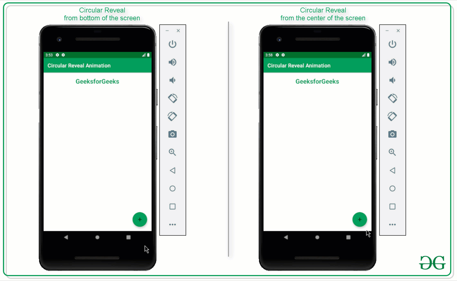
Ahora revelando el mismo diseño desde la parte inferior de la pantalla
Paso 3: trabajar con el archivo MainActivity.kt
- En primer lugar, el código es para la animación de revelación circular de la parte inferior derecha de la pantalla.
- Invoque el siguiente código y consulte su salida para una mejor comprensión, los comentarios se agregan para una mejor comprensión.
Kotlin
import android.animation.Animator
import android.annotation.SuppressLint
import android.content.res.ColorStateList
import android.os.Build
import android.os.Bundle
import android.view.View
import android.view.ViewAnimationUtils
import androidx.annotation.RequiresApi
import androidx.appcompat.app.AppCompatActivity
import androidx.core.content.res.ResourcesCompat
import com.google.android.material.floatingactionbutton.FloatingActionButton
import kotlin.math.hypot
import kotlin.math.max

class MainActivity : AppCompatActivity() {

    private lateinit var mRevealLayout: View
    private lateinit var mFab: FloatingActionButton

    // boolean variable to check whether the
      // reveal layout is visible or not
    private var isRevealed = false

    @RequiresApi(Build.VERSION_CODES.M)
    override fun onCreate(savedInstanceState: Bundle?) {
        super.onCreate(savedInstanceState)
        setContentView(R.layout.activity_main)

        mRevealLayout = findViewById(R.id.revealLayout)
        mFab = findViewById(R.id.fab)

        // initially the color of the FAB should be green
        mFab.backgroundTintList = ColorStateList.valueOf(
                ResourcesCompat.getColor(
                        resources,
                        R.color.green_500,
                        null
                )
        )

        // upon clicking the FAB the reveal should be
          // toggled according to the boolean value
        mFab.setOnClickListener {
            revealLayoutFun()
        }
    }

    // this function is triggered when
      // the FAB is clicked
    @RequiresApi(Build.VERSION_CODES.M)
    @SuppressLint("ResourceAsColor")
    private fun revealLayoutFun() {

        // based on the boolean value the
          // reveal layout should be toggled
        if (!isRevealed) {

            // get the right and bottom side
              // lengths of the reveal layout
            val x: Int = mRevealLayout.right
            val y: Int = mRevealLayout.bottom

            // here the starting radius of the reveal
              // layout is 0 when it is not visible
            val startRadius = 0

            // make the end radius should match
              // the while parent view
            val endRadius = hypot(
                    mRevealLayout.width.toDouble(),
                    mRevealLayout.height.toDouble()
            ).toInt()

            // and set the background tint of the FAB to white
              // color so that it can be visible
            mFab.backgroundTintList = ColorStateList.valueOf(
                    ResourcesCompat.getColor(
                            resources,
                            R.color.white,
                            null
                    )
            )
            // now set the icon as close for the FAB
            mFab.setImageResource(R.drawable.ic_close)

            // create the instance of the ViewAnimationUtils to
              // initiate the circular reveal animation
            val anim = ViewAnimationUtils.createCircularReveal(
                    mRevealLayout,
                    x,
                    y,
                    startRadius.toFloat(),
                    endRadius.toFloat()
            )

            // make the invisible reveal layout to visible
              // so that upon revealing it can be visible to user
            mRevealLayout.visibility = View.VISIBLE
            // now start the reveal animation
            anim.start()

            // set the boolean value to true as the reveal
              // layout is visible to the user
            isRevealed = true

        } else {

            // get the right and bottom side lengths
              // of the reveal layout
            val x: Int = mRevealLayout.right
            val y: Int = mRevealLayout.bottom

            // here the starting radius of the reveal layout is its full width
            val startRadius: Int = max(mRevealLayout.width, mRevealLayout.height)

            // and the end radius should be zero
              // at this point because the layout should be closed
            val endRadius = 0

            // now set the background tint of the FAB to green
              // so that it can be visible to the user
            mFab.backgroundTintList = ColorStateList.valueOf(
                    ResourcesCompat.getColor(
                            resources,
                            R.color.green_500,
                            null
                    )
            )

            // now again set the icon of the FAB to plus
            mFab.setImageResource(R.drawable.ic_add)

            // create the instance of the ViewAnimationUtils to
              // initiate the circular reveal animation
            val anim = ViewAnimationUtils.createCircularReveal(
                    mRevealLayout,
                    x,
                    y,
                    startRadius.toFloat(),
                    endRadius.toFloat()
            )

            // now as soon as the animation is ending, the reveal
              // layout should also be closed
            anim.addListener(object : Animator.AnimatorListener {
                override fun onAnimationStart(animator: Animator) {}
                override fun onAnimationEnd(animator: Animator) {
                    mRevealLayout.visibility = View.GONE
                }

                override fun onAnimationCancel(animator: Animator) {}
                override fun onAnimationRepeat(animator: Animator) {}
            })

            // start the closing animation
            anim.start()

            // set the boolean variable to false
              // as the reveal layout is invisible
            isRevealed = false
        }
    }
}
Producción:
Ahora revelando el mismo diseño desde el centro de la pantalla
Nota: El diseño de la aplicación sigue siendo el mismo, solo se cambia el código del archivo MainActivity.kt.
- Invoque el siguiente código dentro del archivo MainActivity.kt para revelar el mismo diseño desde el centro de la pantalla.
Kotlin
import android.animation.Animator
import android.annotation.SuppressLint
import android.content.res.ColorStateList
import android.os.Build
import android.os.Bundle
import android.view.View
import android.view.ViewAnimationUtils
import androidx.annotation.RequiresApi
import androidx.appcompat.app.AppCompatActivity
import androidx.core.content.res.ResourcesCompat
import com.google.android.material.floatingactionbutton.FloatingActionButton
import kotlin.math.hypot
import kotlin.math.max

class MainActivity : AppCompatActivity() {

    private lateinit var mRevealLayout: View
    private lateinit var mFab: FloatingActionButton

    // boolean variable to check whether
      // the reveal layout is visible or not
    private var isRevealed = false

    @RequiresApi(Build.VERSION_CODES.M)
    override fun onCreate(savedInstanceState: Bundle?) {
        super.onCreate(savedInstanceState)
        setContentView(R.layout.activity_main)

        mRevealLayout = findViewById(R.id.revealLayout)
        mFab = findViewById(R.id.fab)

        // initially the color of the FAB should be green
        mFab.backgroundTintList = ColorStateList.valueOf(
                ResourcesCompat.getColor(
                        resources,
                        R.color.green_500,
                        null
                )
        )

        // upon clicking the FAB the reveal should
          // be toggled according to the boolean value
        mFab.setOnClickListener {
            revealLayoutFun()
        }
    }

    // this function is triggered when
      // the FAB is clicked
    @RequiresApi(Build.VERSION_CODES.M)
    @SuppressLint("ResourceAsColor")
    private fun revealLayoutFun() {

        // based on the boolean value the
          // reveal layout should be toggled
        if (!isRevealed) {

            // get the right and bottom side
              // lengths of the reveal layout
            val x: Int = mRevealLayout.right / 2
            val y: Int = mRevealLayout.bottom / 2

            // here the starting radius of the reveal
              // layout is 0 when it is not visible
            val startRadius = 0

            // make the end radius should
              // match the while parent view
            val endRadius = hypot(
                    mRevealLayout.width.toDouble(),
                    mRevealLayout.height.toDouble()
            ).toInt()

            // and set the background tint of the FAB to white
             // color so that it can be visible
            mFab.backgroundTintList = ColorStateList.valueOf(
                    ResourcesCompat.getColor(
                            resources,
                            R.color.white,
                            null
                    )
            )
            // now set the icon as close for the FAB
            mFab.setImageResource(R.drawable.ic_close)

            // create the instance of the ViewAnimationUtils to
              // initiate the circular reveal animation
            val anim = ViewAnimationUtils.createCircularReveal(
                    mRevealLayout,
                    x,
                    y,
                    startRadius.toFloat(),
                    endRadius.toFloat()
            )

            // make the invisible reveal layout to visible
              // so that upon revealing it can be visible to user
            mRevealLayout.visibility = View.VISIBLE
            // now start the reveal animation
            anim.start()

            // set the boolean value to true as the reveal
              // layout is visible to the user
            isRevealed = true

        } else {

            // get the right and bottom side lengths
              // of the reveal layout
            val x: Int = mRevealLayout.right / 2
            val y: Int = mRevealLayout.bottom / 2

            // here the starting radius of the reveal layout is its full width
            val startRadius: Int = max(mRevealLayout.width, mRevealLayout.height)

            // and the end radius should be zero at this
              // point because the layout should be closed
            val endRadius = 0

            // now set the background tint of the FAB to green
              // so that it can be visible to the user
            mFab.backgroundTintList = ColorStateList.valueOf(
                    ResourcesCompat.getColor(
                            resources,
                            R.color.green_500,
                            null
                    )
            )

            // now again set the icon of the FAB to plus
            mFab.setImageResource(R.drawable.ic_add)

            // create the instance of the ViewAnimationUtils
              // to initiate the circular reveal animation
            val anim = ViewAnimationUtils.createCircularReveal(
                    mRevealLayout,
                    x,
                    y,
                    startRadius.toFloat(),
                    endRadius.toFloat()
            )

            // now as soon as the animation is ending, the reveal
              // layout should also be closed
            anim.addListener(object : Animator.AnimatorListener {
                override fun onAnimationStart(animator: Animator) {}
                override fun onAnimationEnd(animator: Animator) {
                    mRevealLayout.visibility = View.GONE
                }

                override fun onAnimationCancel(animator: Animator) {}
                override fun onAnimationRepeat(animator: Animator) {}
            })

            // start the closing animation
            anim.start()

            // set the boolean variable to false
             // as the reveal layout is invisible
            isRevealed = false
        }
    }
}
Producción:
Publicación traducida automáticamente
Artículo escrito por adityamshidlyali y traducido por Barcelona Geeks. The original can be accessed here. Licence: CCBY-SA