Jetpack Compose es un conjunto de herramientas de interfaz de usuario moderno que está diseñado para simplificar el desarrollo de la interfaz de usuario en Android. Consiste en un modelo de programación reactivo con la concisión y facilidad del lenguaje de programación Kotlin. Es completamente declarativo para que pueda describir su interfaz de usuario llamando a una serie de funciones que transformarán sus datos en una jerarquía de interfaz de usuario. Cuando los datos cambian o se actualizan, el marco recuerda automáticamente estas funciones y actualiza la vista por usted.
requisitos previos:
- Familiarizado con Kotlin y OOP Concepts también
- Comprensión básica sobre Jetpack Compose
- Estudio Android
Por lo tanto, solo vamos a crear una interfaz de usuario de la aplicación utilizando jetpack compose (Kotlin). nuestra interfaz de usuario final se verá así.
Es una interfaz de usuario fácil de construir usando jetpack compose pero un poco difícil usando XML. Entonces, comencemos paso a paso.
Implementación paso a paso
Paso 1: crea un nuevo proyecto de estudio de Android
Para crear un nuevo proyecto en Android Studio usando Jetpack Compose, consulte:- Cómo crear un nuevo proyecto en Android Studio Canary Version con Jetpack Compose.
Paso 2: agreguemos recursos al proyecto
Hay algunos recursos como colores, activos de imagen, fuentes y algunas cosas pequeñas. Puede encontrarlos fácilmente; de lo contrario, simplemente obténgalos del repositorio de GitHub .
Paso 3: Crear una clase de Kotlin HomeScreen.kt
También podemos hacer la misma tarea en MainActivity.kt, pero es una buena práctica crear otro archivo. Inicialmente, comenzamos desde la parte superior, por lo que creamos el primer encabezado de la interfaz de usuario. tener dos textos con una imagen de un icono de búsqueda. Las cosas son muy fáciles, en este caso solo creamos funciones y las llamamos, y así es como podemos reutilizar el código muy fácilmente.
Kotlin
package com.cuid.geekscourse.ui.theme

import androidx.compose.foundation.background
import androidx.compose.foundation.layout.*
import androidx.compose.material.Icon
import androidx.compose.material.MaterialTheme
import androidx.compose.material.Text
import androidx.compose.runtime.Composable
import androidx.compose.ui.Alignment
import androidx.compose.ui.Modifier
import androidx.compose.ui.graphics.Color
import androidx.compose.ui.res.painterResource
import androidx.compose.ui.tooling.preview.Preview
import androidx.compose.ui.unit.dp
import com.cuid.composeui.R

// here we have created HomeScreen function
// and we will call all functions inside it.
// and finally just call this function from mainActivity
@Composable
fun HomeScreen() {
      // this is the most outer box that will
      // contain all the views,buttons,chips,etc.
    Box(
        modifier = Modifier
            .background(DeepBlue)
            .fillMaxSize()
    ) {
        Column {
              // this is how we call
              // function adding whole UI
            GreetingSection()
        }
 }


@Composable

// and this is the function
// just for creating header at top
fun GreetingSection(
    name: String = "Geeks"
) {
      // here we just arrange the views
    Row(
        horizontalArrangement = Arrangement.SpaceBetween,
        verticalAlignment = Alignment.CenterVertically,
        modifier = Modifier
            .fillMaxWidth()
            .padding(15.dp)
    ) {
        Column(
            verticalArrangement = Arrangement.Center
        ) {
              // heading text view
            Text(
                text = "Good morning, $name",
                style = MaterialTheme.typography.h1
            )
            Text(
                text = "We wish you have a good day!",
                style = MaterialTheme.typography.body1
            )
        }
        // search icon
        Icon(
            painter = painterResource(id = R.drawable.ic_search),
            contentDescription = "Search",
            tint = Color.White,
            modifier = Modifier.size(24.dp)
        )
    }
}
Paso 4: crea otra función para chips
Como hemos mostrado anteriormente en la vista previa de la aplicación, podemos cambiar las fichas. Así que vamos a construirlo.
Kotlin
// This is how we can create chip seaction at the top of app

@Composable
fun ChipSection(
     // function with single argument
    chips: List<String>
) {
    var selectedChipIndex by remember {
        // it will not update the string
        // but save and it will helpful for us
        mutableStateOf(0)
    }
    LazyRow {
        items(chips.size) {
            Box(
                contentAlignment = Alignment.Center,
                modifier = Modifier
                    .padding(start = 15.dp, top = 15.dp, bottom = 15.dp)
                    .clickable {
                        selectedChipIndex = it
                    }
                    .clip(RoundedCornerShape(10.dp))
                    .background(
                        // this is basic condition for selected chip index
                        if (selectedChipIndex == it) ButtonGreen
                        else DarkerButtonGreen
                    )
                    .padding(15.dp)
            ) {
                Text(text = chips[it], color = TextWhite)
            }
        }
    }
}
Paso 5: Crear una función para SuggestionSecation
Es realmente una parte muy básica de esta aplicación.
Kotlin
// This function is for suggestion secation

@Composable
fun SuggestionSection(
    color: Color = LightBlue
) {
    Row(
        verticalAlignment = Alignment.CenterVertically,
        horizontalArrangement = Arrangement.SpaceBetween,
        modifier = Modifier
            .padding(15.dp)
            .clip(RoundedCornerShape(10.dp))
            .background(color)
            .padding(horizontal = 15.dp, vertical = 20.dp)
            .fillMaxWidth()
    ) {
        Column {
            // here are two text views or we can say only text
            Text(
                text = "Daily Coding",
                  // it can be litile bit confusing but
                  // it is just text style alternate
                  // of fontfamily in XML
                style = MaterialTheme.typography.h2

            )
            Text(
                // same as above
                text = "do at least • 3-10 problems / day",
                style = MaterialTheme.typography.body1,
                color = TextWhite
            )
        }
        Box(
            // box containing icon
            contentAlignment = Alignment.Center,
            modifier = Modifier
                .size(40.dp)
                .clip(CircleShape)
                .background(ButtonGreen)
                .padding(10.dp)
        ) {
            Icon(
                painter = painterResource(id = R.drawable.ic_play),
                contentDescription = "Play",
                tint = Color.White,
                modifier = Modifier.size(16.dp)
            )
        }
    }
}
El siguiente paso debería ser la tarjeta de cursos, pero eso no es fácil o podemos decir que es la parte más difícil de toda la interfaz de usuario, así que lo haremos después del último.
- Vamos a crear una sección inferior, pero antes de eso, debemos crear la clase por simplicidad.
- porque nuestro elemento BottomSection tiene dos campos o vistas, así que hagamos
Paso 6: Crear clase para ButtomSection (BottomMenuContent.kt)
Kotlin
package com.cuid.geekscourses

import androidx.annotation.DrawableRes
// having two parameters title and iconid
data class BottomMenuContent(
    val title: String,
    @DrawableRes val iconId: Int
)
Paso 7: Crear función para ButtomSection
Kotlin
@Composable
// this function tells us that
// how menu item should look like
fun BottomMenu(
    items: List<BottomMenuContent>,
    modifier: Modifier = Modifier,
    activeHighlightColor: Color = ButtonGreen,
    activeTextColor: Color = Color.White,
    inactiveTextColor: Color = AquaBlue,
    initialSelectedItemIndex: Int = 0
) {
    var selectedItemIndex by remember {
        mutableStateOf(initialSelectedItemIndex)
    }
    Row(
        horizontalArrangement = Arrangement.SpaceAround,
        verticalAlignment = Alignment.CenterVertically,
        modifier = modifier
            .fillMaxWidth()
            .background(DeepBlue)
            .padding(15.dp)
    ) {
          // it is basically what we should have
          // for creating an element of BottomMenuItem
        items.forEachIndexed { index, item ->
            BottomMenuItem(
                item = item,
                isSelected = index == selectedItemIndex,
                activeHighlightColor = activeHighlightColor,
                activeTextColor = activeTextColor,
                inactiveTextColor = inactiveTextColor
            ) {
                selectedItemIndex = index
            }
        }
    }
}
// it's basically how menu item should look like
@Composable
fun BottomMenuItem(
    item: BottomMenuContent,
    isSelected: Boolean = false,
    activeHighlightColor: Color = ButtonGreen,
    activeTextColor: Color = Color.White,
    inactiveTextColor: Color = AquaBlue,
    onItemClick: () -> Unit
) {
    Column(
        horizontalAlignment = Alignment.CenterHorizontally,
        verticalArrangement = Arrangement.Center,
        modifier = Modifier.clickable {
            onItemClick()
        }
    ) {
          // here are some peremetens
          // for how elements will align
        Box(
            contentAlignment = Alignment.Center,
            modifier = Modifier
                .clip(RoundedCornerShape(10.dp))
                .background(if (isSelected) activeHighlightColor else Color.Transparent)
                .padding(10.dp)
        ) {
            Icon(
                painter = painterResource(id = item.iconId),
                contentDescription = item.title,
                tint = if (isSelected) activeTextColor else inactiveTextColor,
                modifier = Modifier.size(20.dp)
            )
        }
        Text(
            text = item.title,
              // it's basic condition
            color = if(isSelected) activeTextColor else inactiveTextColor
        )
    }
}
Ahora, la parte final de la aplicación es un poco complicada, que no es más que el elemento del curso, este:
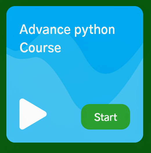
elemento del curso
Aquí también tenemos tres colores, una string y un ícono, luego, al igual que arriba, crearemos una clase y estableceremos los datos durante la llamada a la función.
Paso 8: Creando Class Course.kt
Esta sección tiene cinco campos, así que cree cinco variables de sus tipos. Los campos que puedes ver en el código también.
Kotlin
package com.cuid.geekscourses

import androidx.annotation.DrawableRes
import androidx.compose.ui.graphics.Color

data class Course(
    val title: String,
    @DrawableRes val iconId: Int,
    val lightColor: Color,
    val mediumColor: Color,
    val darkColor: Color
)
Ahora solo piénsalo, cómo hacer esas curvas en la tarjeta. Básicamente, establecemos algunos puntos y creamos una curva suave uniendo los puntos creados
Paso 9: Creando CourseSection
Es básicamente cómo se organizará nuestra cuadrícula.
Kotlin
@ExperimentalFoundationApi
@Composable
// here we have just passed the list of courses
fun CourseSection(courses: List<Course>) {
    Column(modifier = Modifier.fillMaxWidth()) {
        Text(
            text = "courses",
            style = MaterialTheme.typography.h1,
            modifier = Modifier.padding(15.dp)
        )
        // we have used lazyVertically grid
        LazyVerticalGrid(
            cells = GridCells.Fixed(2), // it basically tells no. of cells in a row
            contentPadding = PaddingValues(start = 7.5.dp, end = 7.5.dp,bottom = 100.dp),
            modifier = Modifier.fillMaxHeight()
        ) {
            items(courses.size) {
              // here we have to define how one of these item is look like
              // we will tell after defining item design
              // let me comment it for now and after
              // creating you just have to remove

              // CourseItem(course = courses[it])
            }
        }
    }
}
Paso 10: Crear un diseño de elemento de tarjeta de curso
Kotlin
@Composable
fun CourseItem(
    course: Course
) {
    BoxWithConstraints(
          // Box with some attributes
        modifier = Modifier
            .padding(7.5.dp)
            .aspectRatio(1f)
            .clip(RoundedCornerShape(10.dp))
            .background(feature.darkColor)
    ) {
        val width = constraints.maxWidth
        val height = constraints.maxHeight
        // setting 5 points for medium
        // color or we can say for another
        // Medium colored path
        val mediumColoredPoint1 = Offset(0f, height * 0.3f)
        val mediumColoredPoint2 = Offset(width * 0.1f, height * 0.35f)
        val mediumColoredPoint3 = Offset(width * 0.4f, height * 0.05f)
        val mediumColoredPoint4 = Offset(width * 0.75f, height * 0.7f)
        val mediumColoredPoint5 = Offset(width * 1.4f, -height.toFloat())
        // joining points to make curves with the help of path class
        // path file that we have created earlier
        // having function that just help to reduce our code
        // and the function is standardQuadFromTo(m1,m2) taking
        // two peramente and connect them
        val mediumColoredPath = Path().apply {
            moveTo(mediumColoredPoint1.x, mediumColoredPoint1.y)
            standardQuadFromTo(mediumColoredPoint1, mediumColoredPoint2)
            standardQuadFromTo(mediumColoredPoint2, mediumColoredPoint3)
            standardQuadFromTo(mediumColoredPoint3, mediumColoredPoint4)
            standardQuadFromTo(mediumColoredPoint4, mediumColoredPoint5)
            lineTo(width.toFloat() + 100f, height.toFloat() + 100f)
            lineTo(-100f, height.toFloat() + 100f)
            close()
        }
        // it's another part of that
          // texture with light color
        // Light colored path
        val lightPoint1 = Offset(0f, height * 0.35f)
        val lightPoint2 = Offset(width * 0.1f, height * 0.4f)
        val lightPoint3 = Offset(width * 0.3f, height * 0.35f)
        val lightPoint4 = Offset(width * 0.65f, height.toFloat())
        val lightPoint5 = Offset(width * 1.4f, -height.toFloat() / 3f)

        val lightColoredPath = Path().apply {
            moveTo(lightPoint1.x, lightPoint1.y)
            standardQuadFromTo(lightPoint1, lightPoint2)
            standardQuadFromTo(lightPoint2, lightPoint3)
            standardQuadFromTo(lightPoint3, lightPoint4)
            standardQuadFromTo(lightPoint4, lightPoint5)
            lineTo(width.toFloat() + 100f, height.toFloat() + 100f)
            lineTo(-100f, height.toFloat() + 100f)
            close()
        }
        // canvas is used when we
          // want to draw something
        Canvas(
            modifier = Modifier
                .fillMaxSize()
        ) {
            drawPath(
                  // function for drawing paths
                  // just pass the path
                path = mediumColoredPath,
                color = course.mediumColor
            )
            drawPath( // it's for the lighter path
                path = lightColoredPath,
                color = course.lightColor
            )
        }
         // so , we have done with texture and
         // now just creating box and other things
        // box containing course elements
        Box(
            modifier = Modifier
                .fillMaxSize()
                .padding(15.dp)
        ) {
            Text(
                text = course.title,
                style = MaterialTheme.typography.h2,
                lineHeight = 26.sp,
                modifier = Modifier.align(Alignment.TopStart)
            )
            Icon(
                painter = painterResource(id = course.iconId),
                contentDescription = course.title,
                tint = Color.White,
                modifier = Modifier.align(Alignment.BottomStart)
            )
            Text(
                text = "Start",
                color = TextWhite,
                fontSize = 14.sp,
                fontWeight = FontWeight.Bold,
                modifier = Modifier
                    .clickable {
                        // Handle the clicks
                    }
                    .align(Alignment.BottomEnd)
                    .clip(RoundedCornerShape(10.dp))
                    .background(ButtonGreen)
                    .padding(vertical = 6.dp, horizontal = 15.dp)
            )
        }
    }
}
Eso es todo acerca de cómo se verá nuestro artículo. Así que simplemente pase el elemento en la sección del curso.
CourseItem(curso = cursos[it])
Es ese archivo que hemos discutido anteriormente para reducir nuestro código
Kotlin
package com.cuid.geekscourses

import androidx.compose.ui.geometry.Offset
import androidx.compose.ui.graphics.Path
import kotlin.math.abs
// The function is standardQuadFromTo(m1,m2)
// taking two peramente those are nothing but points
// that we are created and just add.
fun Path.standardQuadFromTo(from: Offset, to: Offset) {
      // this function is basically draw
      // a line to our second point and
      // also smooth on that line and make it curve
    quadraticBezierTo(
        from.x,
        from.y,
        abs(from.x + to.x) / 2f,
        abs(from.y + to.y) / 2f
    )
}
Ahora tenemos todo listo, así que simplemente llame a todas las funciones y vea su resultado como
Kotlin
@ExperimentalFoundationApi
@Composable
fun HomeScreen() {
    // this is the most outer box
      // having all the views inside it
    Box(
        modifier = Modifier
            .background(DeepBlue)
            .fillMaxSize()
    ) {
        Column {
              // this is the function for header
            GreetingSection()
            // it's for chipsSecation, and pass
              // as many strings as you want
            ChipSection(chips = listOf("Data structures", "Algorithms", "competitive programming", "python"))
             // function for suggestionSection
             suggestionSection()
              // this is for course secation
            CourseSection(
                  // function require list of courses and
                  // one course contain 5 attributes
                courses = listOf(
                    Course(
                        title = "geek of the year",
                        R.drawable.ic_headphone,
                          // these are colors.......
                        BlueViolet1,
                        BlueViolet2,
                        BlueViolet3
                    ),
                      // below are the copies of the objects
                      // and you can add as many as you want
                    Course(
                        title = "How does AI Works",
                        R.drawable.ic_videocam,
                        LightGreen1,
                        LightGreen2,
                        LightGreen3
                    ),
                    Course(
                        title = "Advance python Course",
                        R.drawable.ic_play,
                        skyblue1,
                        skyblue2,
                        skyblue3
                    ),
                    Course(
                        title = "Advance Java Course",
                        R.drawable.ic_headphone,
                        Beige1,
                        Beige2,
                        Beige3
                    ),
                    Course(
                        title = "prepare for aptitude test",
                        R.drawable.ic_play,
                        OrangeYellow1,
                        OrangeYellow2,
                        OrangeYellow3
                    ),
                    Course(
                        title = "How does AI Works",
                        R.drawable.ic_videocam,
                        LightGreen1,
                        LightGreen2,
                        LightGreen3
                    ),
                )
            )
        }
        // this is the final one that is bottomMenu
        BottomMenu(items = listOf(
              // having 5 instances
            BottomMenuContent("Home", R.drawable.ic_home),
            BottomMenuContent("explore", R.drawable.ic_baseline_explore_24),
            BottomMenuContent("dark mode", R.drawable.ic_moon),
            BottomMenuContent("videos", R.drawable.ic_videocam),
            BottomMenuContent("Profile", R.drawable.ic_profile),
        ), modifier = Modifier.align(Alignment.BottomCenter))
    }
}
Ahora agregue la divertida HomeScreen() que contiene todas las funciones, en MainActivity como
Kotlin
package com.cuid.geekscourses

import android.os.Bundle
import androidx.activity.ComponentActivity
import androidx.activity.compose.setContent
import androidx.compose.foundation.ExperimentalFoundationApi
import com.cuid.geekscourses.ui.HomeScreen
import com.cuid.geekscourses.ui.theme.Geekscourse

class MainActivity : ComponentActivity() {
    @ExperimentalFoundationApi
    override fun onCreate(savedInstanceState: Bundle?) {
        super.onCreate(savedInstanceState)
        setContent {
            Geekscourse{
                HomeScreen()
            }
        }
    }
}
Finalmente, nuestra interfaz de usuario se ve así:
Producción:

Enlace del proyecto: Haga clic aquí
Publicación traducida automáticamente
Artículo escrito por eralokyadav2019 y traducido por Barcelona Geeks. The original can be accessed here. Licence: CCBY-SA