El mapa de calor se define como una representación gráfica de datos que utiliza colores para visualizar el valor de la array. En este, para representar valores más comunes o actividades mayores se utilizan colores más brillantes básicamente colores rojizos y para representar valores menos comunes o de actividad se prefieren colores más oscuros. El mapa de calor también se define por el nombre de la array de sombreado. Los mapas de calor en Seaborn se pueden trazar utilizando la función seaborn.heatmap().
seaborn.mapa de calor()
Sintaxis: seaborn.heatmap( data , * , vmin=Ninguno , vmax=Ninguno , cmap=Ninguno , center=Ninguno , annot_kws=Ninguno , linewidths =0 , linecolor=’white’ , cbar=True , **kwargs )
Parámetros importantes:
- datos: conjunto de datos 2D que se puede convertir en un ndarray.
- vmin , vmax: valores para anclar el mapa de colores; de lo contrario, se deducen de los datos y otros argumentos de palabras clave.
- cmap: el mapeo de valores de datos al espacio de color.
- centro: el valor en el que centrar el mapa de colores al trazar datos divergentes.
- annot: si es verdadero, escriba el valor de los datos en cada celda.
- fmt: código de formato de string para usar al agregar anotaciones.
- linewidths: Ancho de las líneas que dividirán cada celda.
- linecolor: Color de las líneas que dividirán cada celda.
- cbar: Ya sea para dibujar una barra de colores.
Todos los parámetros excepto los datos son opcionales.
Devuelve: un objeto de tipo matplotlib.axes._subplots.AxesSubplot
Entendamos el mapa de calor con ejemplos.
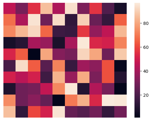
Mapa de calor básico
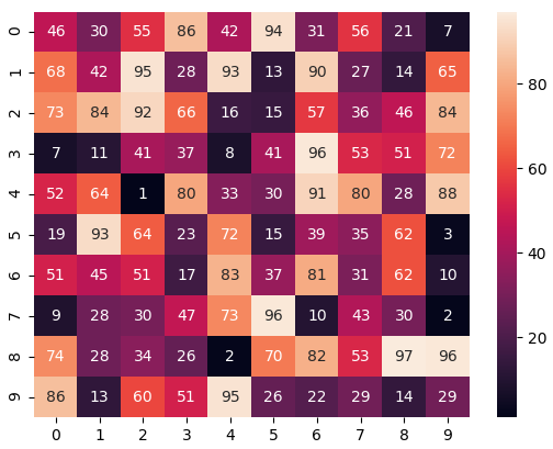
Realización de un mapa de calor con los parámetros por defecto. Crearemos datos 2D de 10 × 10 utilizando la función randint() del módulo NumPy.
Python3
# importing the modules
import numpy as np
import seaborn as sn
import matplotlib.pyplot as plt

# generating 2-D 10x10 matrix of random numbers
# from 1 to 100
data = np.random.randint(low = 1,
                         high = 100,
                         size = (10, 10))
print("The data to be plotted:\n")
print(data)

# plotting the heatmap
hm = sn.heatmap(data = data)

# displaying the plotted heatmap
plt.show()
Producción:
The data to be plotted:

[[46 30 55 86 42 94 31 56 21  7]
[68 42 95 28 93 13 90 27 14 65]
[73 84 92 66 16 15 57 36 46 84]
[ 7 11 41 37  8 41 96 53 51 72]
[52 64  1 80 33 30 91 80 28 88]
[19 93 64 23 72 15 39 35 62  3]
[51 45 51 17 83 37 81 31 62 10]
[ 9 28 30 47 73 96 10 43 30  2]
[74 28 34 26  2 70 82 53 97 96]
[86 13 60 51 95 26 22 29 14 29]]
Usaremos estos mismos datos en todos los ejemplos.
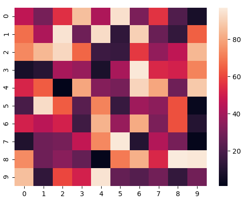
Anclaje del mapa de colores
Si establecemos el valor de vmin en 30 y el valor de vmax en 70, solo se mostrarán las celdas con valores entre 30 y 70. Esto se llama anclar el mapa de colores.
Python3
# importing the modules
import numpy as np
import seaborn as sn
import matplotlib.pyplot as plt

# generating 2-D 10x10 matrix of random numbers
# from 1 to 100
data = np.random.randint(low=1,
                         high=100,
                         size=(10, 10))

# setting the parameter values
vmin = 30
vmax = 70

# plotting the heatmap
hm = sn.heatmap(data=data,
                vmin=vmin,
                vmax=vmax)

# displaying the plotted heatmap
plt.show()
Producción:
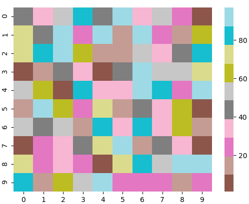
Elegir el mapa de colores
En esto, veremos el parámetro cmap . Matplotlib nos proporciona múltiples mapas de colores, puede verlos todos aquí . En nuestro ejemplo, usaremos tab20 .
Python3
# importing the modules
import numpy as np
import seaborn as sn
import matplotlib.pyplot as plt

# generating 2-D 10x10 matrix of random numbers
# from 1 to 100
data = np.random.randint(low=1,
                         high=100,
                         size=(10, 10))

# setting the parameter values
cmap = "tab20"

# plotting the heatmap
hm = sn.heatmap(data=data,
                cmap=cmap)

# displaying the plotted heatmap
plt.show()
Producción:

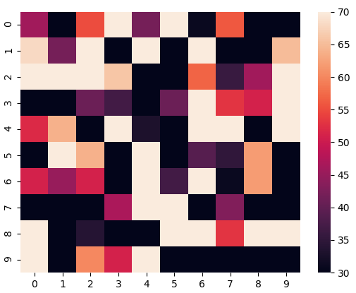
Centrar el mapa de colores
Centrar el cmap en 0 pasando el parámetro center como 0.
Python3
# importing the modules
import numpy as np
import seaborn as sn
import matplotlib.pyplot as plt

# generating 2-D 10x10 matrix of random numbers
# from 1 to 100
data = np.random.randint(low=1,
                         high=100,
                         size=(10, 10))

# setting the parameter values
cmap = "tab20"
center = 0

# plotting the heatmap
hm = sn.heatmap(data=data,
                cmap=cmap,
                center=center)

# displaying the plotted heatmap
plt.show()
Producción:
Mostrar los valores de las celdas
Si queremos mostrar el valor de las celdas, pasamos el parámetro annot como True. fmt se utiliza para seleccionar el tipo de datos del contenido de las celdas mostradas.
Python3
# importing the modules
import numpy as np
import seaborn as sn
import matplotlib.pyplot as plt

# generating 2-D 10x10 matrix of random numbers
# from 1 to 100
data = np.random.randint(low=1,
                         high=100,
                         size=(10, 10))

# setting the parameter values
annot = True

# plotting the heatmap
hm = sn.heatmap(data=data,
                annot=annot)

# displaying the plotted heatmap
plt.show()
Producción:
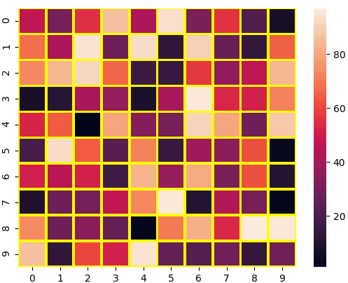
Personalización de la línea de separación
Podemos cambiar el grosor y el color de las líneas que separan las celdas usando los parámetros linewidths y linecolor respectivamente.
Python3
# importing the modules
import numpy as np
import seaborn as sn
import matplotlib.pyplot as plt

# generating 2-D 10x10 matrix of random numbers
# from 1 to 100
data = np.random.randint(low=1,
                         high=100,
                         size=(10, 10))

# setting the parameter values
linewidths = 2
linecolor = "yellow"

# plotting the heatmap
hm = sn.heatmap(data=data,
                linewidths=linewidths,
                linecolor=linecolor)

# displaying the plotted heatmap
plt.show()
Producción:
Ocultar la barra de colores
Podemos deshabilitar la barra de colores configurando el parámetro cbar en False.
Python3
# importing the modules
import numpy as np
import seaborn as sn
import matplotlib.pyplot as plt

# generating 2-D 10x10 matrix of random numbers
# from 1 to 100
data = np.random.randint(low=1,
                         high=100,
                         size=(10, 10))

# setting the parameter values
cbar = False

# plotting the heatmap
hm = sn.heatmap(data=data,
                cbar=cbar)

# displaying the plotted heatmap
plt.show()
Producción:
Quitar las etiquetas
Podemos deshabilitar la etiqueta x y la etiqueta y pasando False en los parámetros xticklabels e yticklabels respectivamente.
Python3
# importing the modules
import numpy as np
import seaborn as sn
import matplotlib.pyplot as plt

# generating 2-D 10x10 matrix of random numbers
# from 1 to 100
data = np.random.randint(low=1,
                         high=100,
                         size=(10, 10))

# setting the parameter values
xticklabels = False
yticklabels = False

# plotting the heatmap
hm = sn.heatmap(data=data,
                xticklabels=xticklabels,
                yticklabels=yticklabels)

# displaying the plotted heatmap
plt.show()
Producción: